A wearable sunk-cost fallacy.
2026-09-25
This page and all of its contents were created without the assistance of any sort of generative AI.
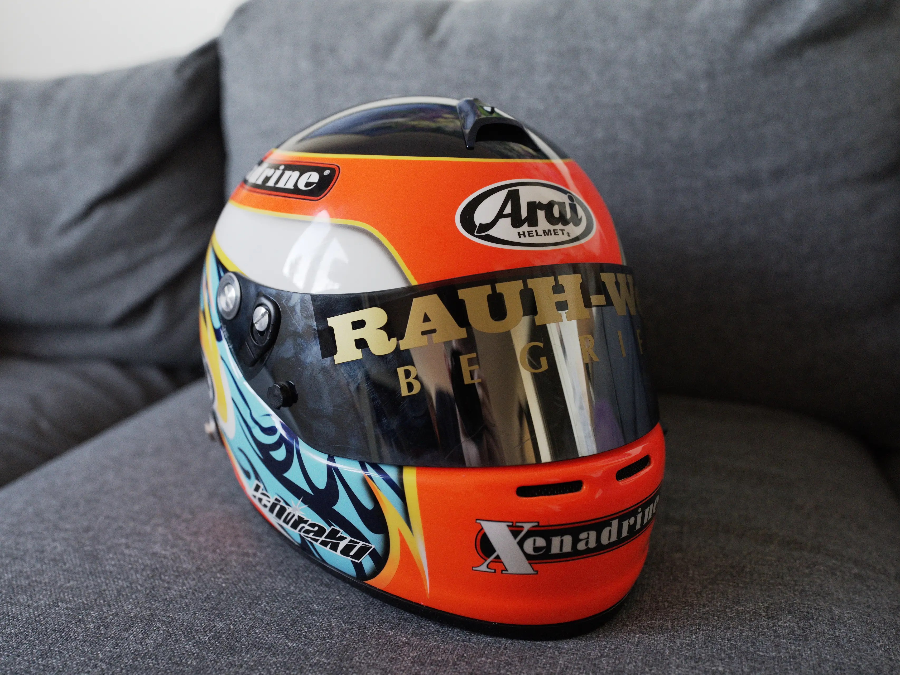
I swear the helmet was finished on time for the ten year anniversary of Blonde! And I have the screenshot to prove it!
TL;DR: I had a dumb idea ages ago, was presented with plenty of opportunities to stop and reconsider, but I was foolish enough to push through all the way to the end. It does look pretty cool though :)
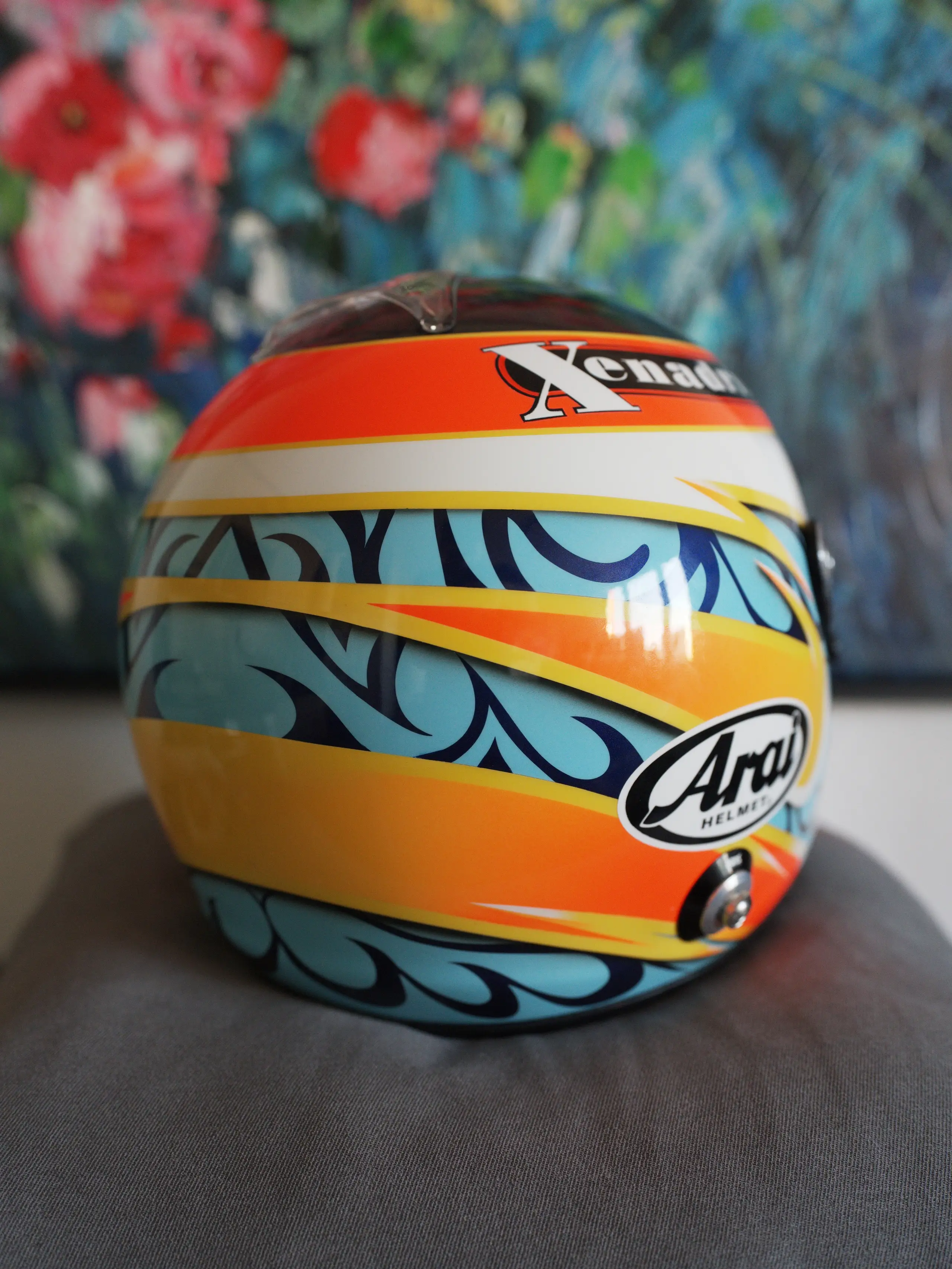
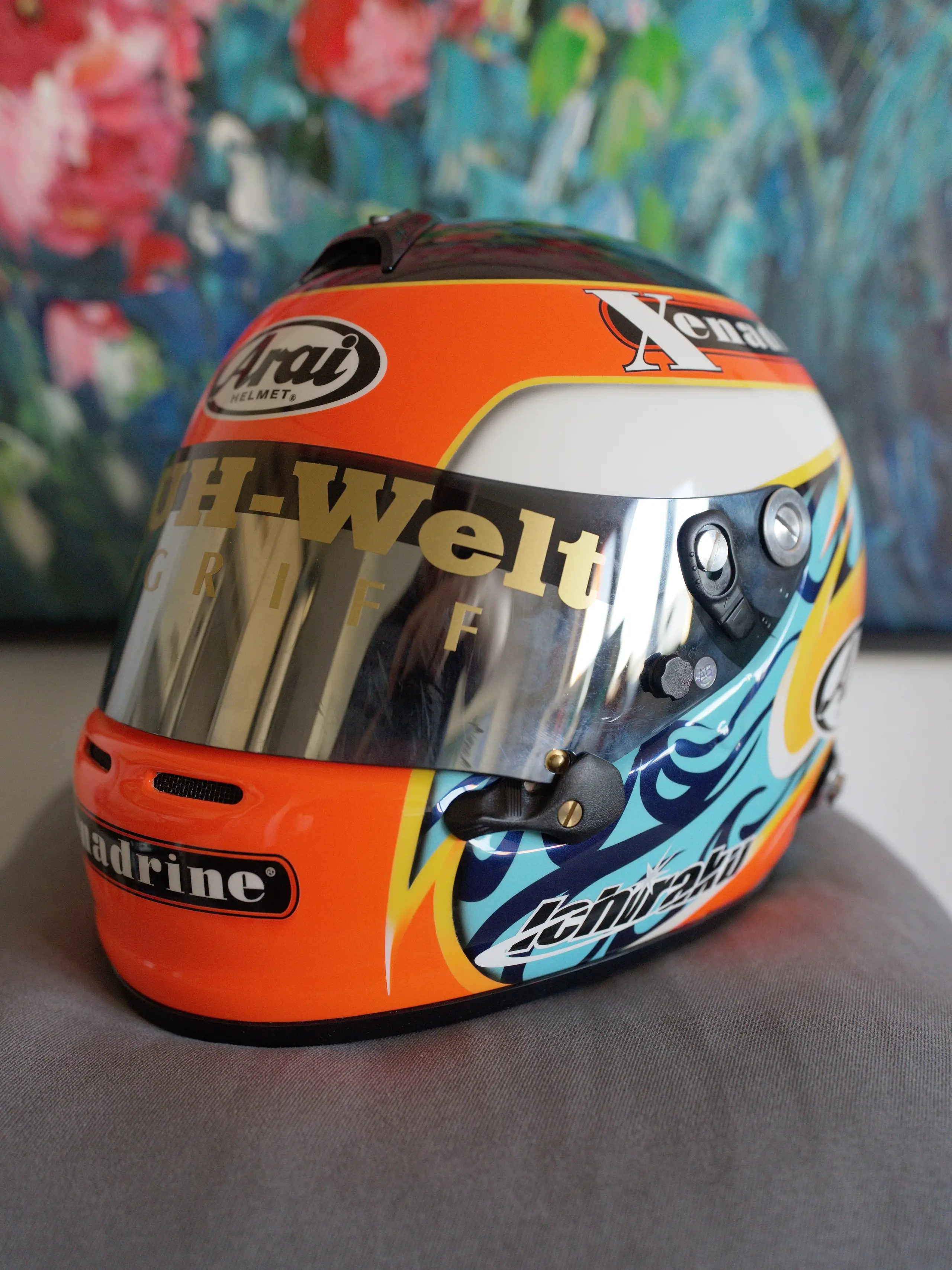
Here’s a photo of the end result:
This post isn’t structured by topic, but simply written down in chronological order.
This entire project started out in 2022 as an idea for a present to a very good friend of mine. Ever since I first met him he’s been using that photo from one of the alternative covers of Frank Ocean’s Blonde as his profile pic. He’s a big fan of Frank Ocean so it only felt right for me to go out of my way to try and recreate the helmet. Even if it doesn’t come out 100% right, it’s the thought that counts.
I figured I’d just remake the design of the helmet. I mean, it can’t be that hard, can it? (this is foreshadowing)
For those unfamiliar with Frank Ocean, here is the photo I’m referencing.
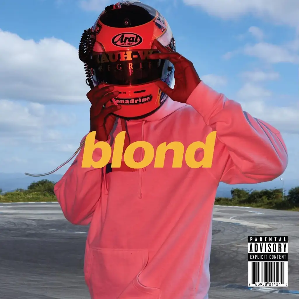
I’m not very invested in the lore surrounding Frank Ocean myself, so I practically started from zero. Now it was time for me to try and uncover as much information about the helmet as I possibly could. This is everything I learned (four years ago, there will be additional new information further down below.)
This particular helmet belongs to Toshiya “Tom” Ichiraku, International Director of RWB (RAUH-Welt BEGRIFF, a company known all around the world for their insanely wide Porsche bodykits). It was worn by Frank Ocean for a photoshoot with Vivian Sassen in Japan at Ebisu Circuit.
Here are the published photos from that shoot plus the (somewhat incorrectly, more on that later) color corrected photos found online.
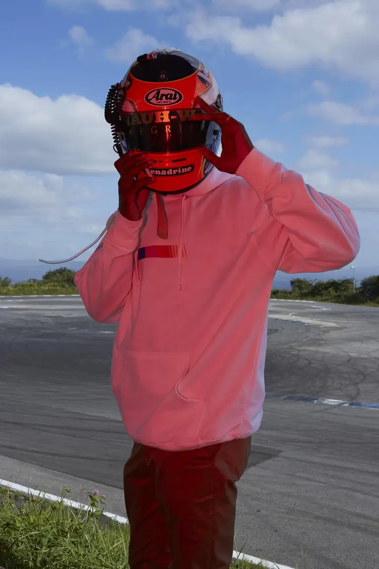
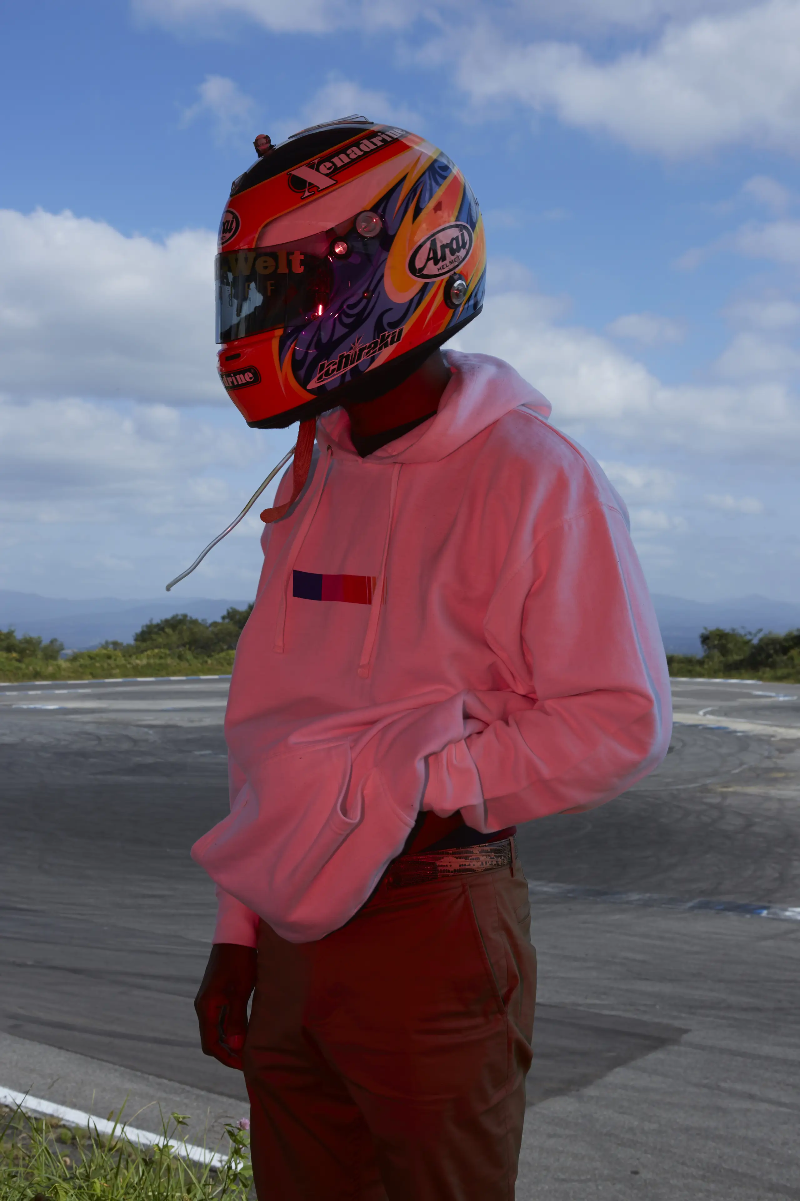
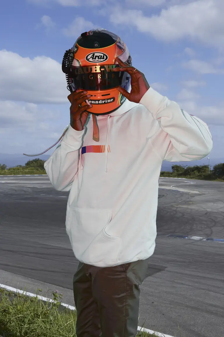
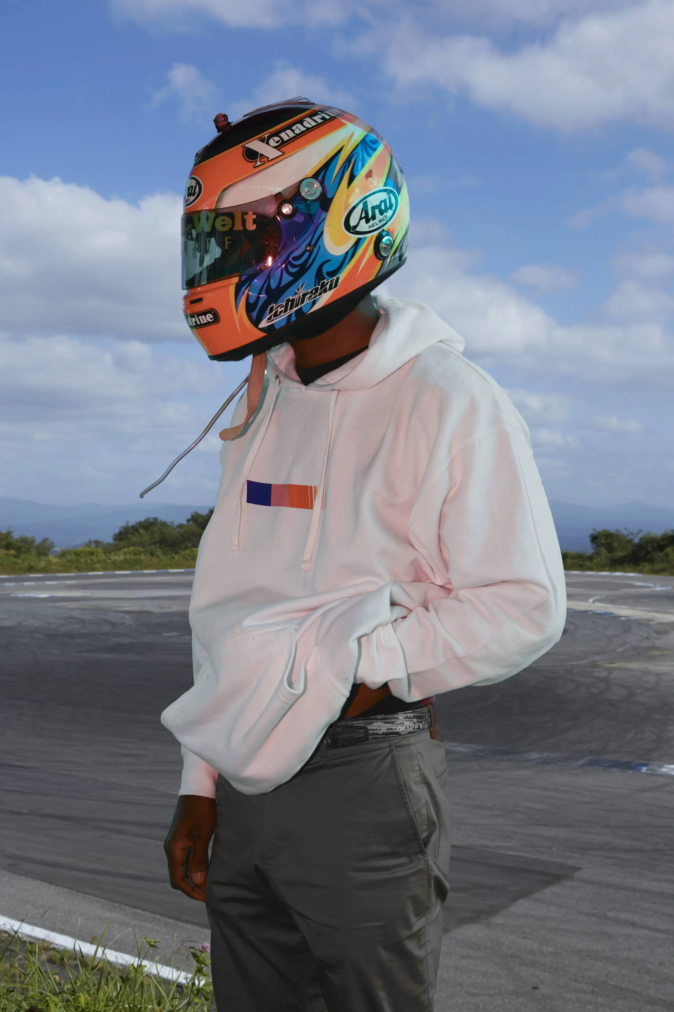
The original full-res photo of him looking to the side can still be found here as of me writing this, with all of the EXIF information intact.
Something I wasn’t able to find written down anywhere is which exact part of Ebisu the photo was taken on. Not that it would matter in any way, but I still wanted to figure it out. If you go through the Google Maps location for Ebisu Circuit you will eventually find this photo of what seems to be a Toyota Mark II, taken in 2017. That background sure looks familiar! There are seemingly not many flat locations at Ebisu from which you can look beyond trees/bushes into the distance.
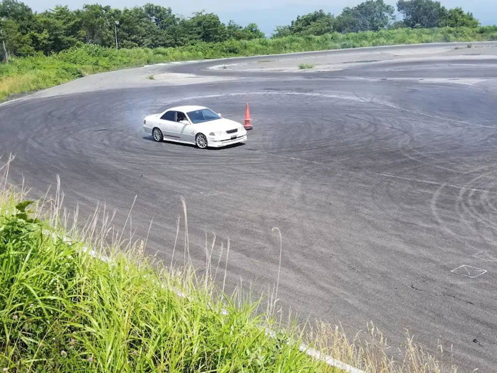
Time to consult a map!
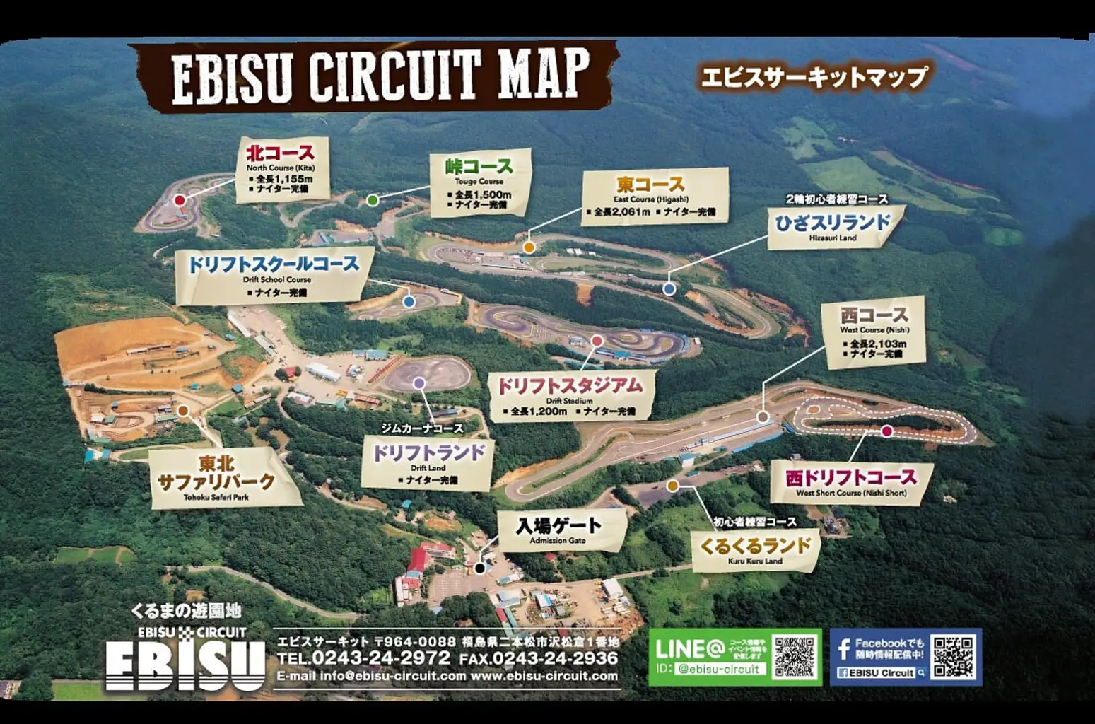
Aha, there we have it! It’s Drift Land!
(I shamelessly ripped the video from YouTube, you never know what might happen to 16 year old videos)
Here’s a POV from the other side. You can see the (albeit brown) grass patch him and the photographer were standing on.
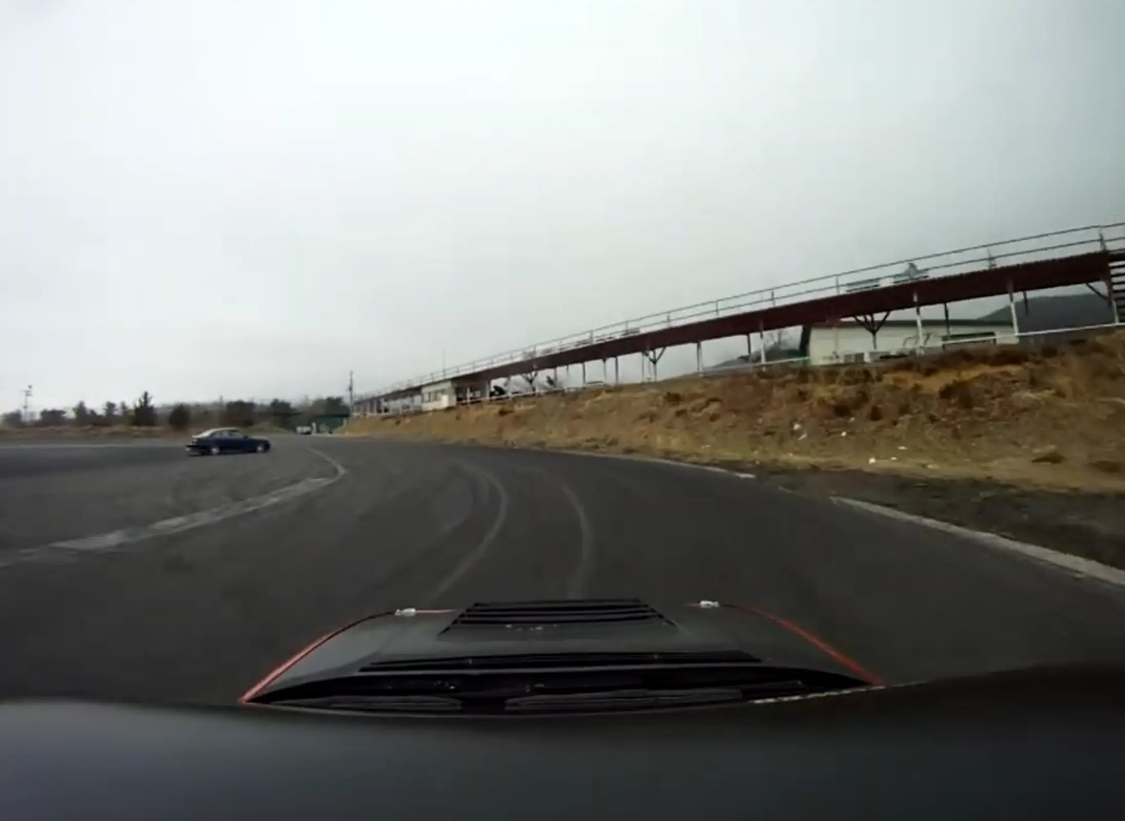
(From another ancient video - mirrored here)
Alright, moving on.
Just to get it out of the way: this reddit post, which states that the helmet shown in the photo is probably an Arai GP-6RC, is incorrect. Instead, it is one of the variations of the GP-5, most likely the GP-5K with HANS posts.
Here’s a comparison between the helmet worn by Frank Ocean, a GP-5 and a GP-6:
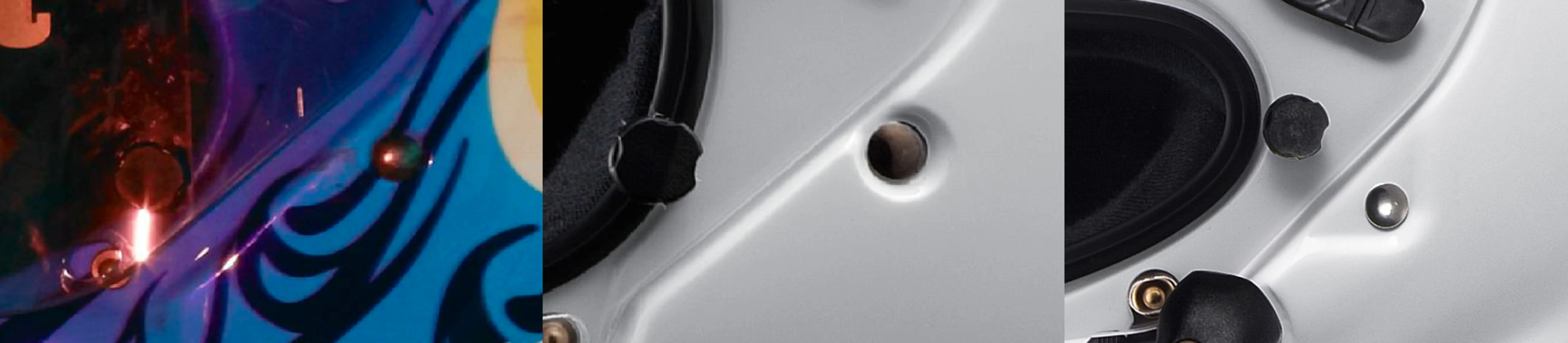
The outer part of the rivet which secures the inner straps to the helmet is located inside of a large indent on the GP-6. On the GP-5 series helmets it is merely inset slightly. The reason I specifically point this out is because the original design with the tribals doesn’t work out the same way if you need to account for that dent, which is a lot deeper than the photos online make it seem.
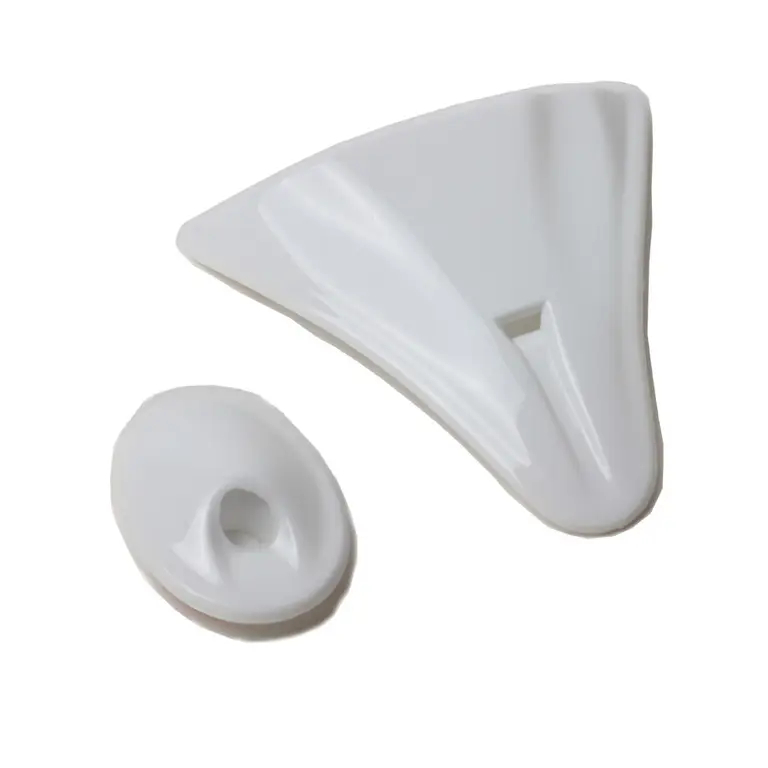
The front air duct on the helmet worn by Frank Ocean is much smaller than on the GP-6 and its position differs as well. The GP-6RC has multiple ducts in the front. A look at the replacement parts list also confirms it: the GP-5 ducts are being sold as a set of three front ducts and one rear duct, which matches no configuration of the GP-6. The GP-5K ducts are a set of two, a tear-shaped front duct and a rear duct:
The cutout for the shield lock release lever (that’s what they call it in the manual for the GP-6) is also different. It is far more round on the GP-5 than the GP-6. That deep indent there doesn’t exist on the older model and the lever is completely missing on Frank’s helmet!
Here is a photo of a GP-5K with HANS posts (taken from this post in a facebook group about racing car helmets):
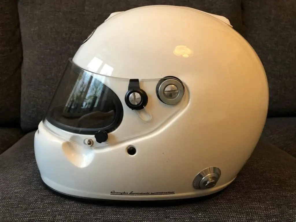
I don’t fault the author of the reddit post for this. I myself only noticed it after I had bought my helmet and was a couple hours deep into the design process. If you’re not pixel peeping, you’re not going to see those minor details. Not to mention that 99.9% of people who saw that post probably thought “oh wow that’s expensive, ouch”, and moved on with their life.
Finding reference images beyond those initial few from the Frank Ocean photoshoot turned out to be difficult.
It should be noted that the design of the helmet has changed in various ways over the years. Here are some of the photos I was able to find. On one there’s a rockstar logo, then there’s the DIXCEL logo, the Advan logo, on several of these you can see the old “Ichiraku” logo as well as the flames without white outlines.
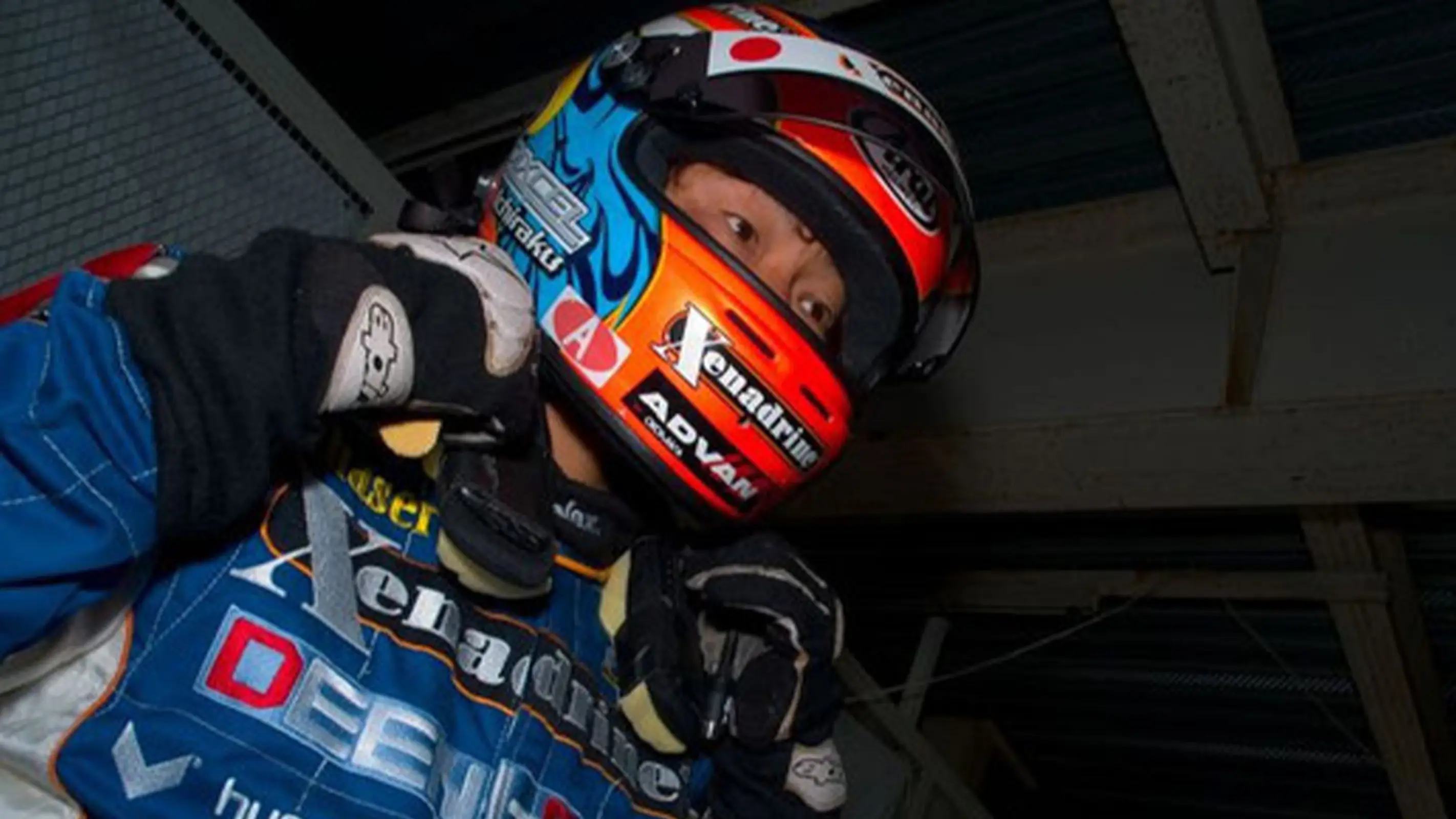
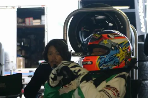
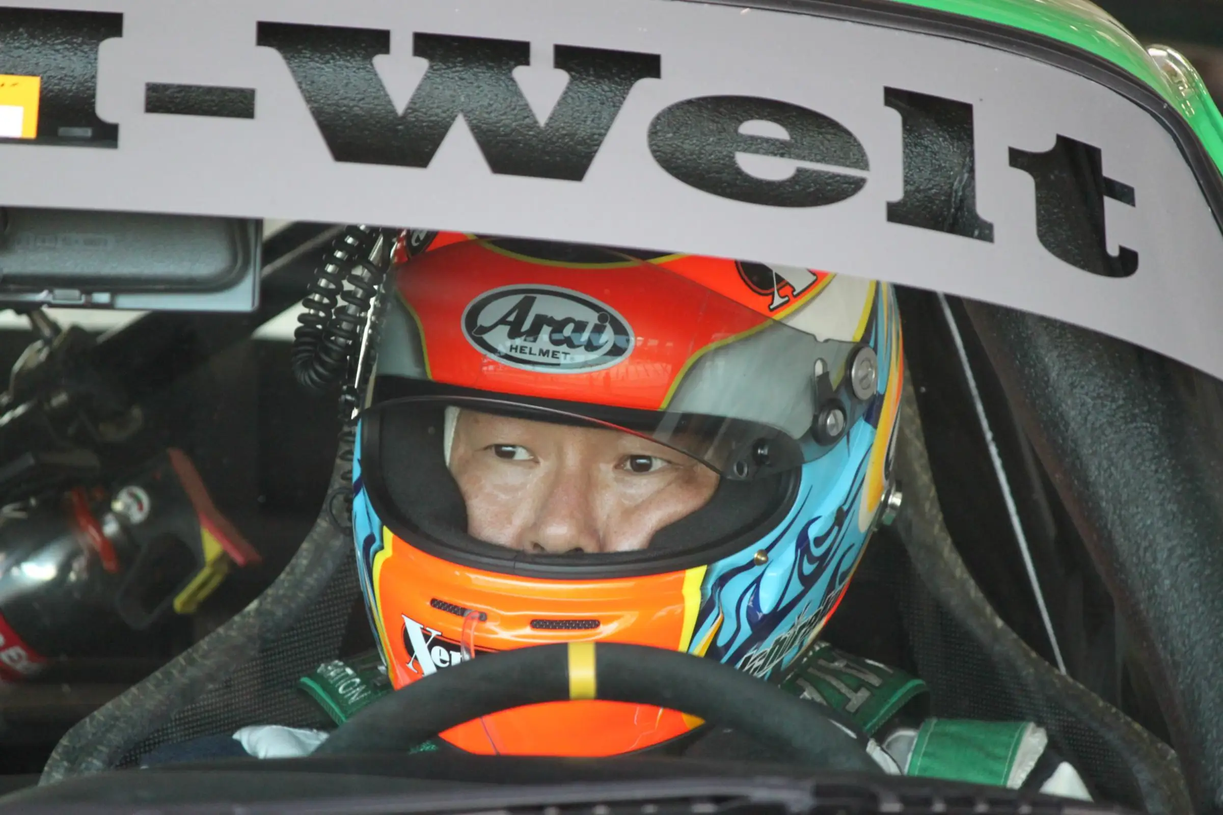
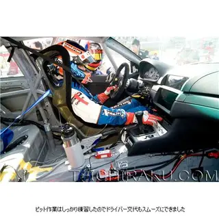
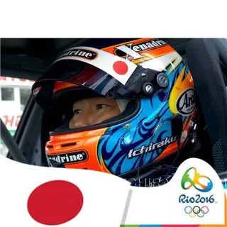
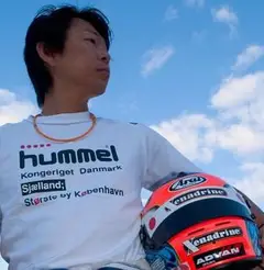
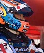
I also emailed Ichiraku himself in an attempt to get my hands on more photos, but he did not respond. It was worth a shot at least.
I’m not the first to recreate the design, which should come as no surprise to anyone. Here’s are two designs made by users in Gran Turismo Sport, captured when the game was still live (thank you for the video, Anansi!)
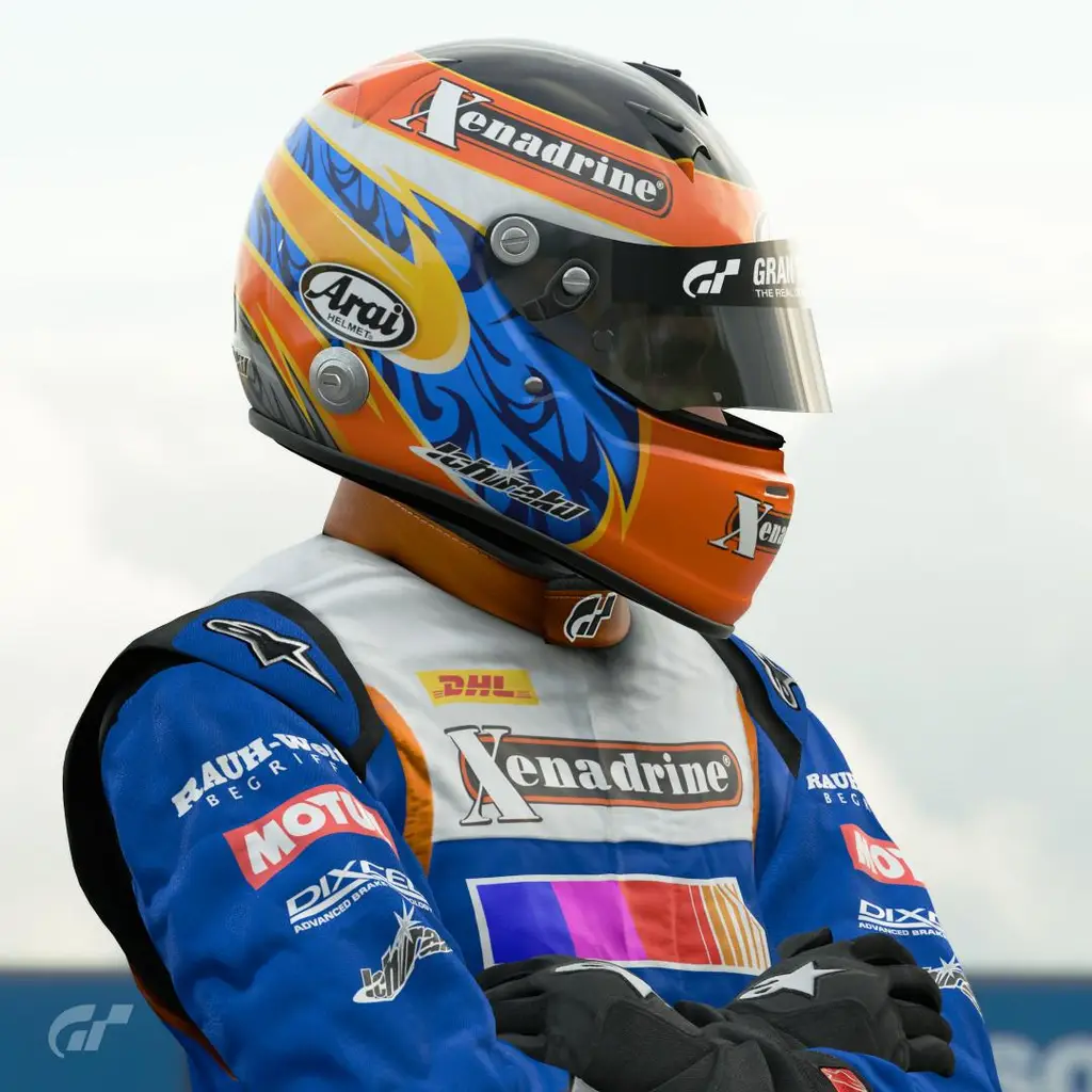
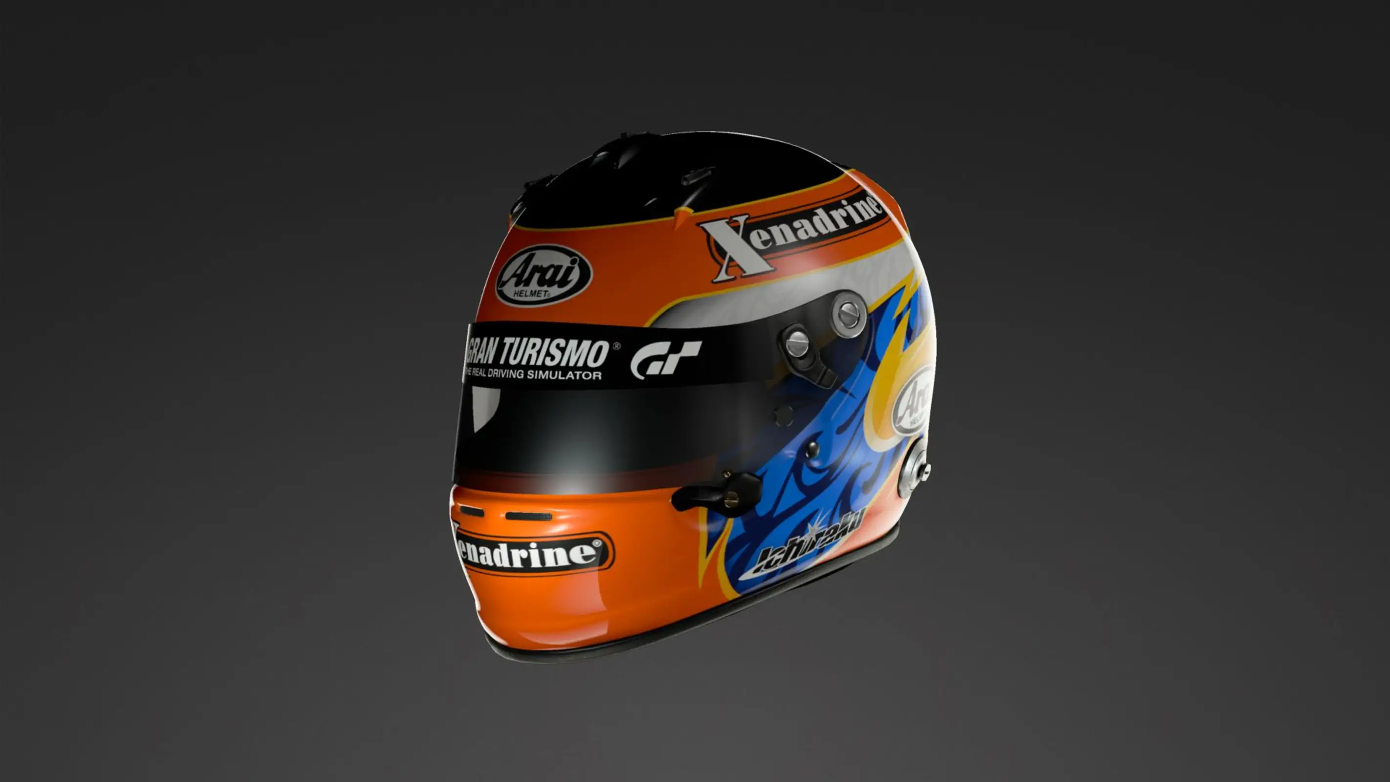
Now someone might say “but those are two different helmets, look at the logos” and you would be correct, but the front of the helmet in the original photos from the Ebisu shoot had plenty of detail and I really only wanted to know what they had done on the back. I had yet to see the back of the helmet anywhere so that was left up to my imagination.
Also note the gray paney at the bottom. This is incorrect and was most likely caused by the user referencing the color-corrected image of the side view from the photoshoot, which I included further up. If you pull the photo into photoshop and simply set the white balance to account for the red hue, then the blue parts of the helmet shift to grey the more light hits them. I cannot fault the GT user or the original photoshopper here, up until recently there were no good photos showing the side/back of the helmet, but I will get to that later.
Going straight to the source, here is a video Ichiraku himself posted to Instagram:
It shows a design element which I chose NOT to incorporate into my recreation. If you look closely, you can see that the Ichiraku logo on the right (from the wearer’s perspective) side of the helmet is mirrored, but none of the other logos are. And since we’ve already thrown the notion of a 100% accurate remake out of the window by starting with the wrong model helmet, I’m not going to flip the logo.
When I went out looking for a GP-6S to buy, eBay was the first place I checked. Other online retailers had some for sale, but all with the helmet at its original retail price of around 900 Euros. Nope. Turns out any helmet on eBay worth considering is being shipped from either the UK or Japan, both of which would royally screw me over when it comes to import taxes considering that they’re listed for 600+. Not ideal.
Through a giant stroke of luck I then found a helmet elsewhere for less than half that! It wasn’t new, but wasn’t in terrible condition either. I asked the seller where the helmet was from and was told that up until recently it was being used by a NASCAR Whelen Euro Series team, DF1 Racing. When their team captain passed away in April of 2022 at the age of 69, the team was dissolved and some items got put up for sale. It came with a transport bag and an extra visor too!
Arai sells bags with replacement parts for the GP-6 series helmets, which was perfect because mine was missing a screw.
While the helmet came with a visor already attached, I did pick up a basically brand new original Arai one. It is slightly darkened to match Ichiraku’s helmet. Hard to judge things like that based on product photos alone, but I didn’t think about that too much when I pressed the ‘buy’ button.
I then bought a sticker pack from this site (or rather, what used to be there). The listing showed a golden sticker, which wasn’t actually for sale. That particular sticker would’ve been what I needed. But while the others may not have the right color, they definitely had the correct size. Re-making one won’t be too difficult. More on that later.
Now it was time to finally sit down and come to the realization that I had overestimated my skills, but only ever so slightly.
The stickers were the easiest part honestly. There are only three different ones present on the helmet at the time of the photoshoot:
the Arai logo
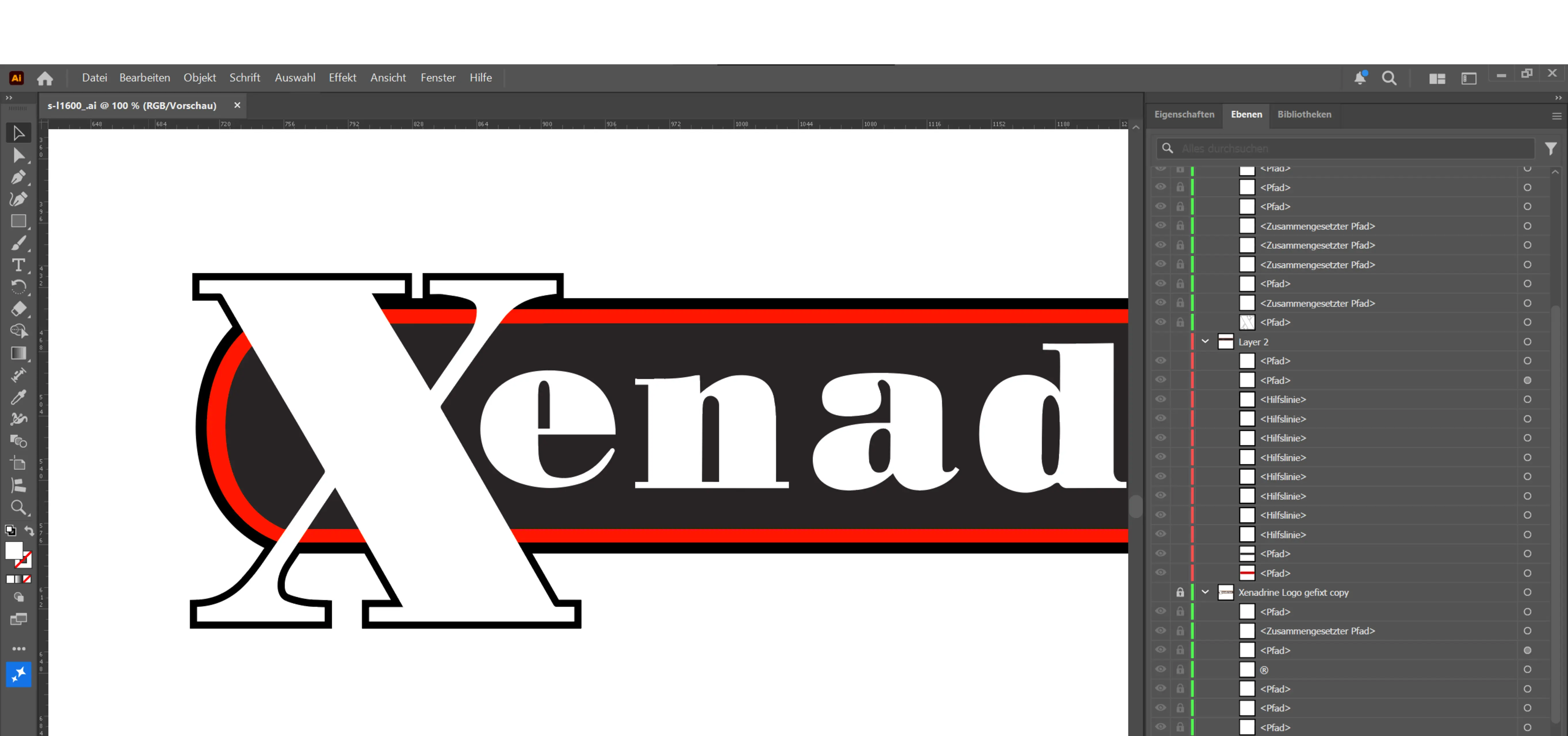
the Xenadrine logo
Ichiraku’s own logo
This one was basically handed to me on a silver platter. You can find SVGs of it online. Copy, paste, done.
The logo on the helmet isn’t actually their current logo, but rather an older version of it. They don’t provide any of their older assets anywhere so I did a bit of digging.
The highest resolution version of their old logo could be found as part of an eBay listing for a shirt.
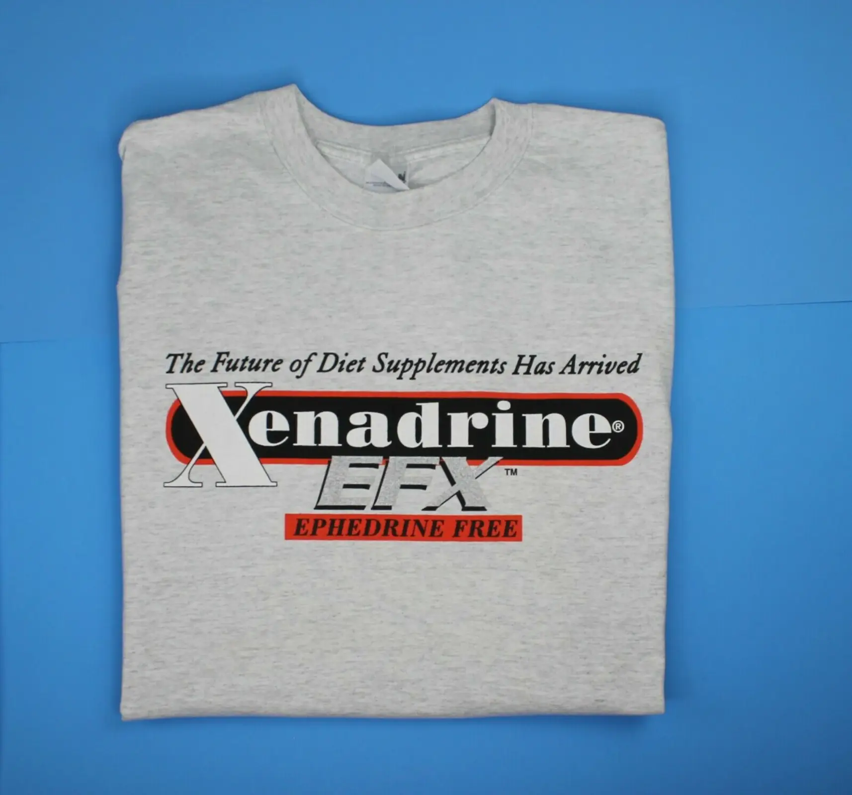
My recreation of the shirt logo ended up looking something like this:
The font itself is based on a variant of Bodoni. I just picked one of the first options that WhatTheFont gave me and ran with it. Bodoni Poster I think it was. Made some small adjustments here and there.
The logo present on the helmet has the registered trademark symbol (®) placed above the center line instead of what’s present on the shirt. That’s an easy adjustment. Moving on.
After spending a little too much time tracing the logo from the photos it occurred to me that it would probably be much easier to just straighten out the text and then try to recreate it.
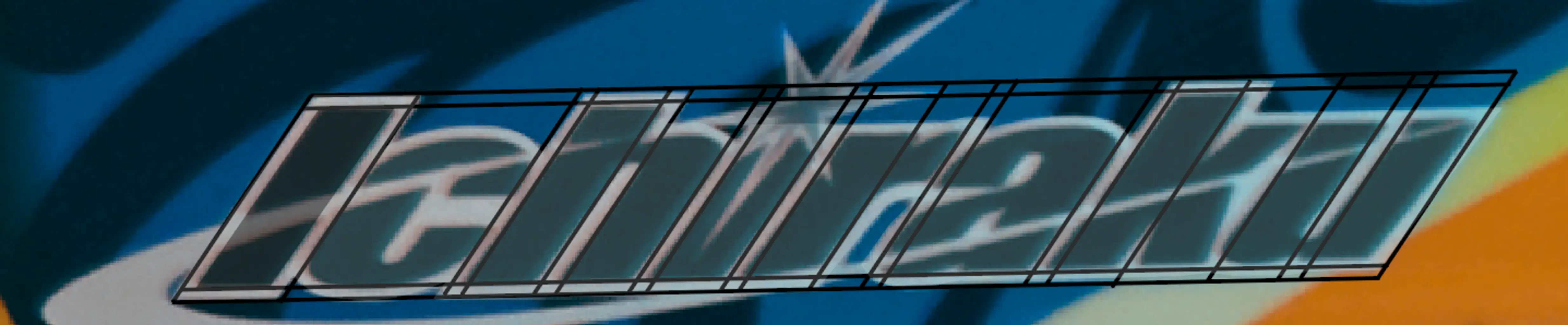
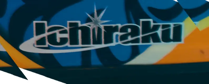
The font used here turns out to be Impact Wide. Can’t believe I would ever pay for a font but here we are.
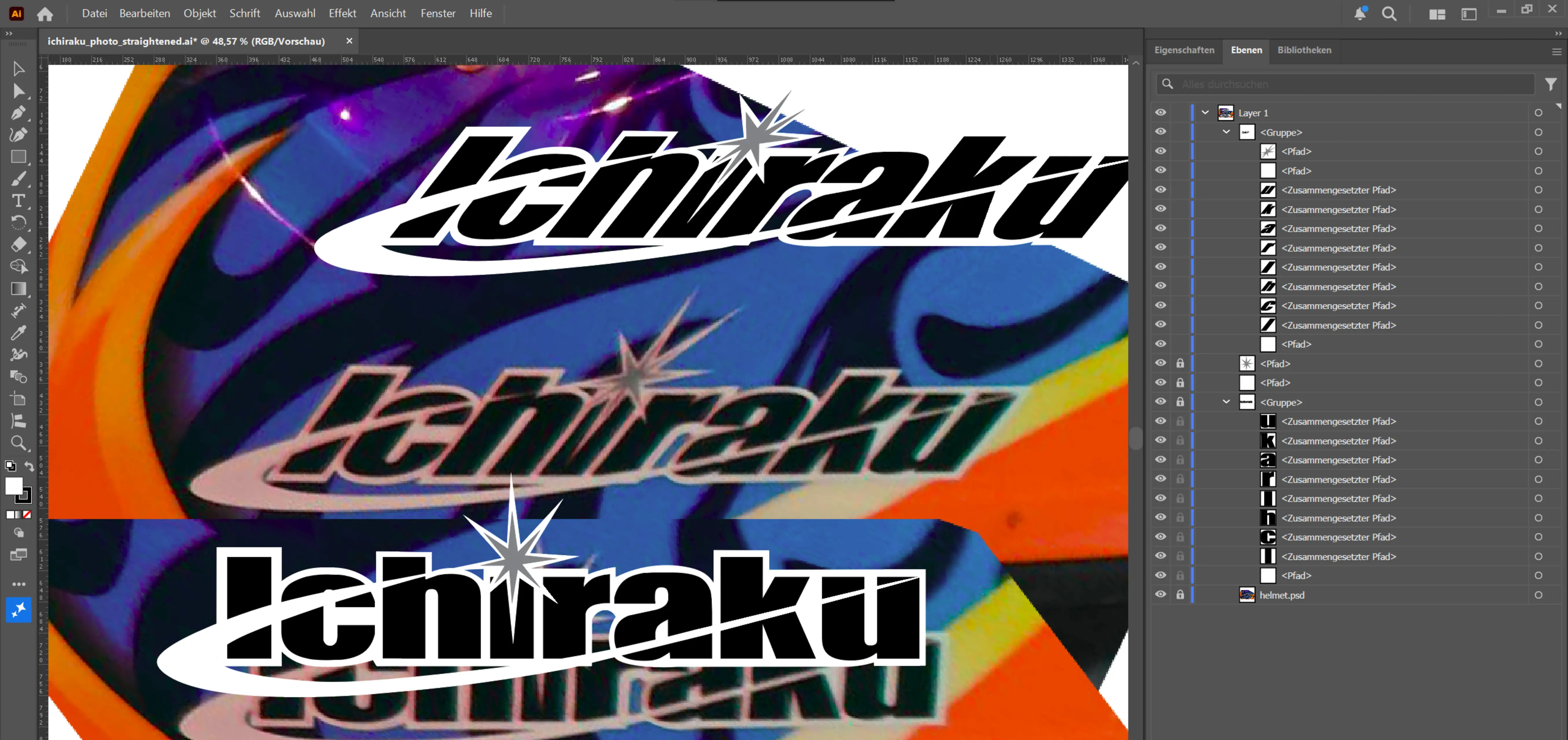
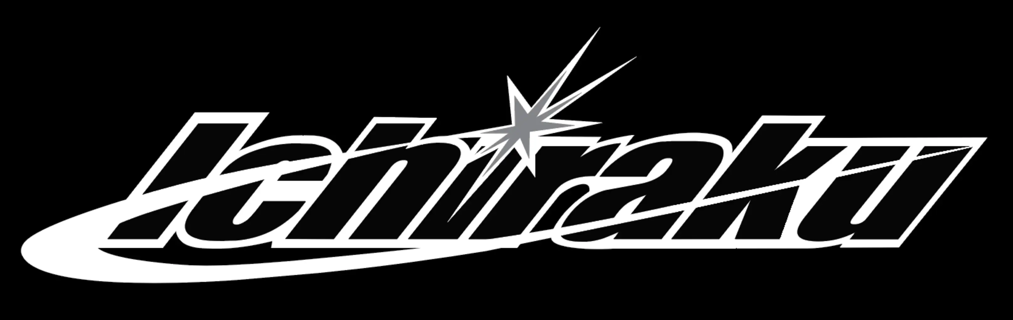
Close enough I’d say.
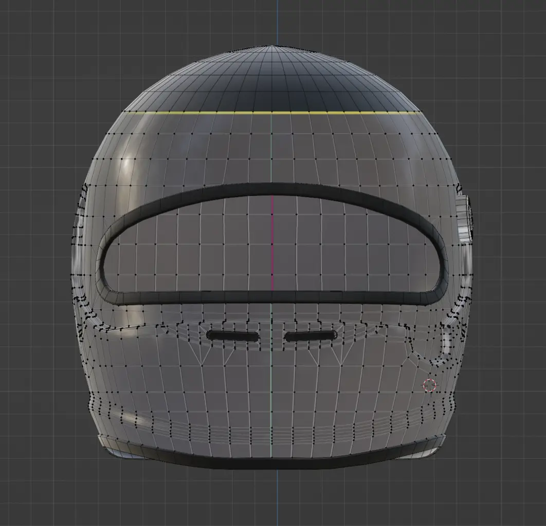
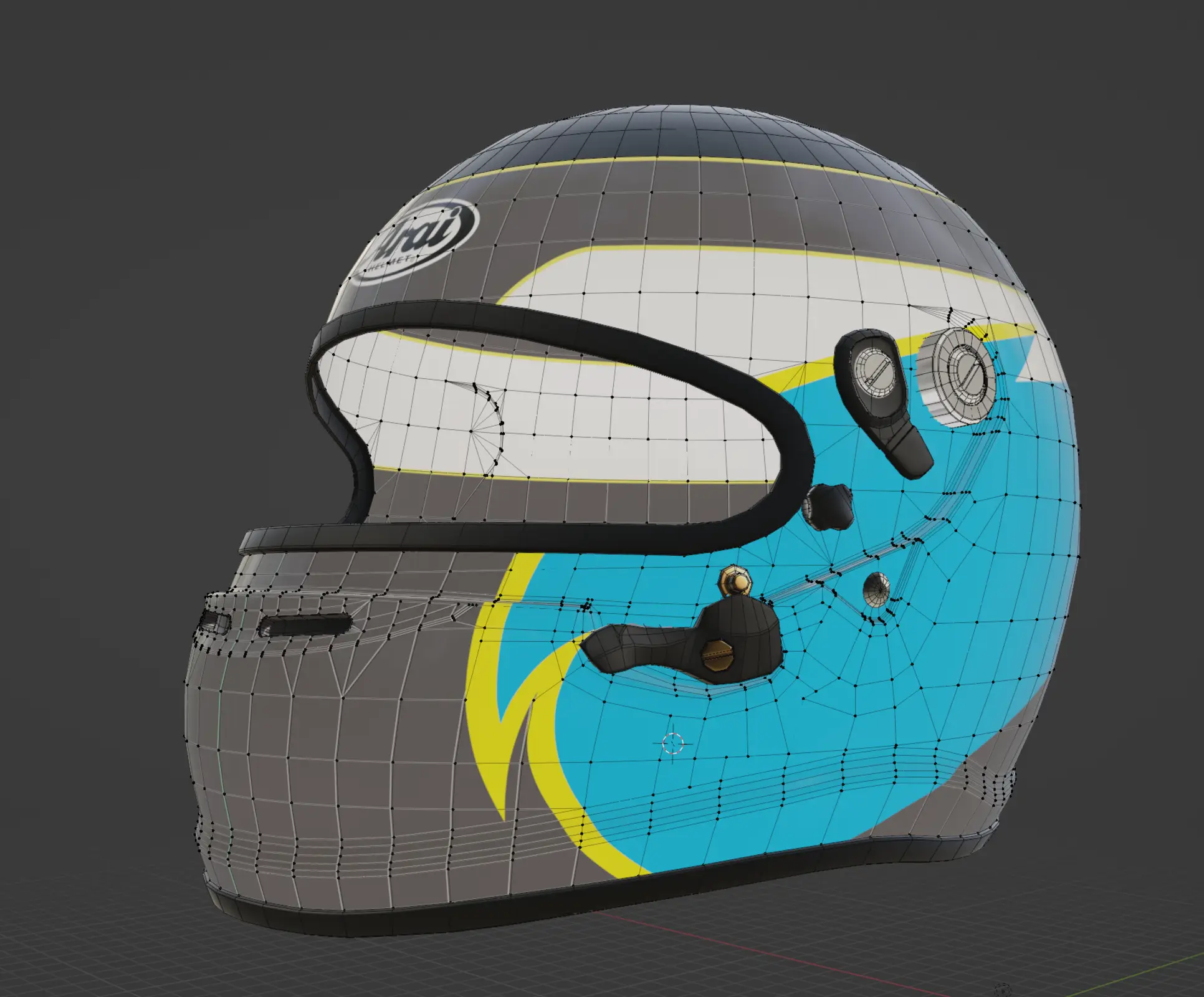
I bought the base model for the helmet from cgtrader and removed all the excess objects I knew I did not need to account for. All that was left was for me to create a mapped texture in Illustrator.
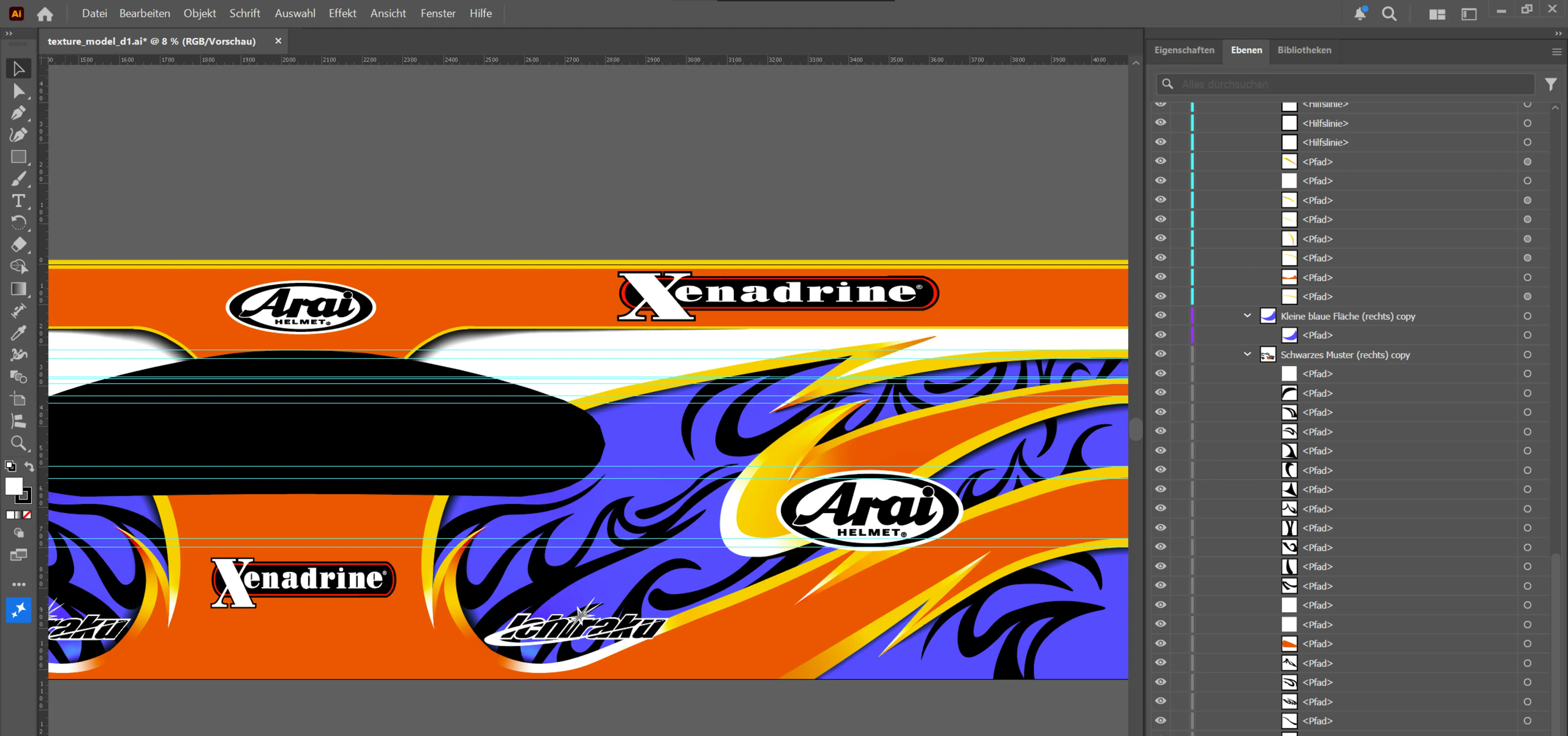
I took a few screenshots throughout the process of what said mapped texture looked like in Blender.
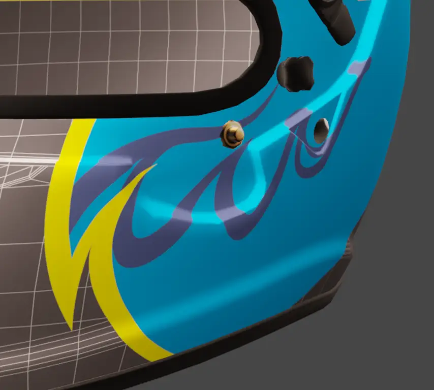
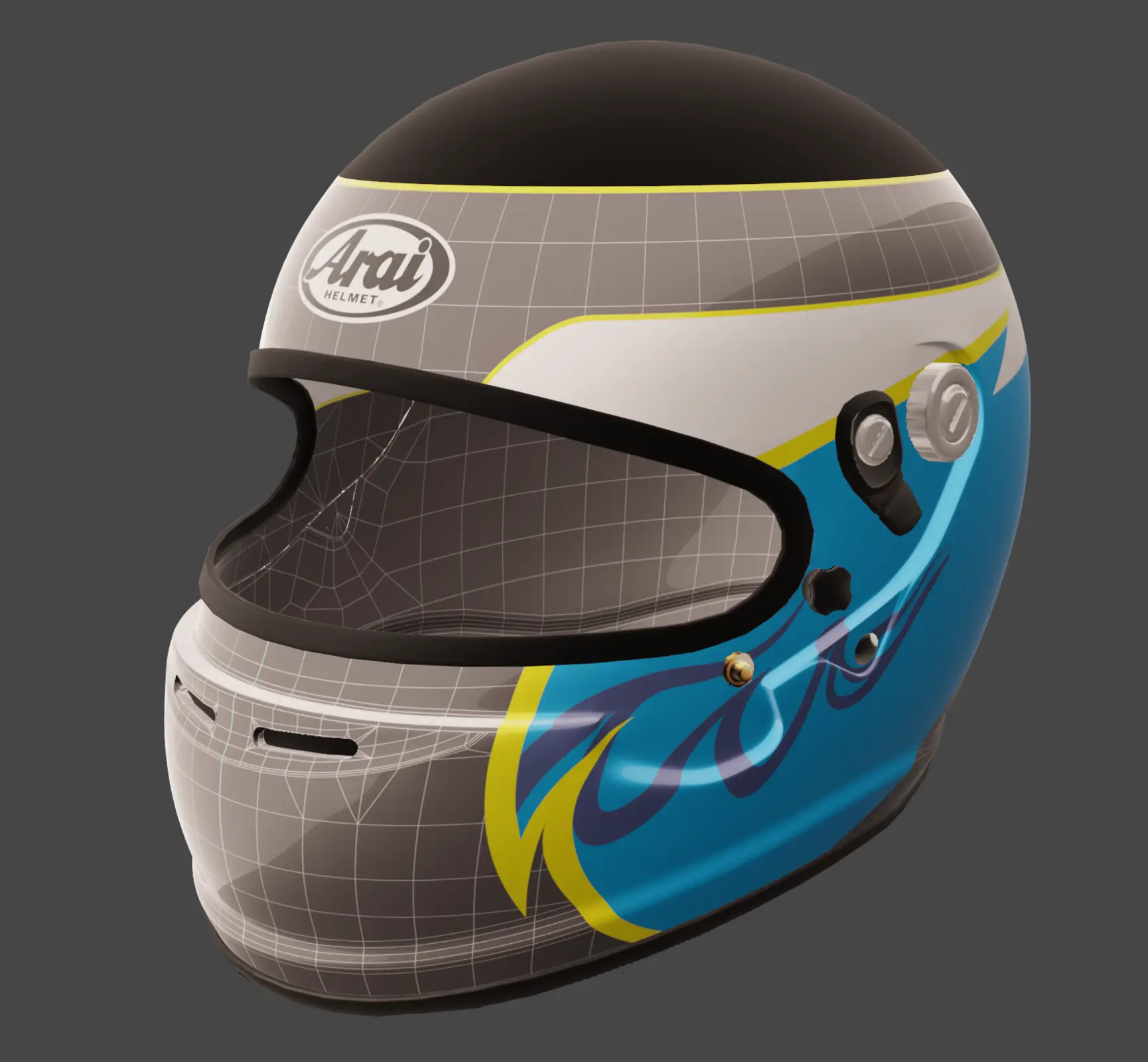
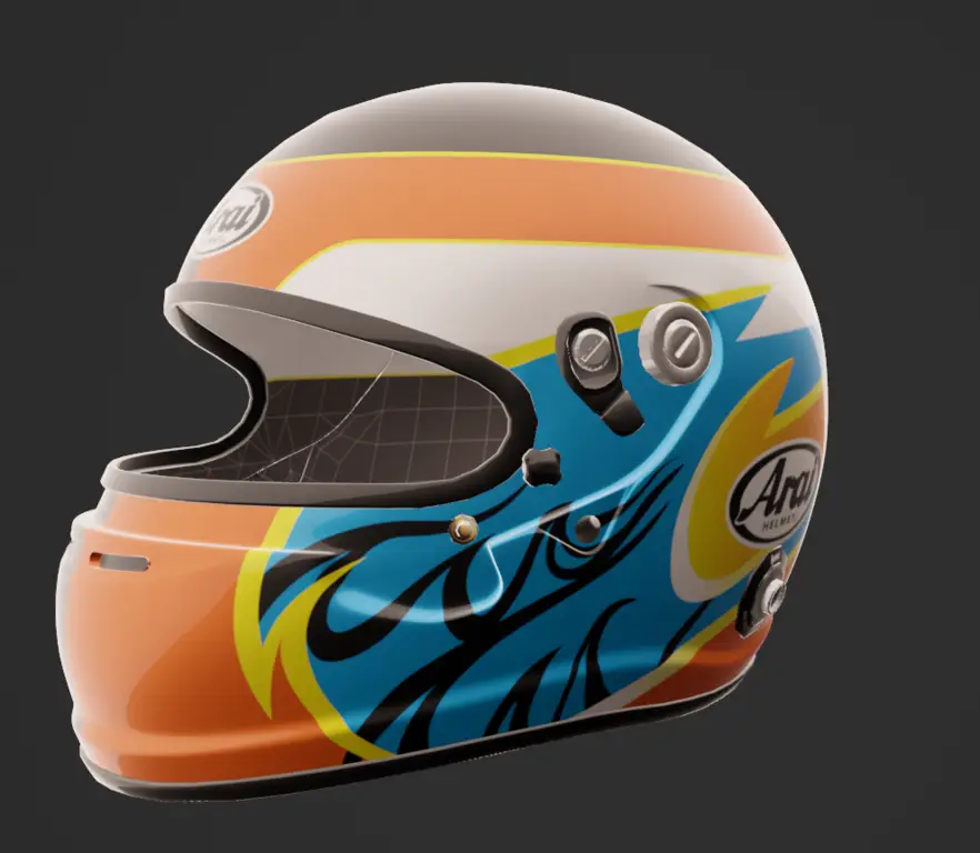
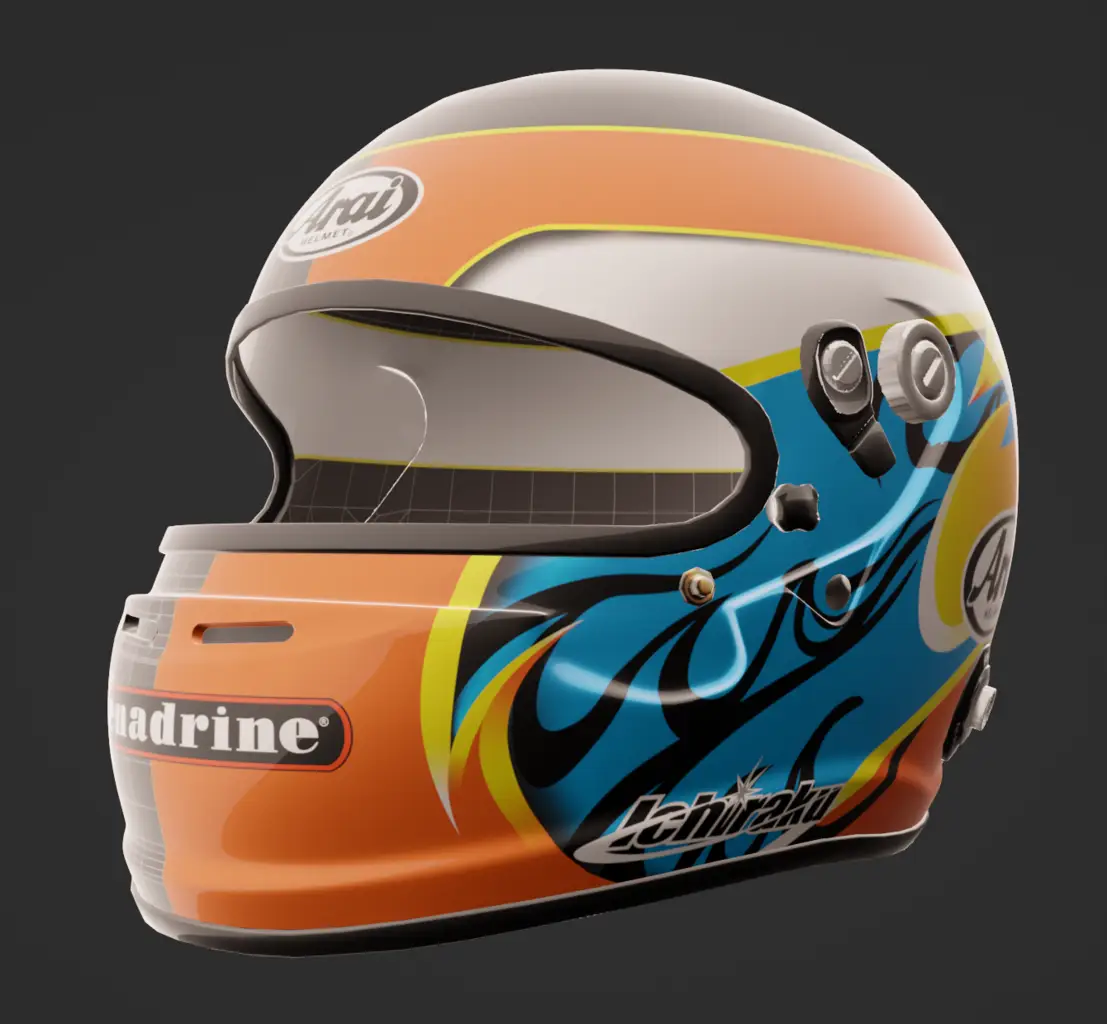
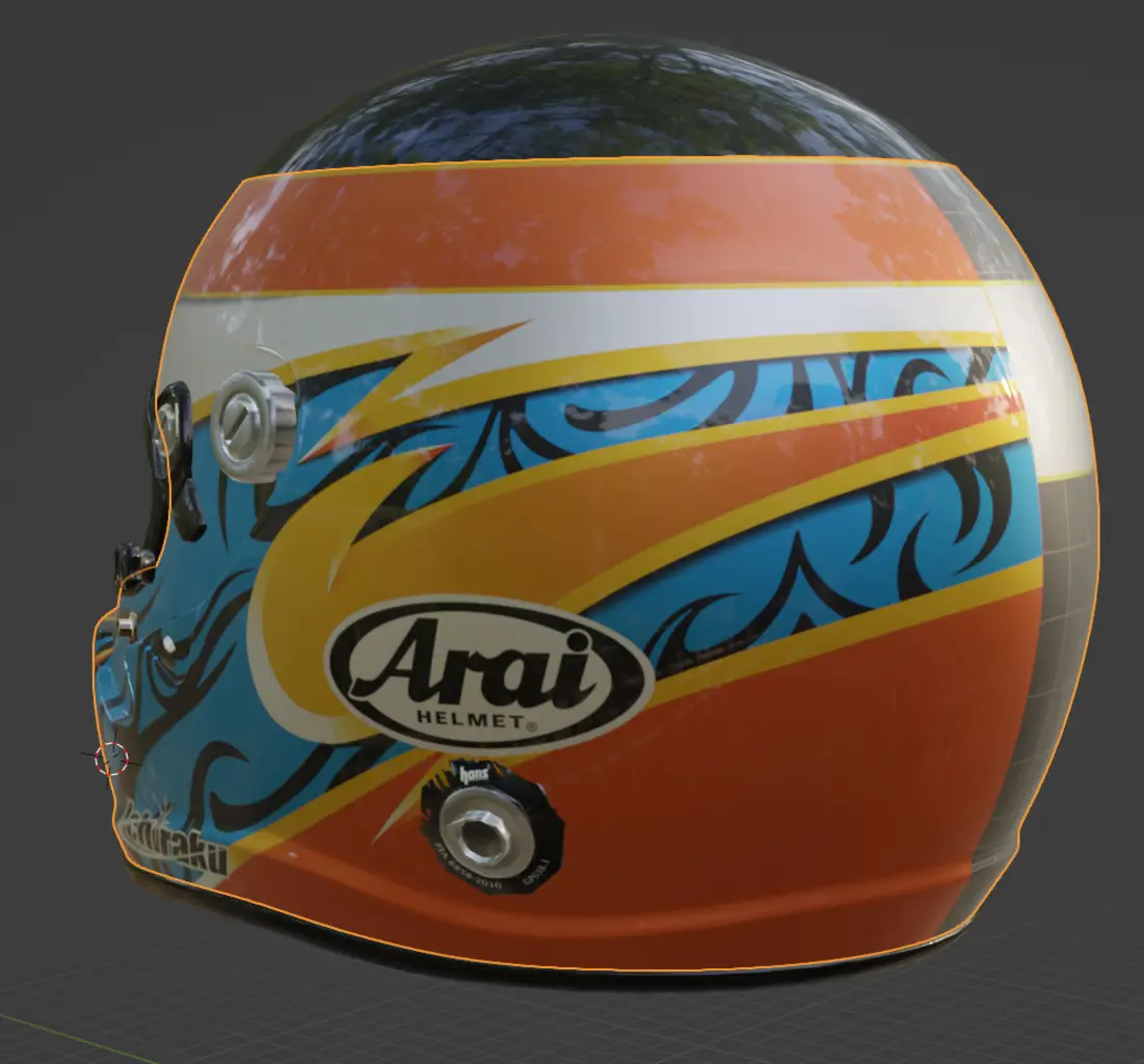
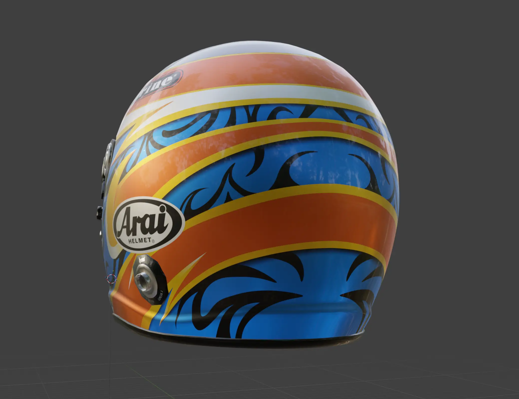
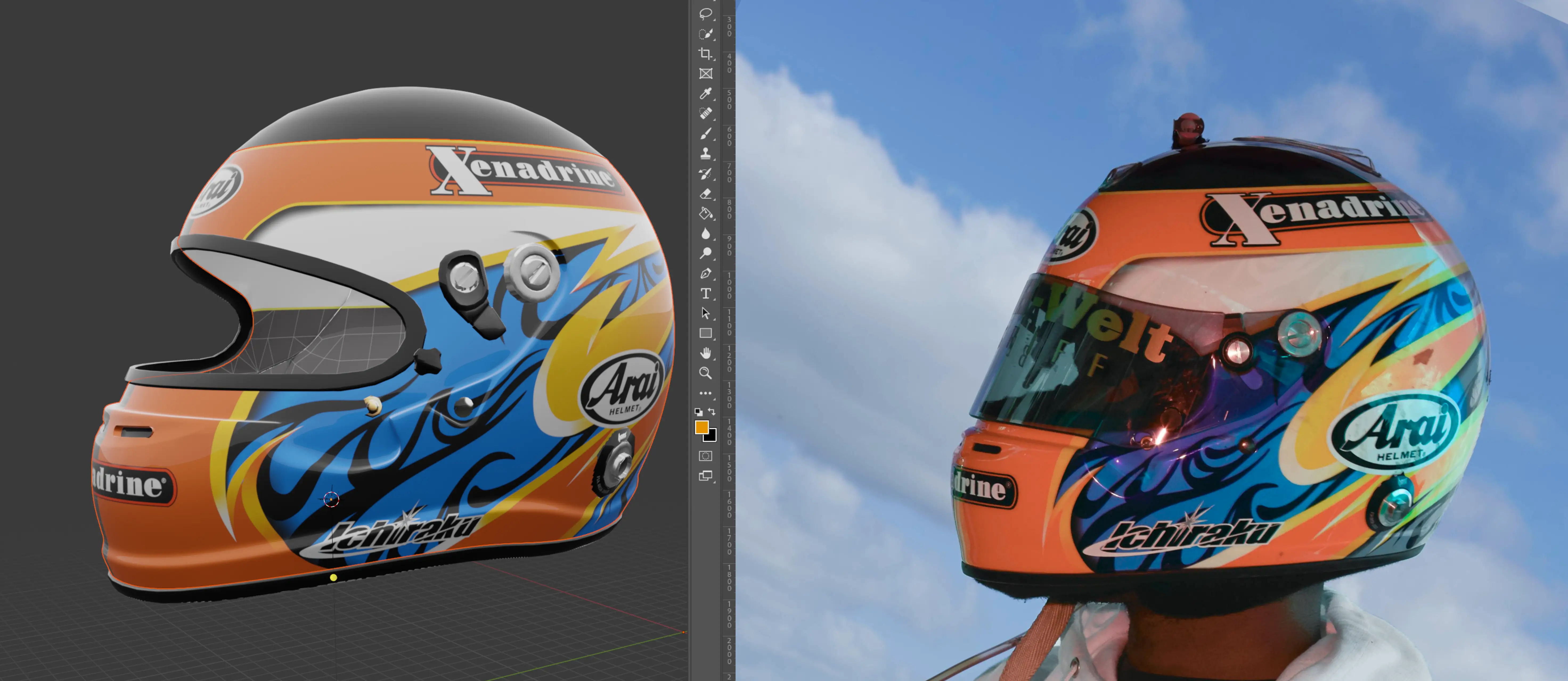
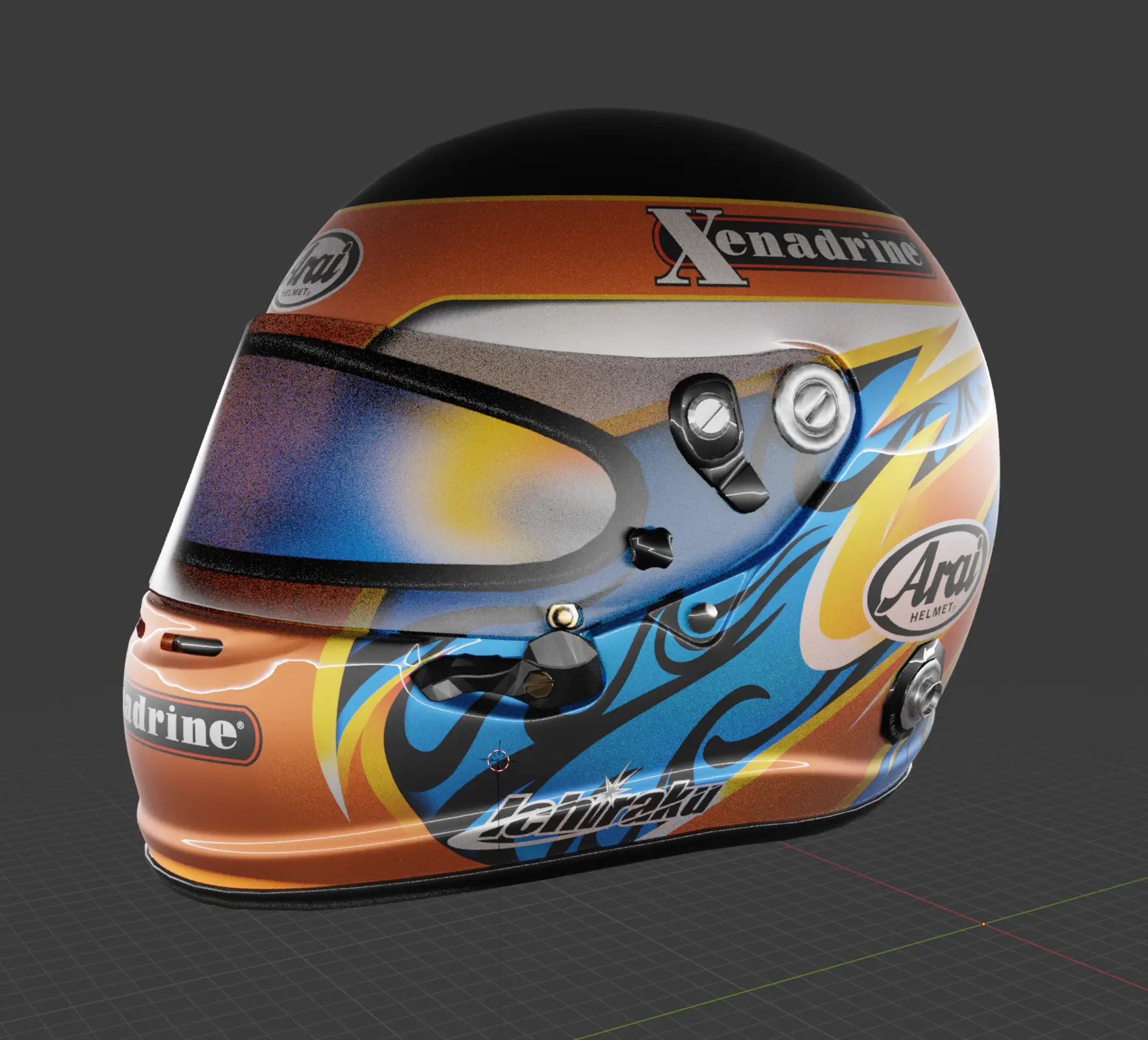
Initially my plan for this helmet was to have someone wrap it in vinyl foil.
I sent out emails to various shops detailing my plans. I got a bunch of responses ranging from “sorry we’re booked out for the next couple of months” to “we don’t do gradients” to “we can do this but only with severe alterations”. Every quote I got was above 800€. I’m not spending that much money only for them to disregard parts of the design.
Airbrush commissions don’t look much better either. The quotes I could find for custom designs were north of 1200€ and looking at this design it might even be more. I’ll be honest, this time around I didn’t even wanna send out emails lol
So, naturally, the conclusion I came to was to try and do it myself. Oh what an idiotic decision.
Let’s do this.
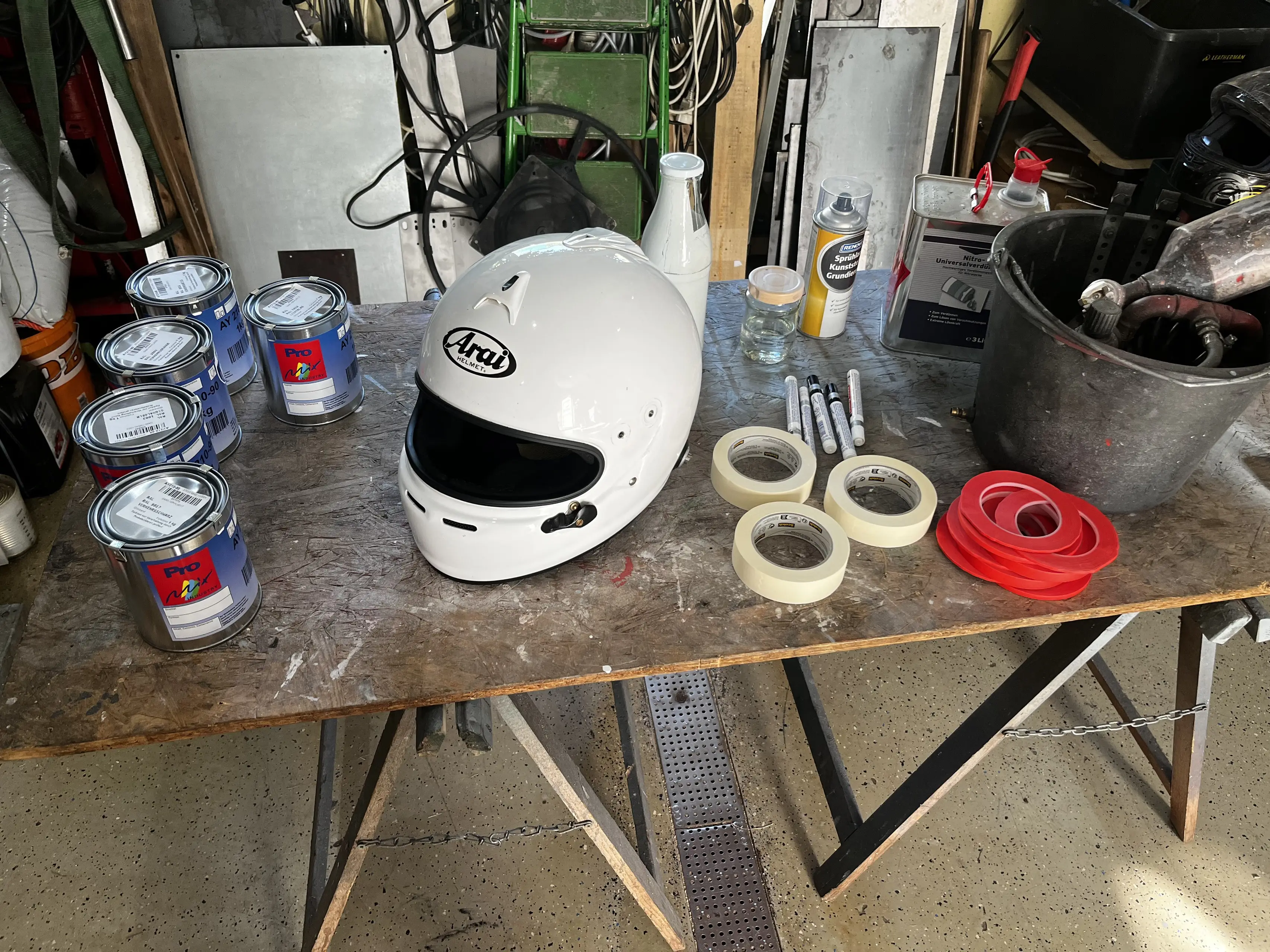
First off, some notes about the disassembly.
If you’ve watched any of the tutorials online on how to disassemble an Arai helmet and you saw people take the chin pads out by unclipping them, be aware that this does NOT apply to the GP-6S.
The only part on the inside that can be removed without any issues is the pad at the top.
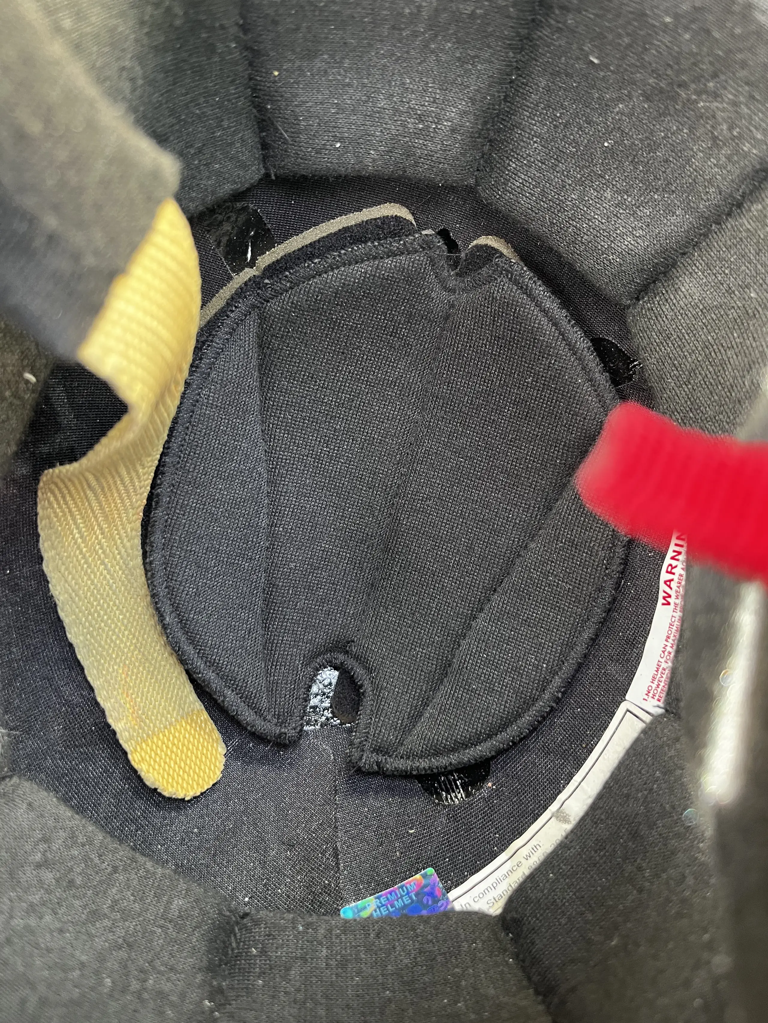
Everything else is glued into place. The chin pads, the cloth right in front of said pads and the grills.
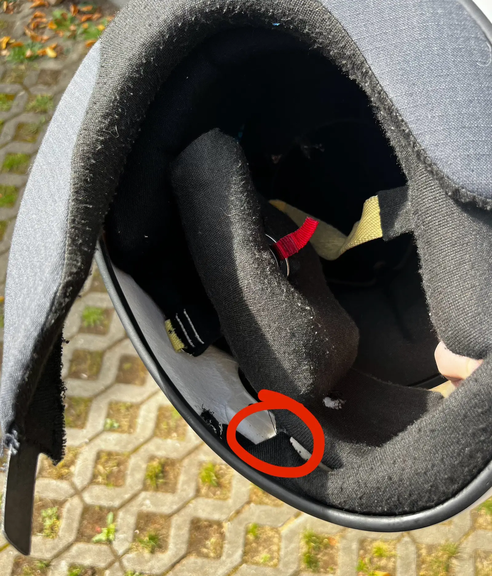
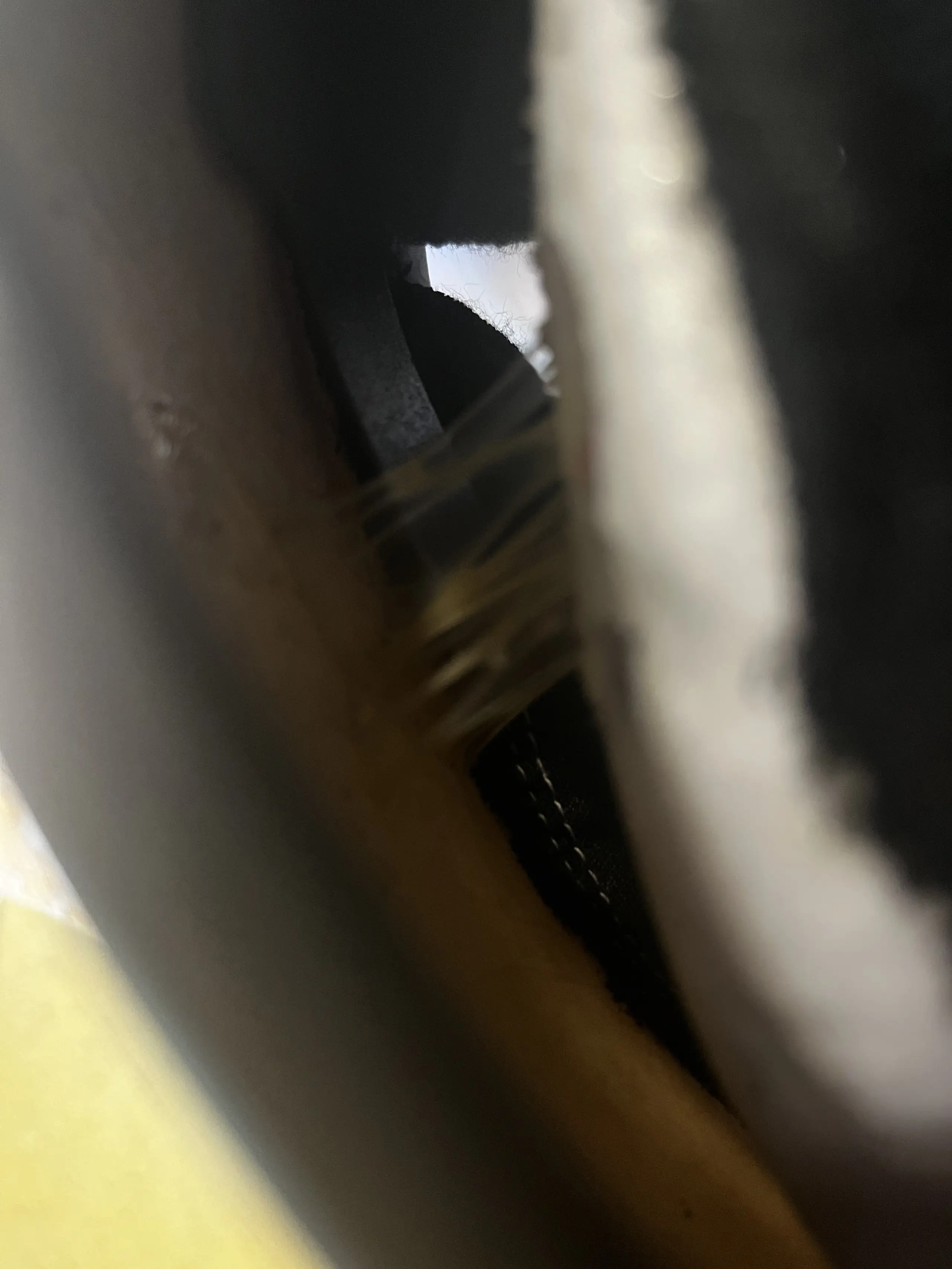
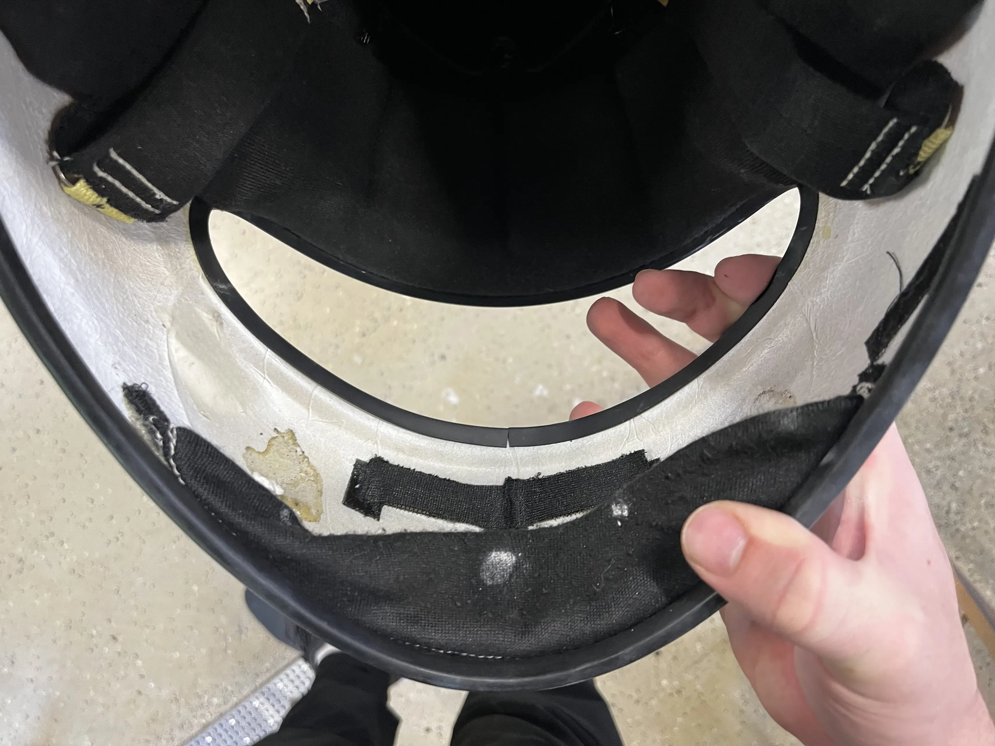
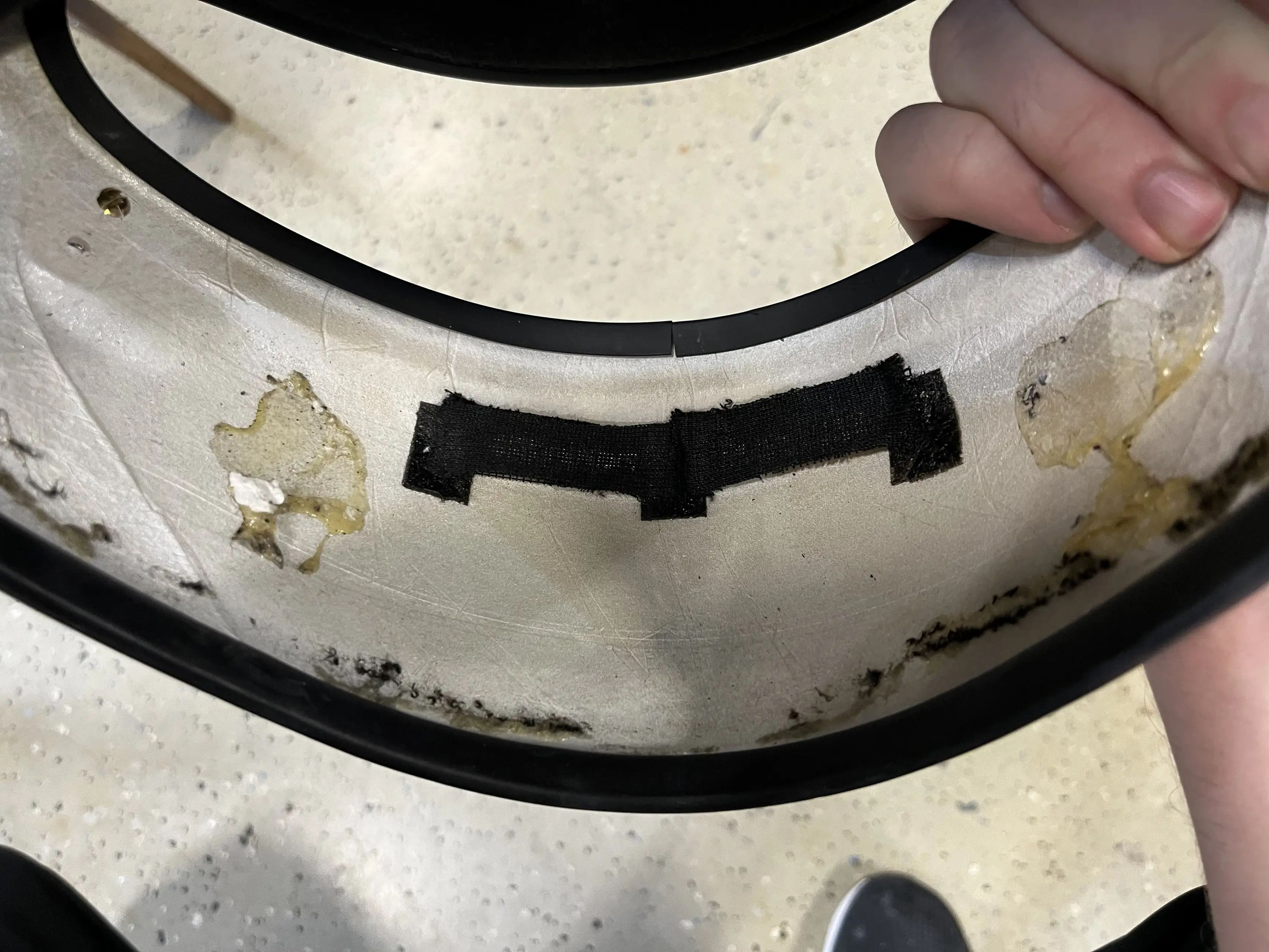
I did also decide to remove the rubber pieces that cover the edges of the helmet and visor. You can lift the rubber flaps on the inside of the helmet and carefully pry them off using something like a tiny flathead screwdriver. The one around the visor will most likely tear once you get to the top part of the edge, as it is fitted below the padding and secured with glue. If you want avoid tearing the rubber at all costs, remove the padding on the inside first.
This took forever… What took even longer was removing the residue to get it ready for painting… This is what an hour of scraping away using a razor blade will get you. Acetone barely does anything. In the end I resorted to sanding for what must have been two hours lol
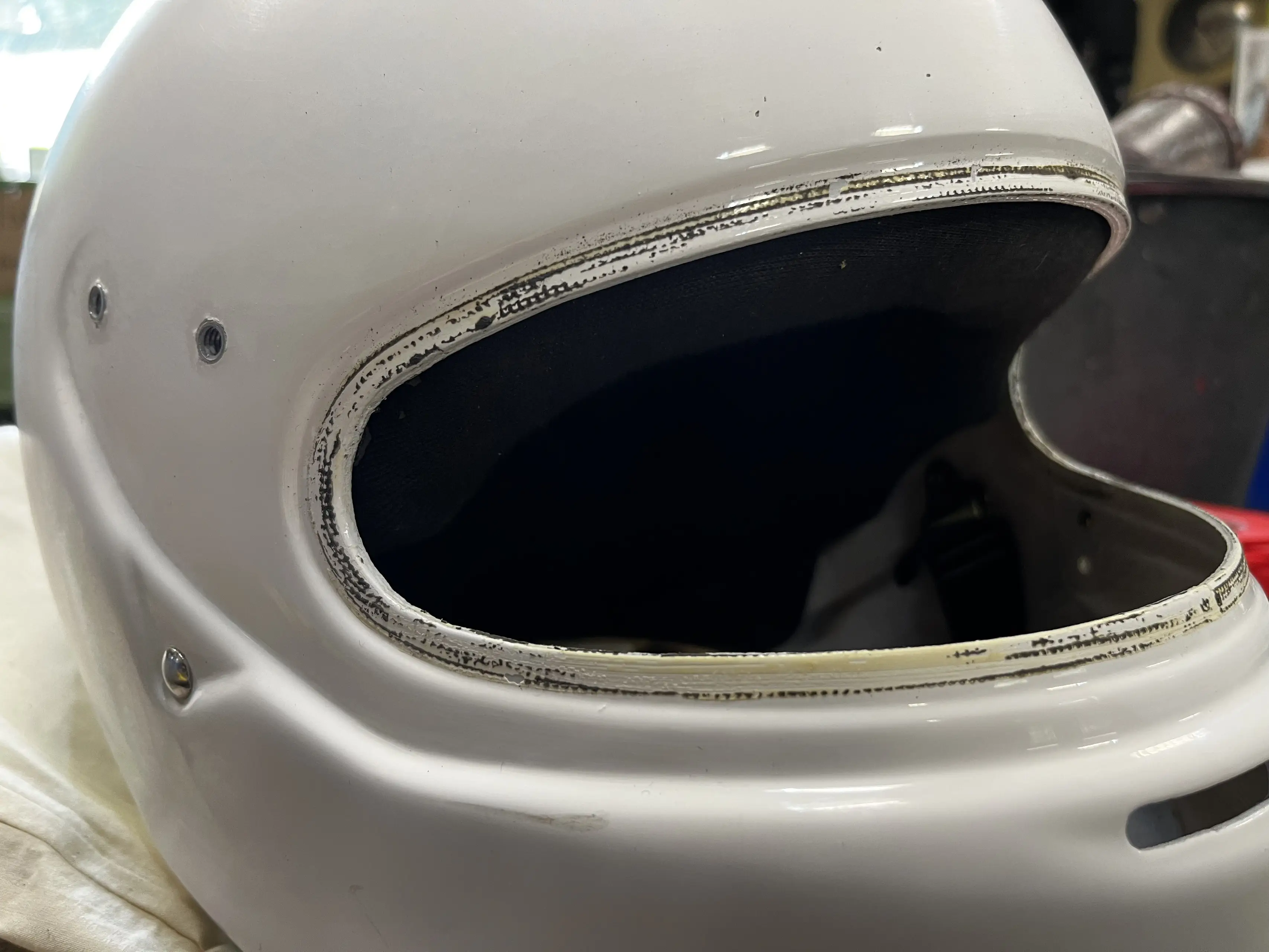
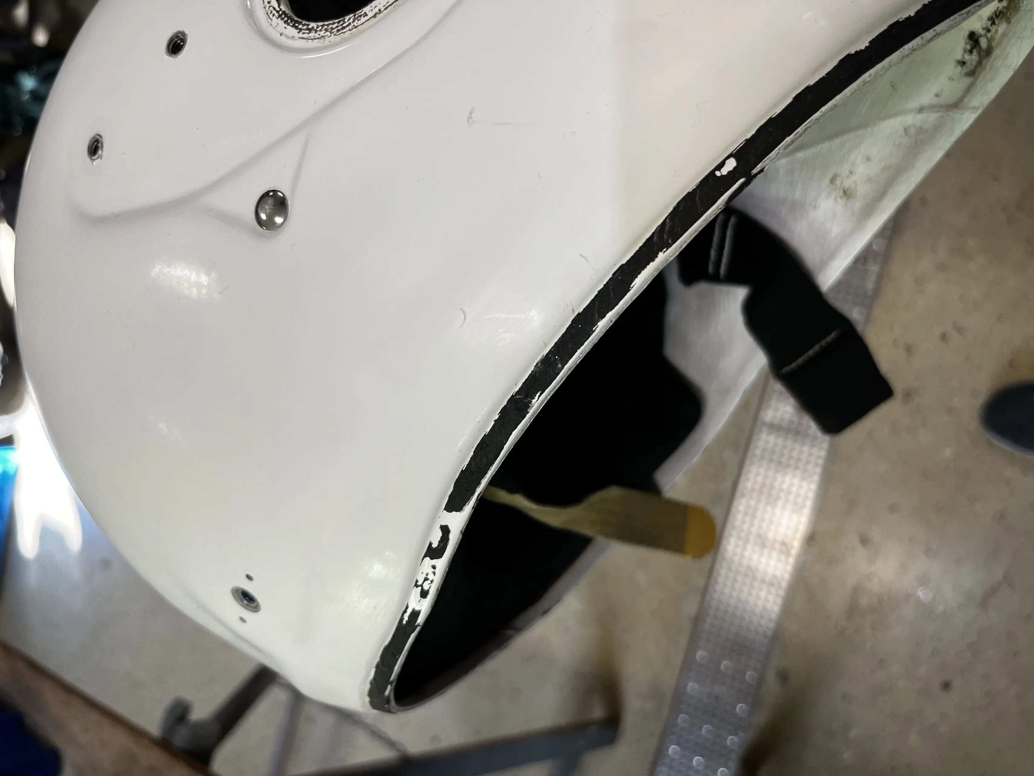
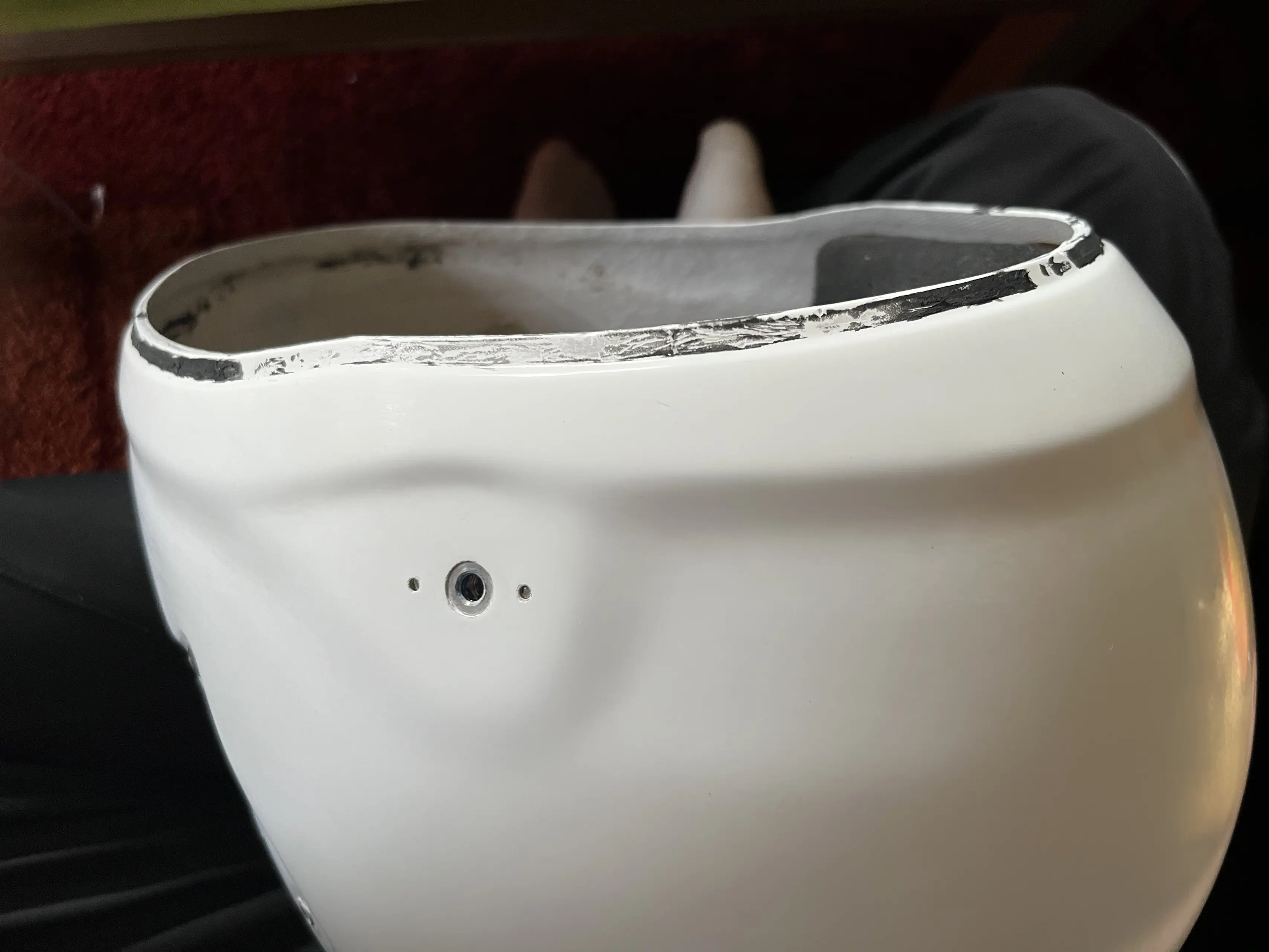
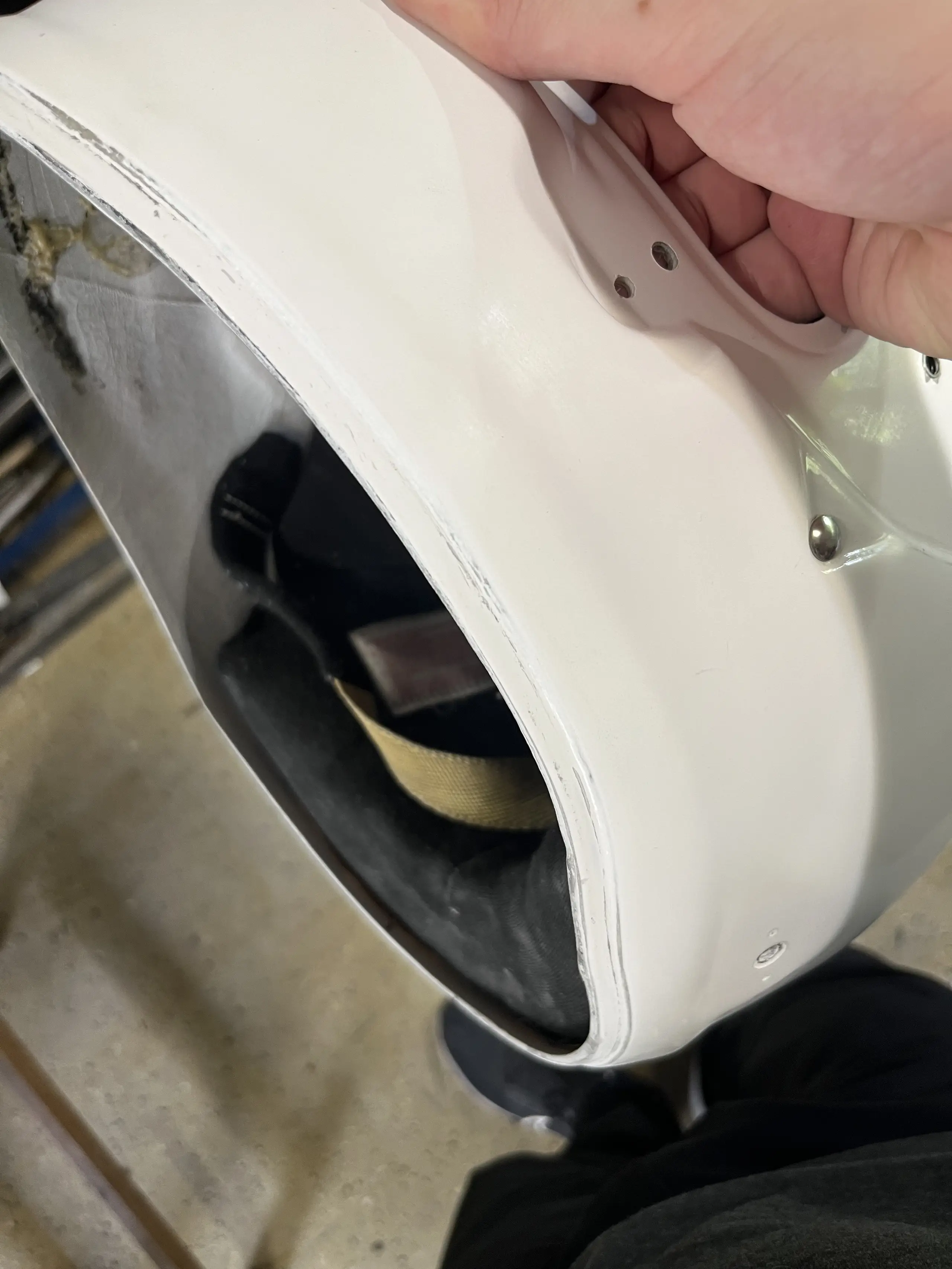
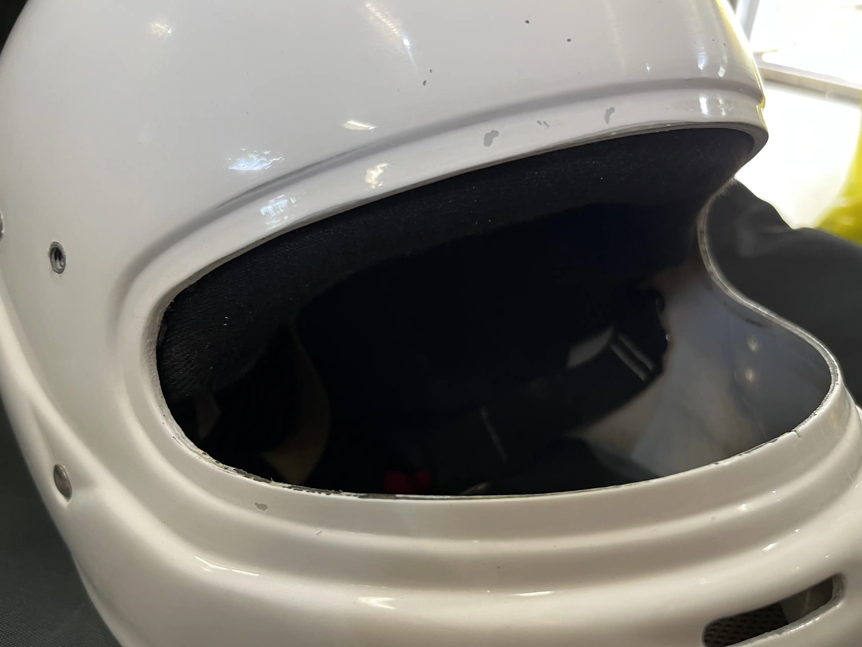
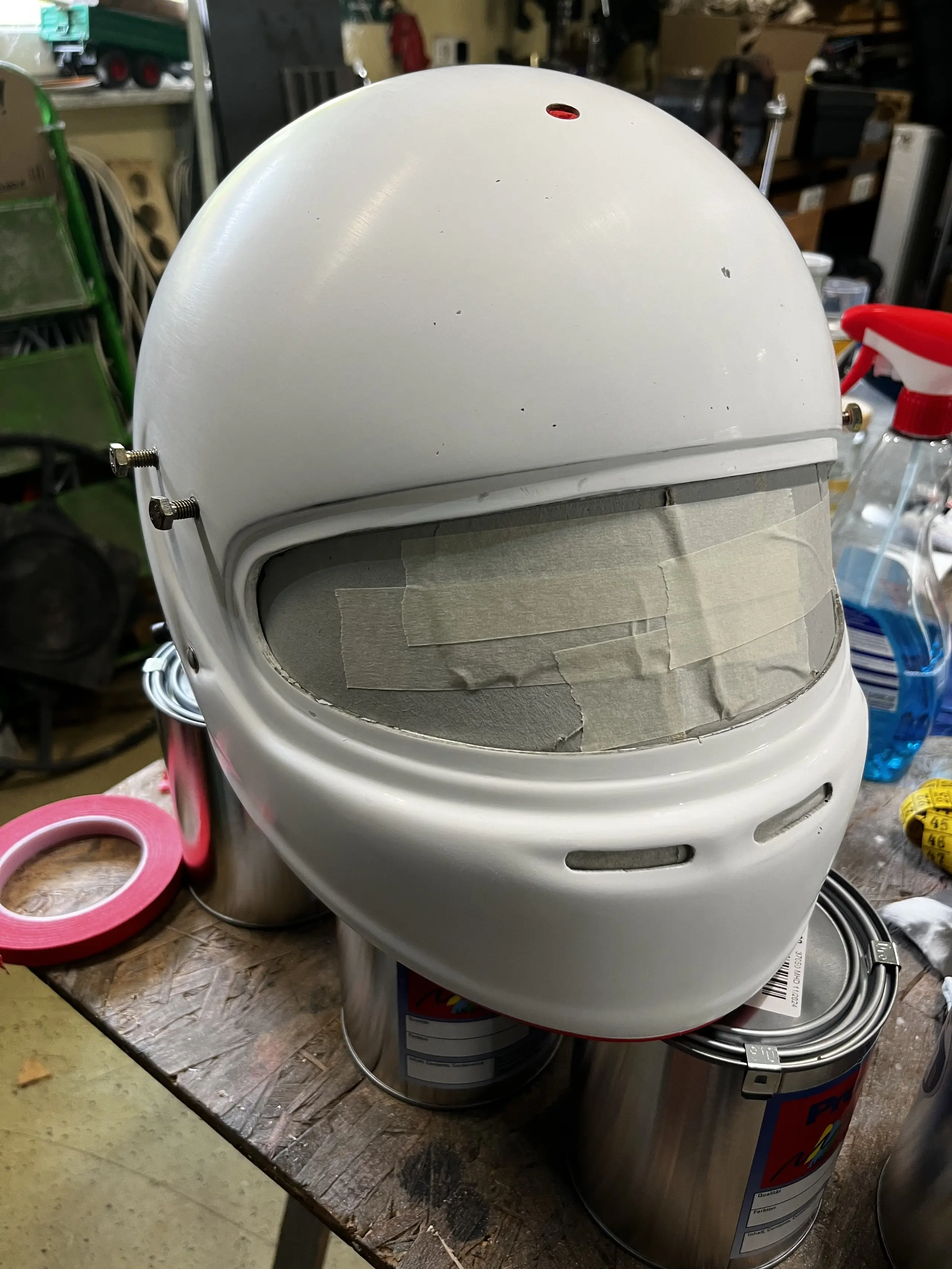
All taped up and ready to go, next up is 2K filler and two rounds of sanding for the deep scratches.
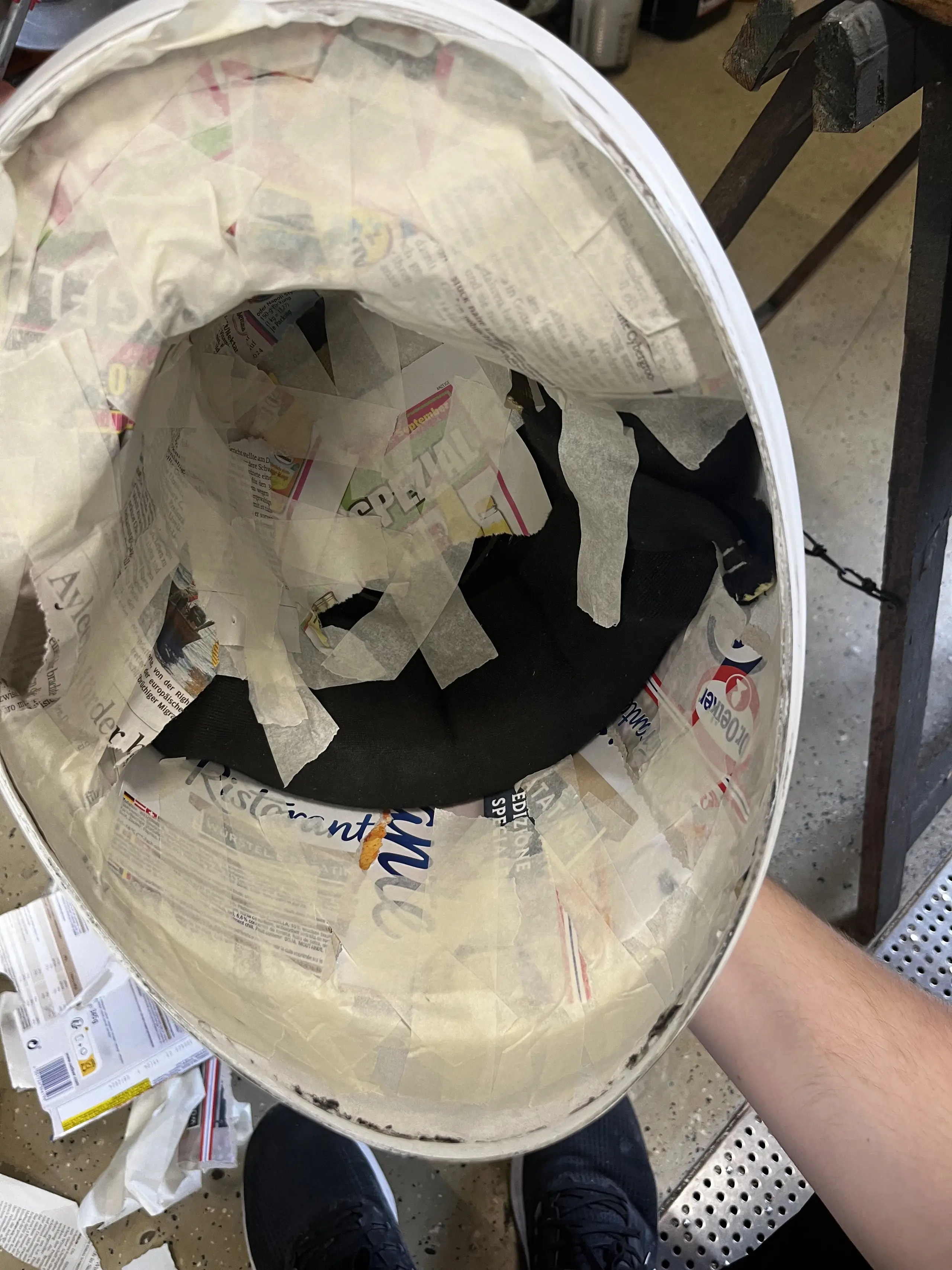
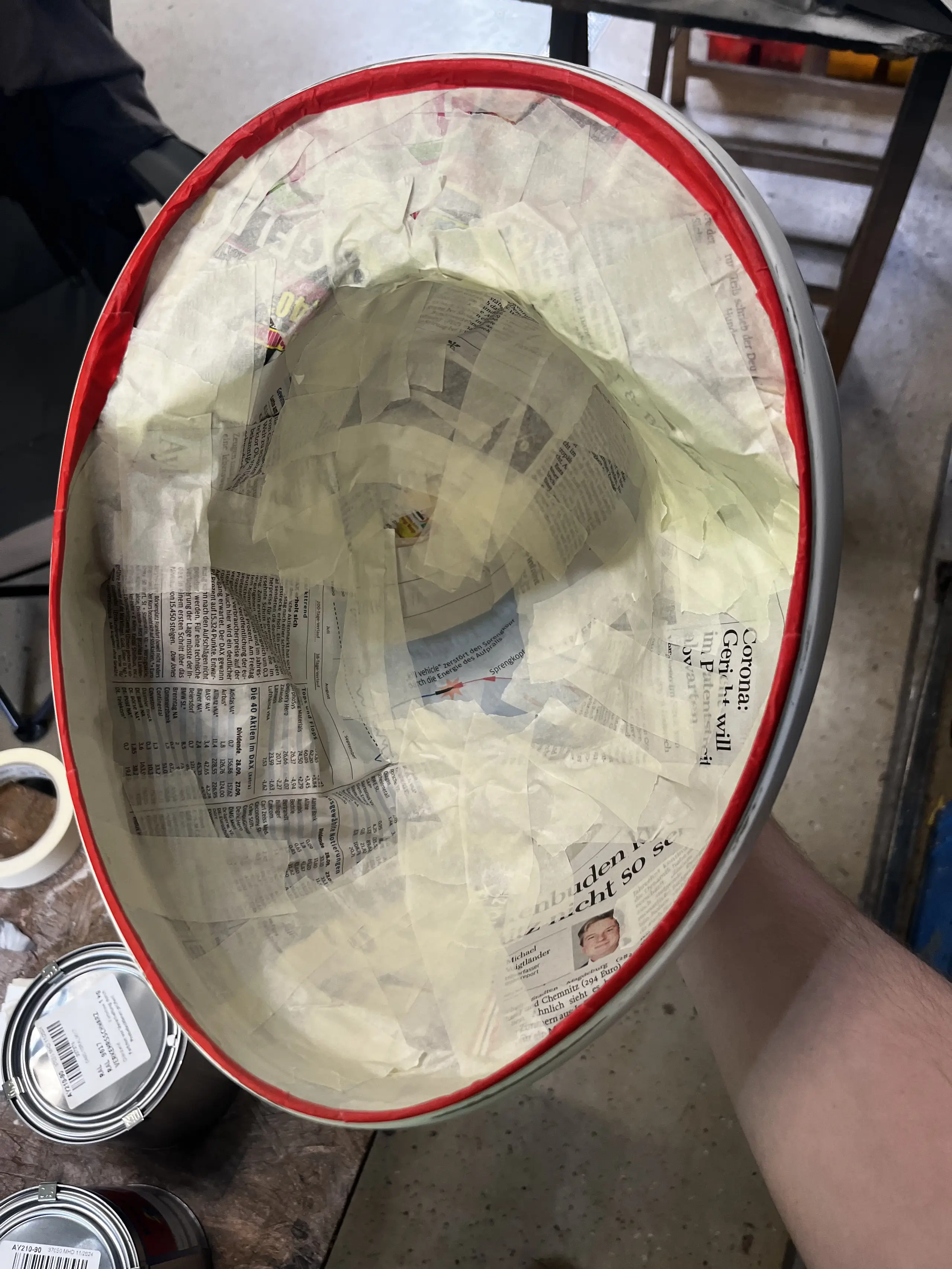
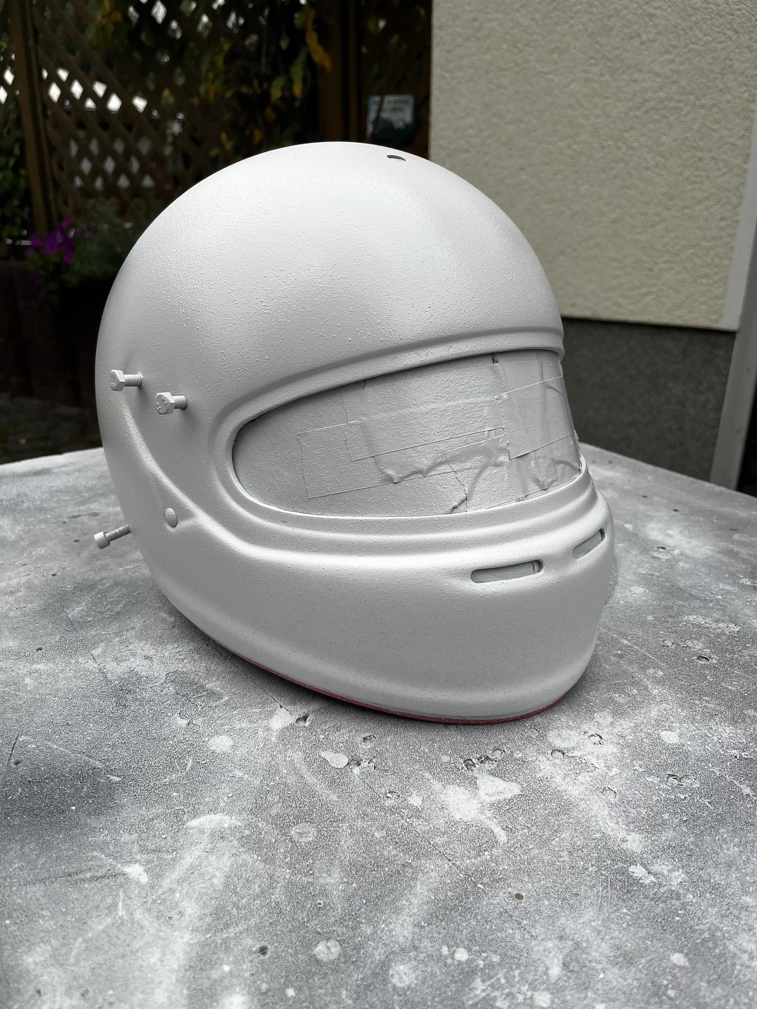
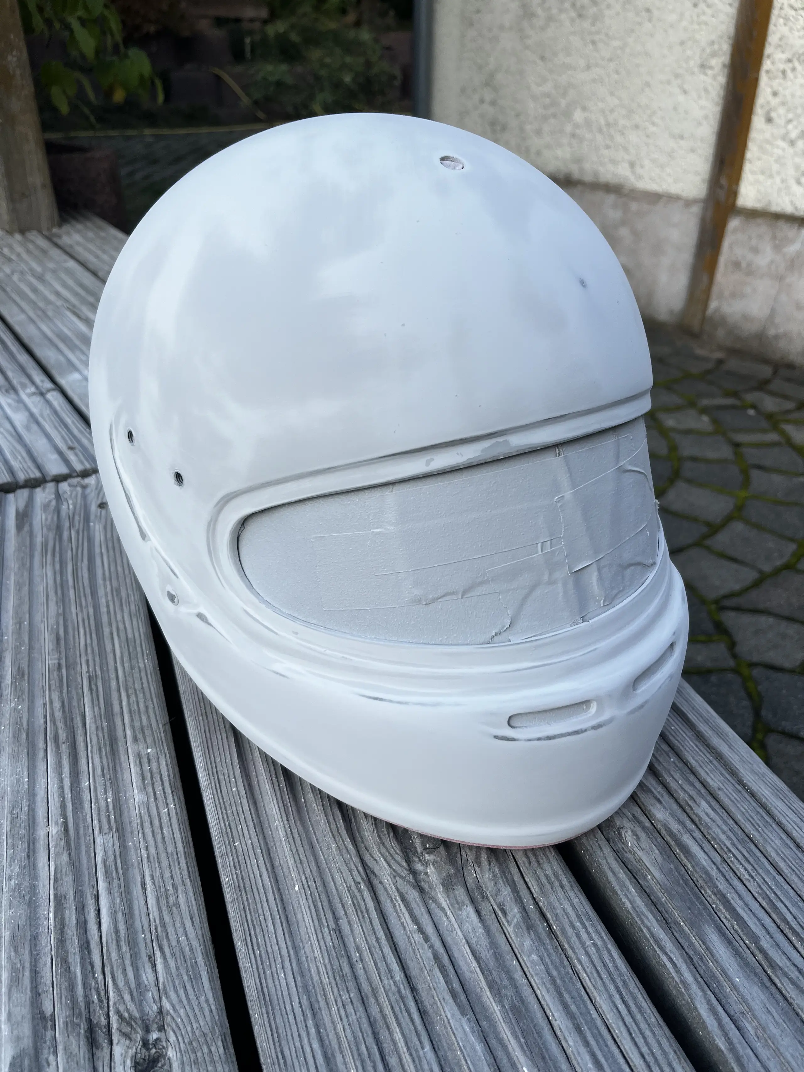
Moving on to painting. Picking colors based on online images is hard if nobody is willing to show actual real life reference images. Lucky for me there are dedicated Vespa restorers online who have posted images of their properly rebuilt motorcycles in various RAL colours.
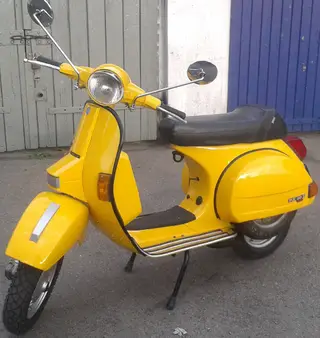
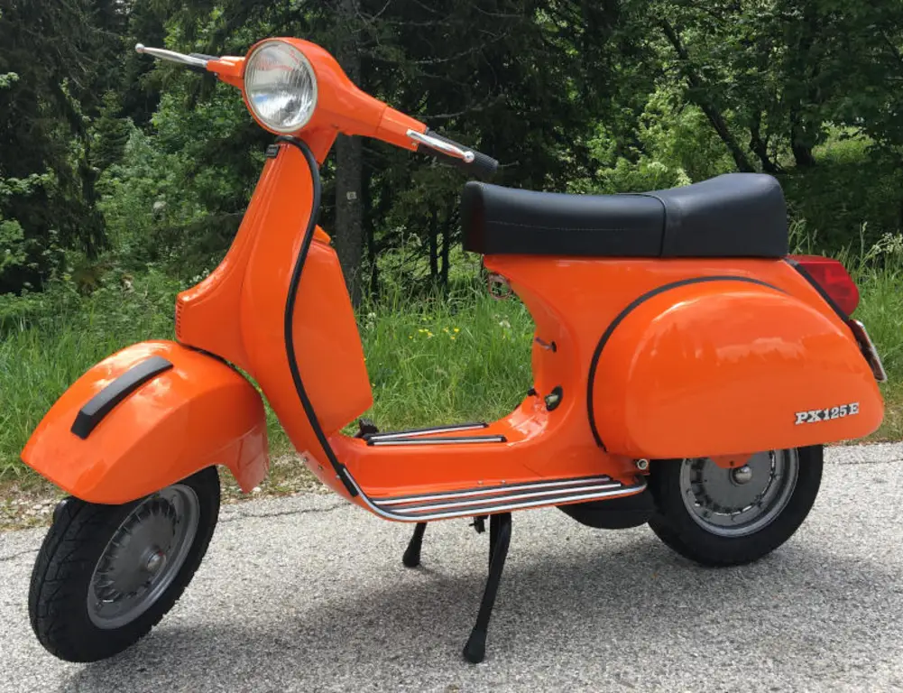
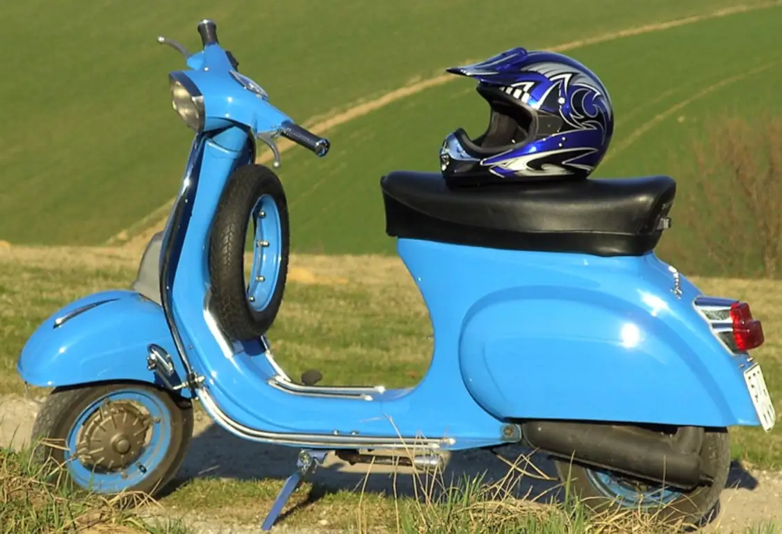
My initial picks for the paint was one can of Mipa 1K AY210 in the following colors:
My plan, in my head, went a little something like this: since I’m not going to spend an excruciatingly long time preparing the helmet for each additional coat at my parent’s place I figured I’d take the helmet home with me in its bag and do it in peace in my apartment. With a small relatively quiet air compressor I could even paint each coat on my balcony, which would save me a whole bunch of time.
It was only after taking it out of the bag, with the first coat applied, that I realized what had happened to the helmet. The simple act of sitting in the bag was enough to leave its mark on the thin layer of paint in multiple places. It was starting to dawn on me what I had gotten myself into.
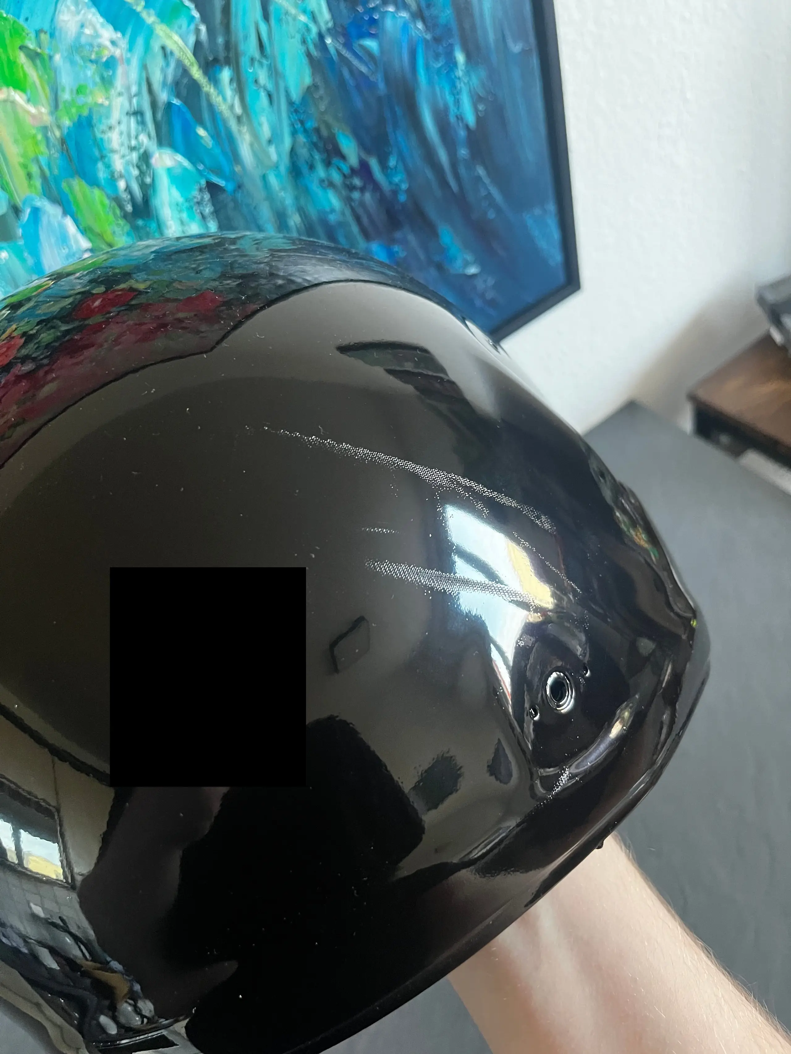
In my infinite wisdom I thought I could sand and paint my way out of this problem. Oh how fooling past me was. It was at this point, after some orange peel and dust, that I decided to cut my losses and strip away all the paint. First with wet sanding, which I gave up on after two hours, and then with paint thinner, which even in a ventilated area gave me one hell of a headache. As a result, I spread out the work over multiple days.
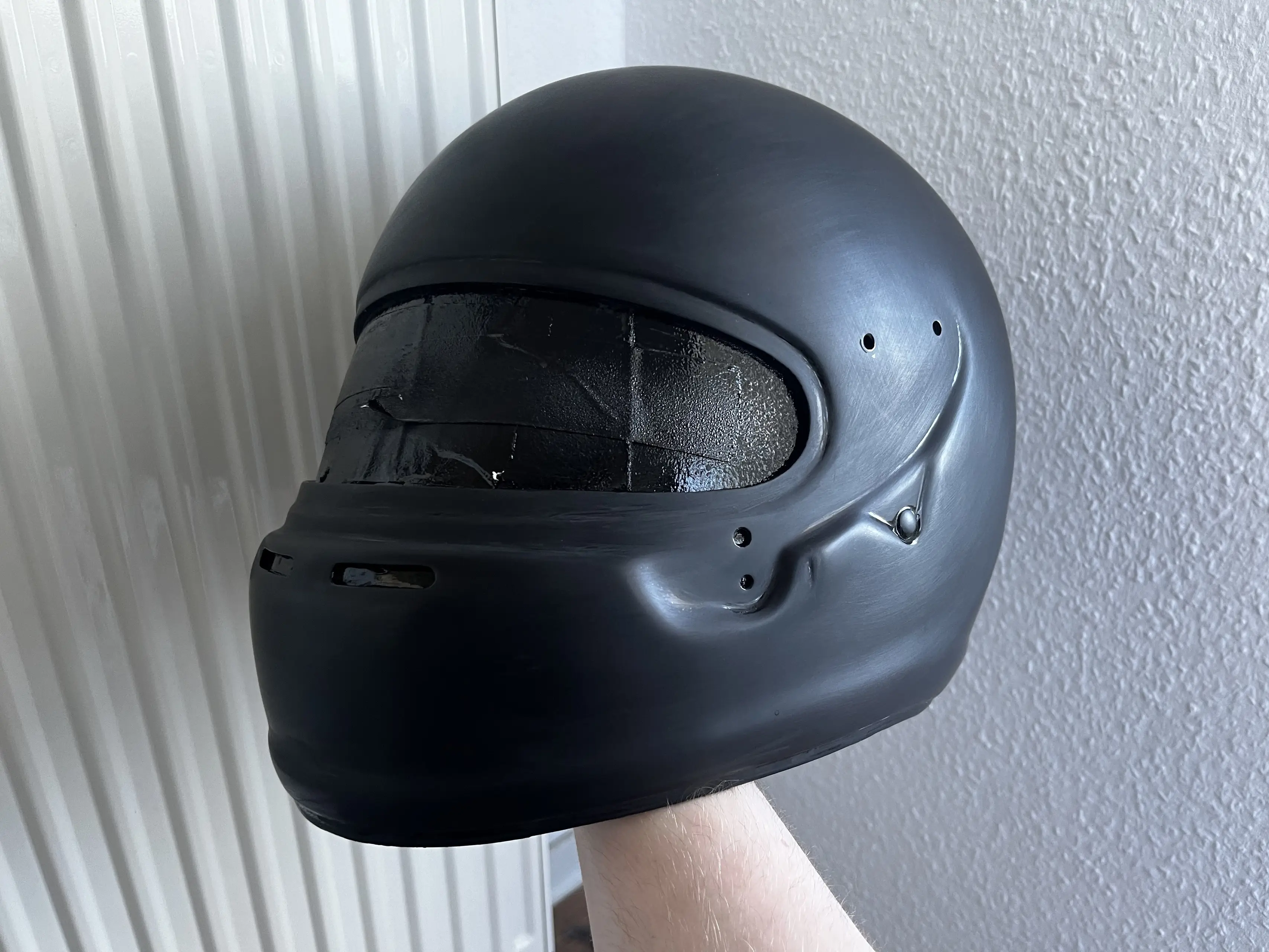
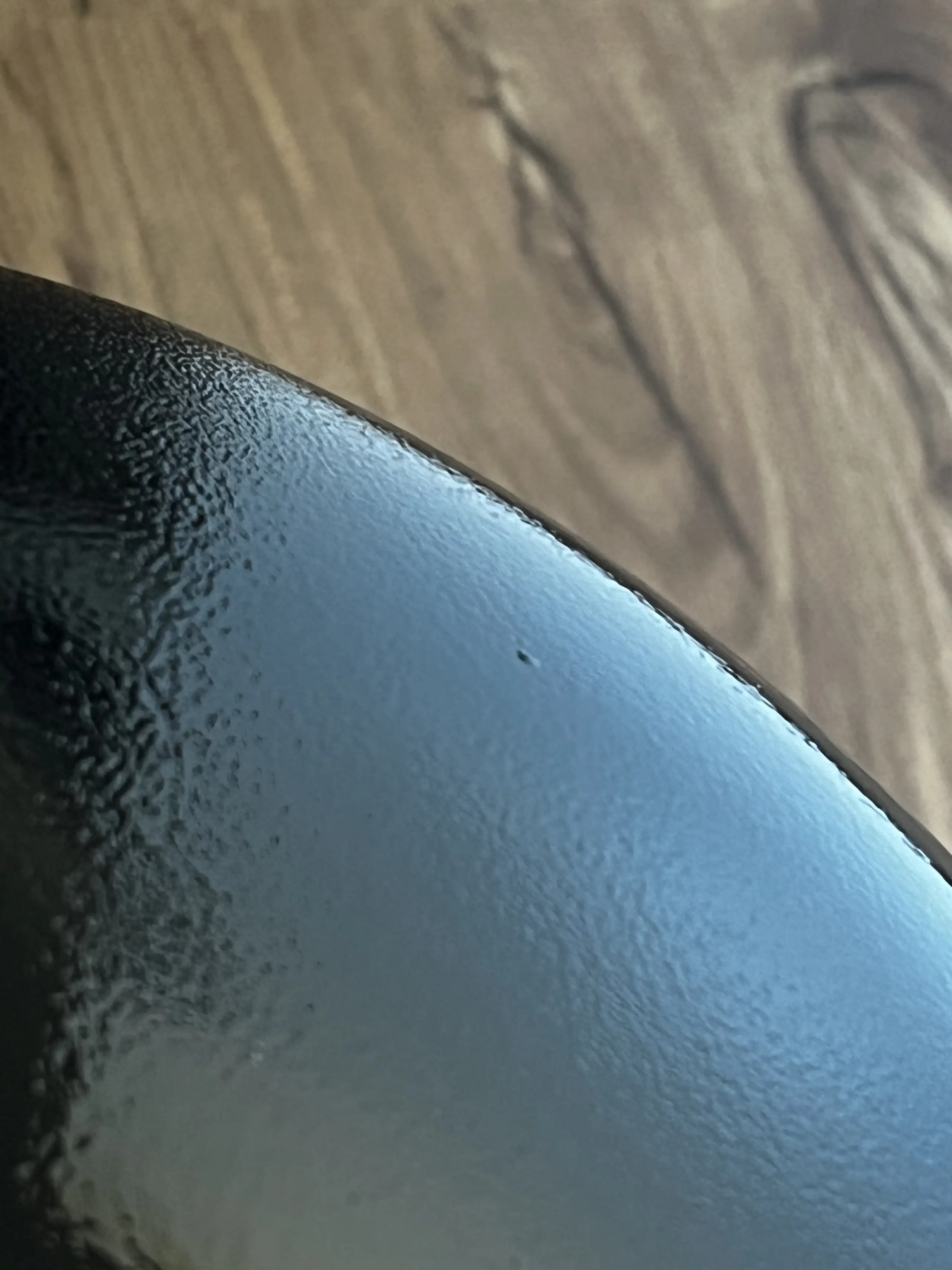
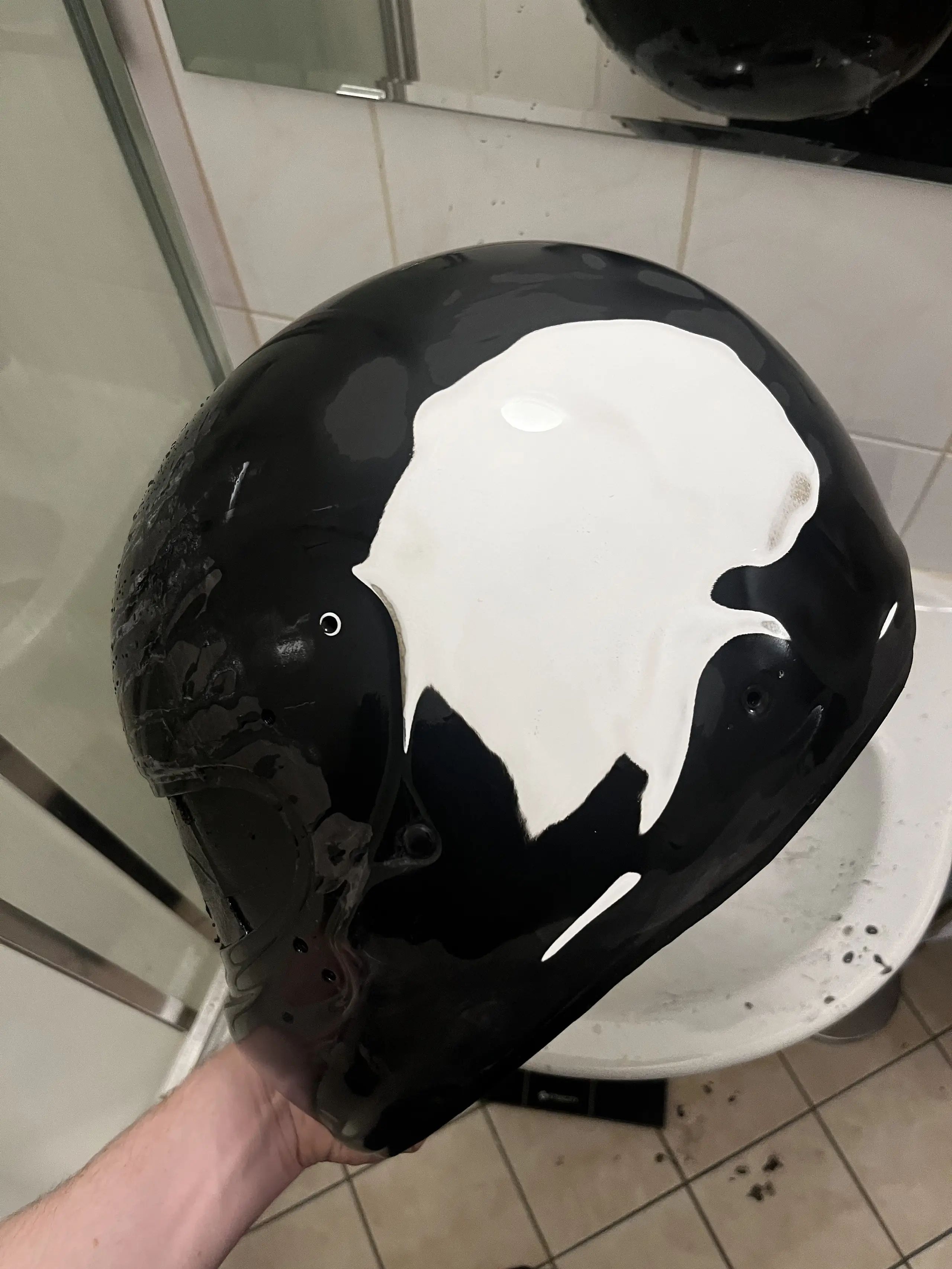
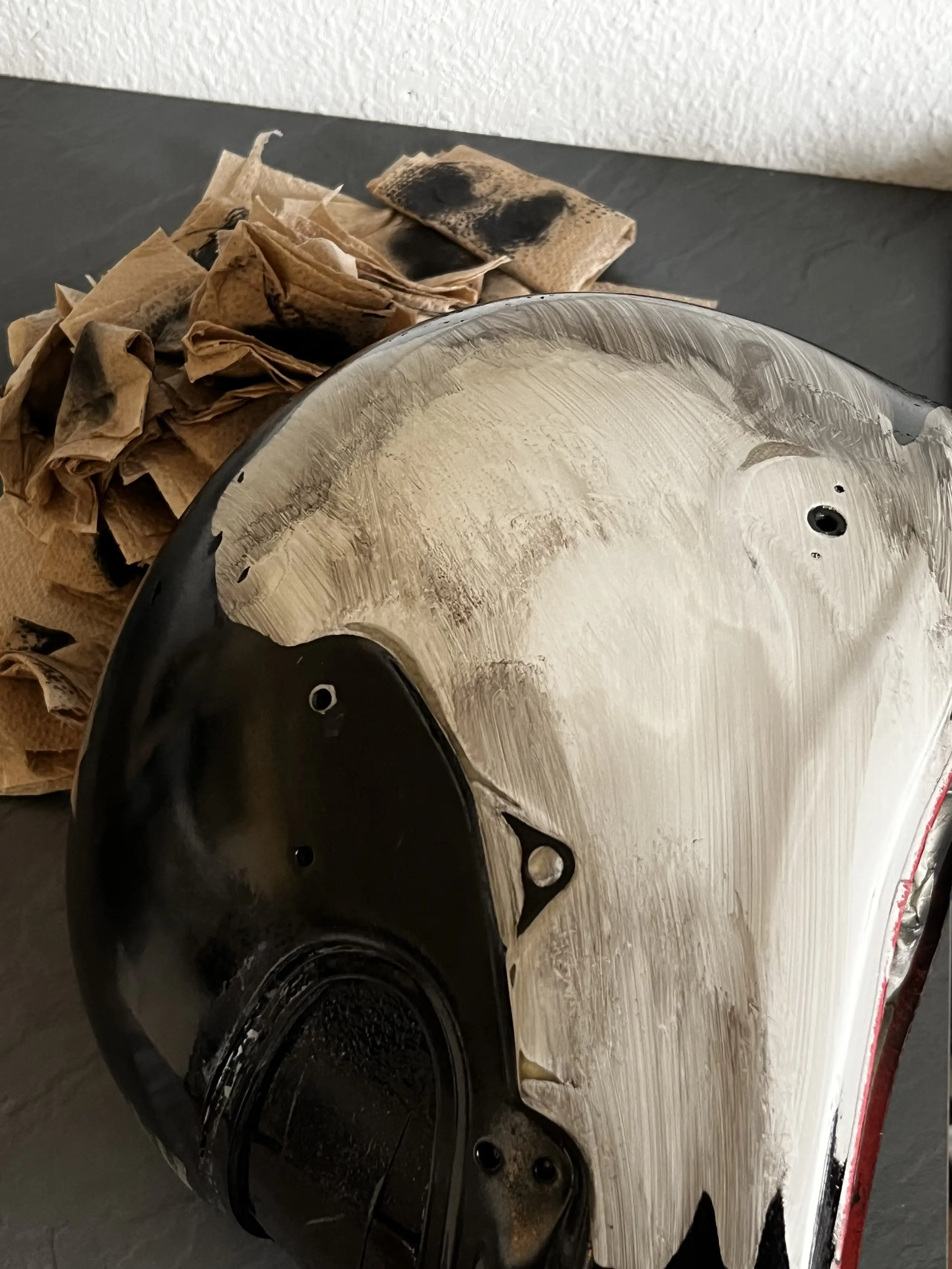
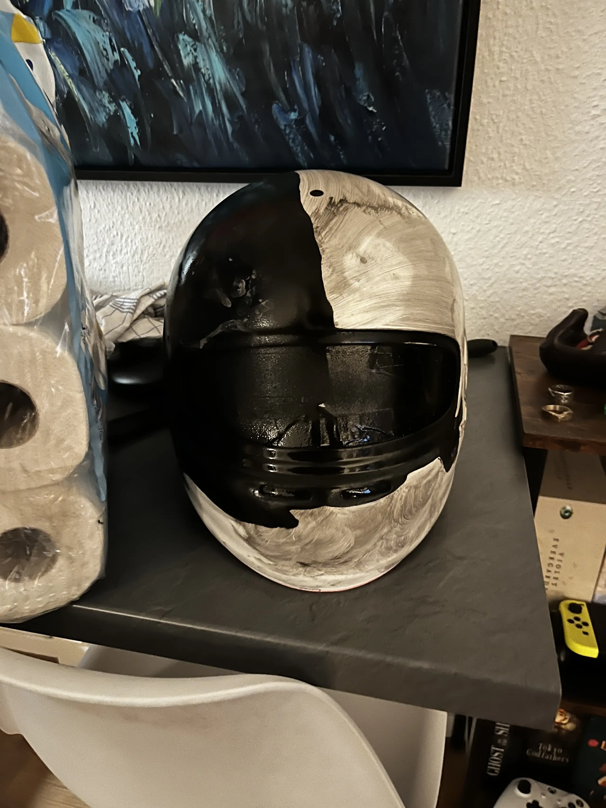
Back to square one. From here on out each coat would be 2K paint instead of 1K. Silly me thought I could get away with one 2K clear coat at the end. Lesson learned. The end result came out great!
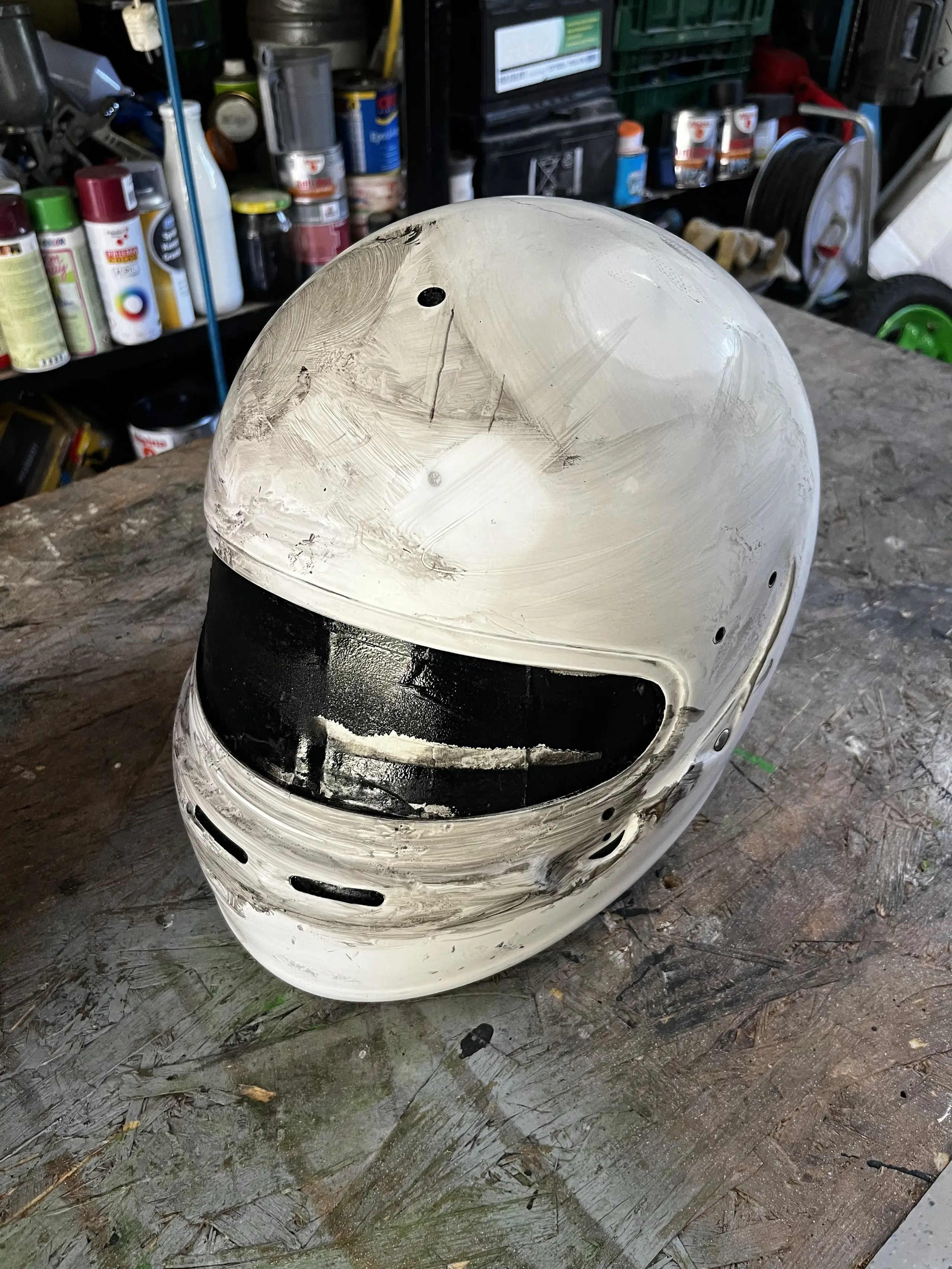
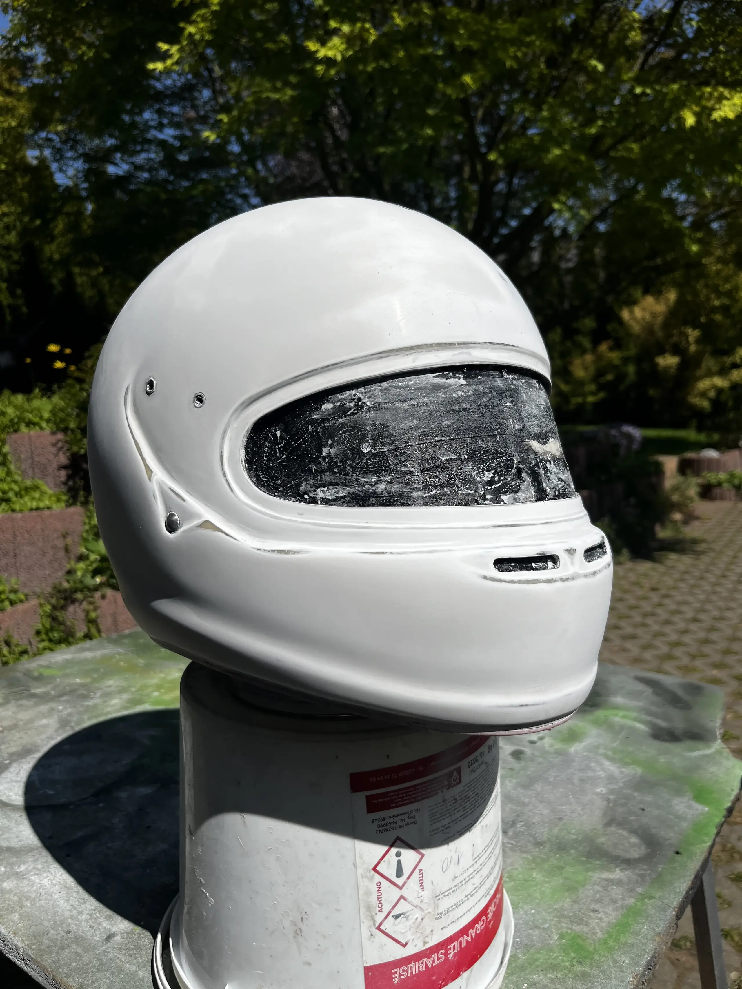
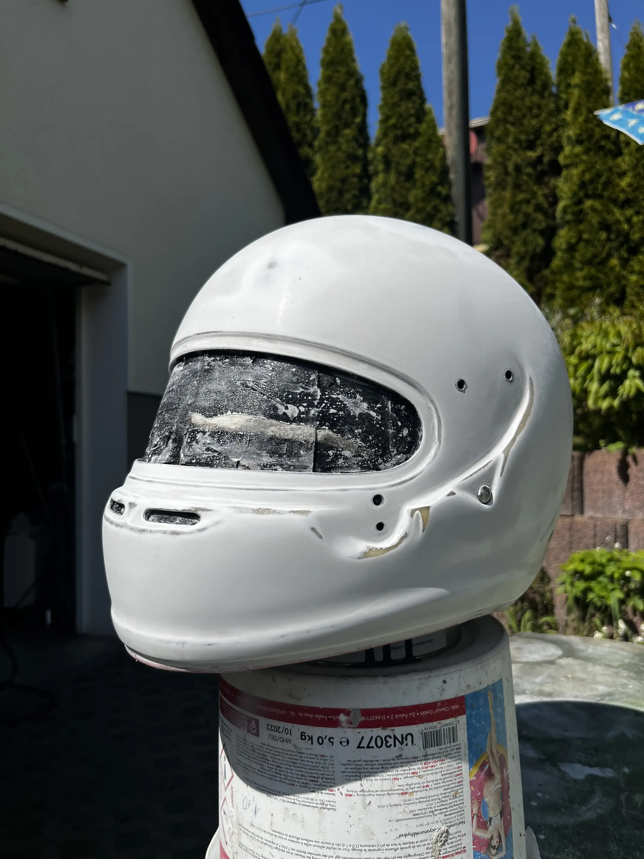
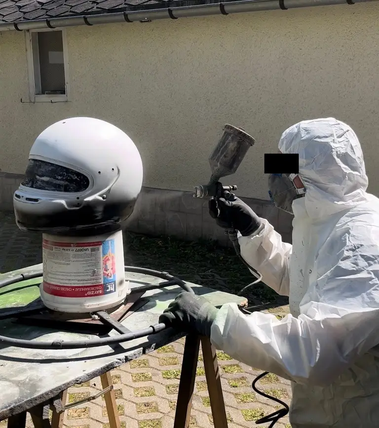
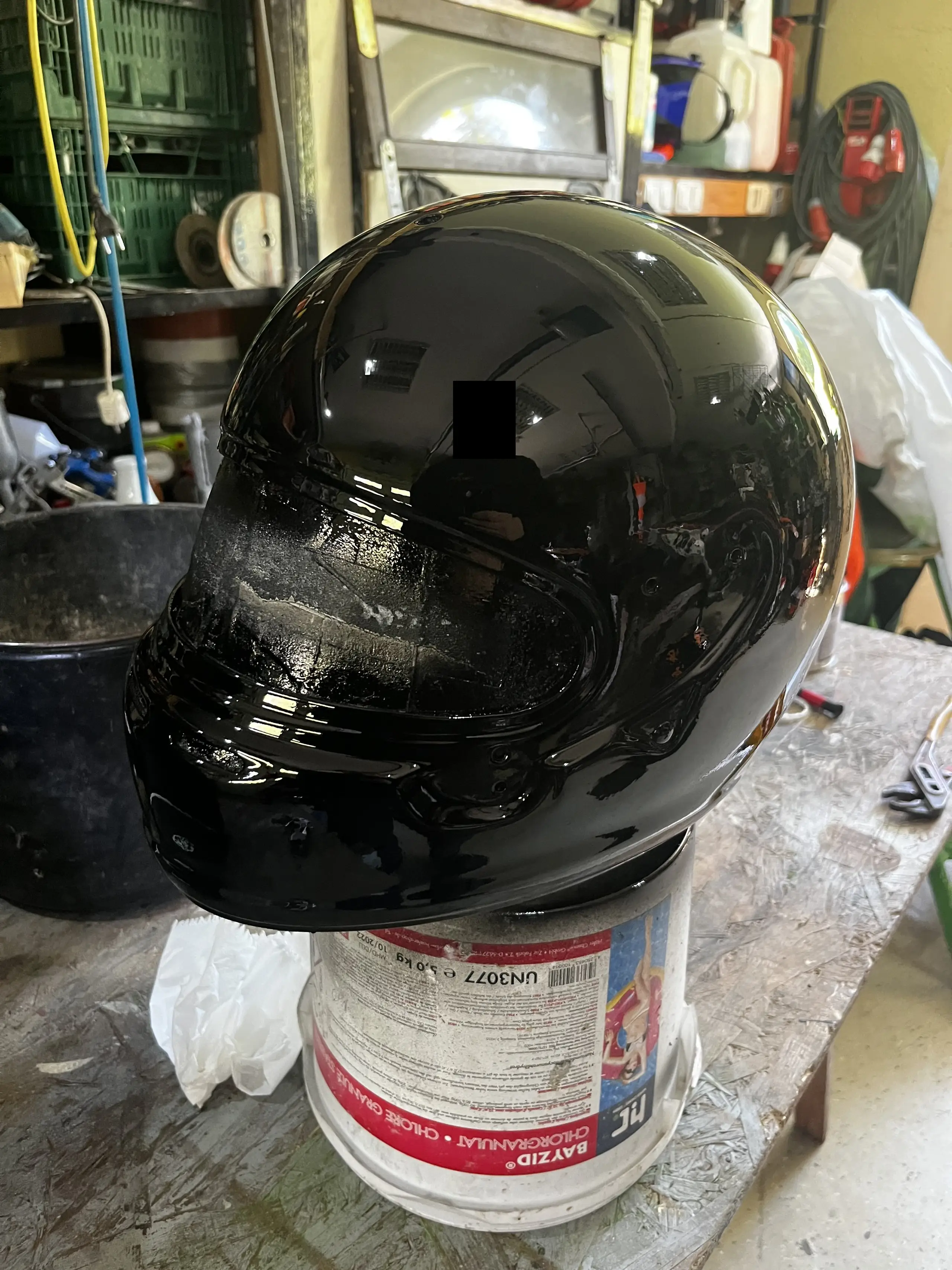
We ended up going with a different, even darker, shade of black, RAL 9005, but it’s not like anyone can tell the difference between the two. And wouldn’t you know it, the helmet made it home safe for me to start masking for the second layer! No imprints or scratches.
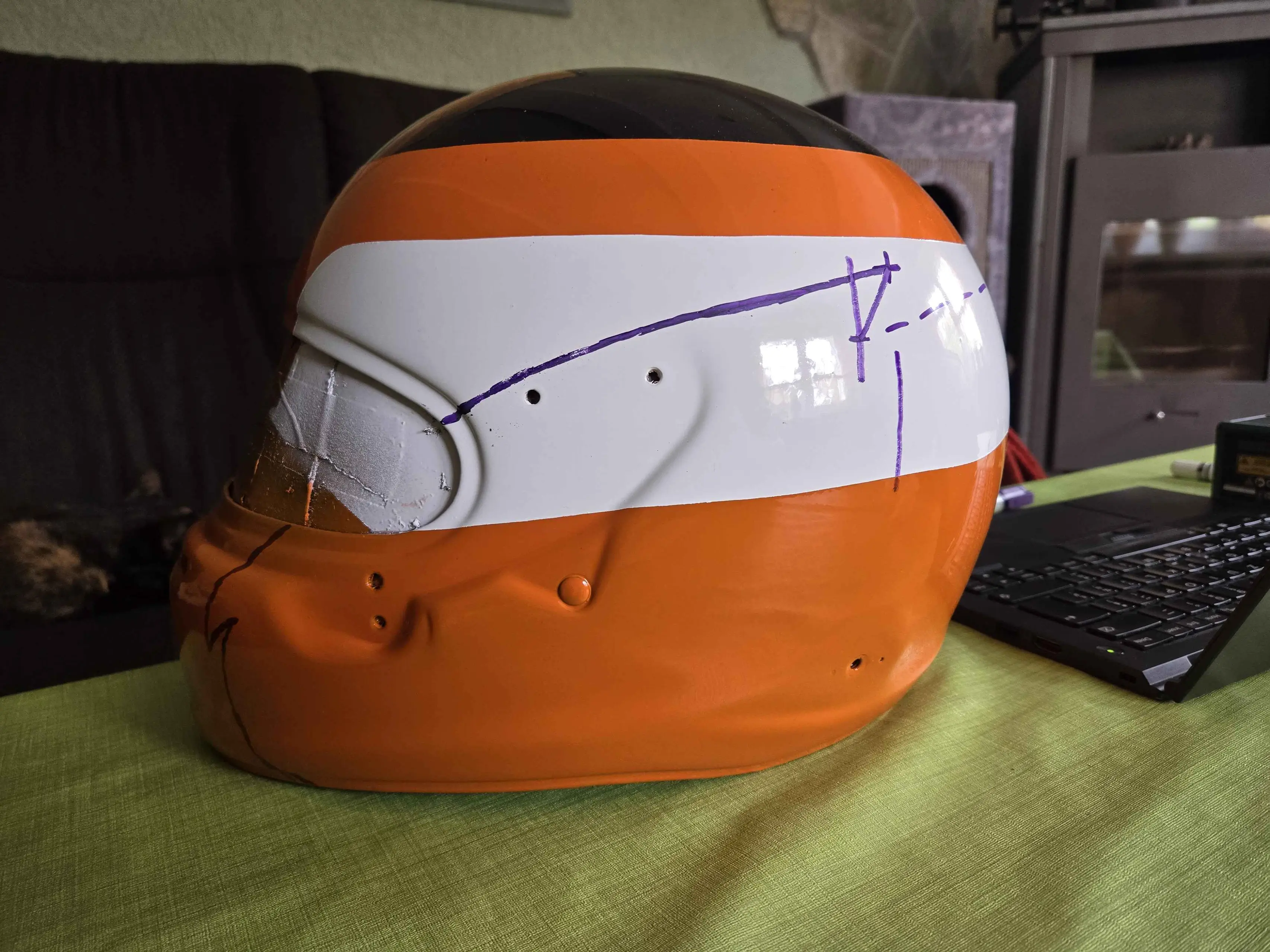
To be able to put down lines on a round surface like that I bought one of those fancy self-leveling lasers and built a cardboard box that to properly mark and measure things. Now that I know how tall the helmet is while sitting down and slightly angled towards the back, I can adjust my 3D model accordingly and figure out how far I need to prop up the helmet to get it perfectly level. That way I also know where exactly to mask off the yellow horizontal line.
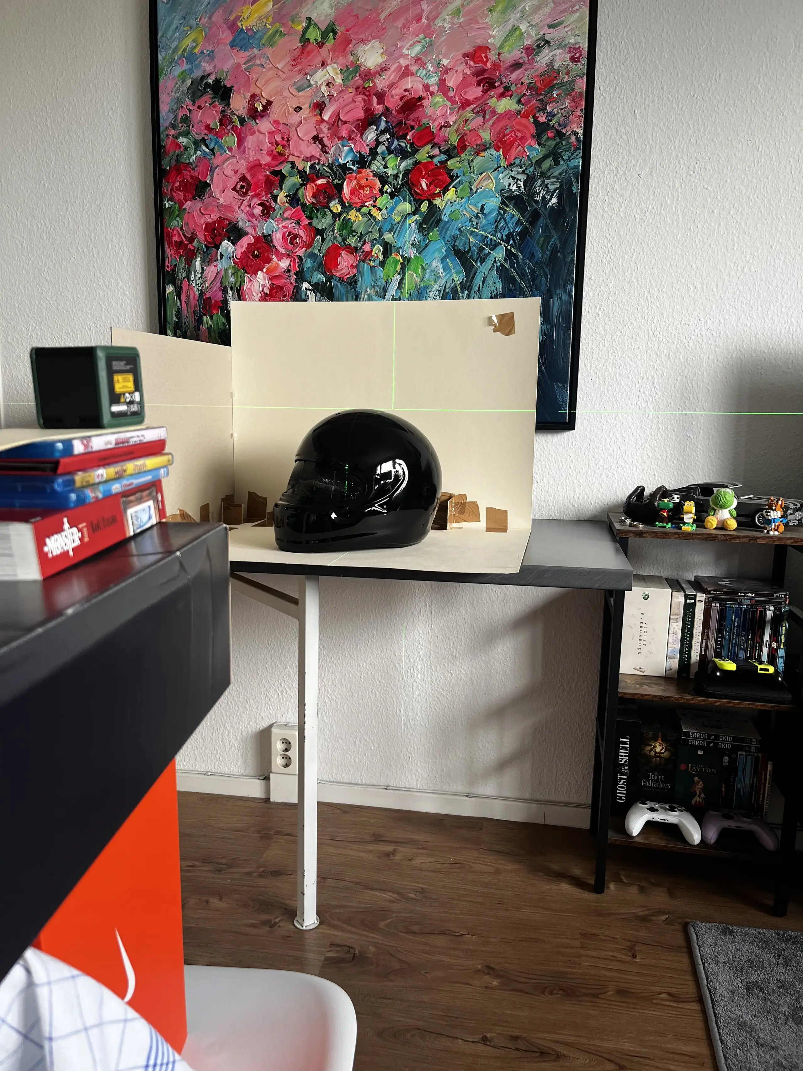
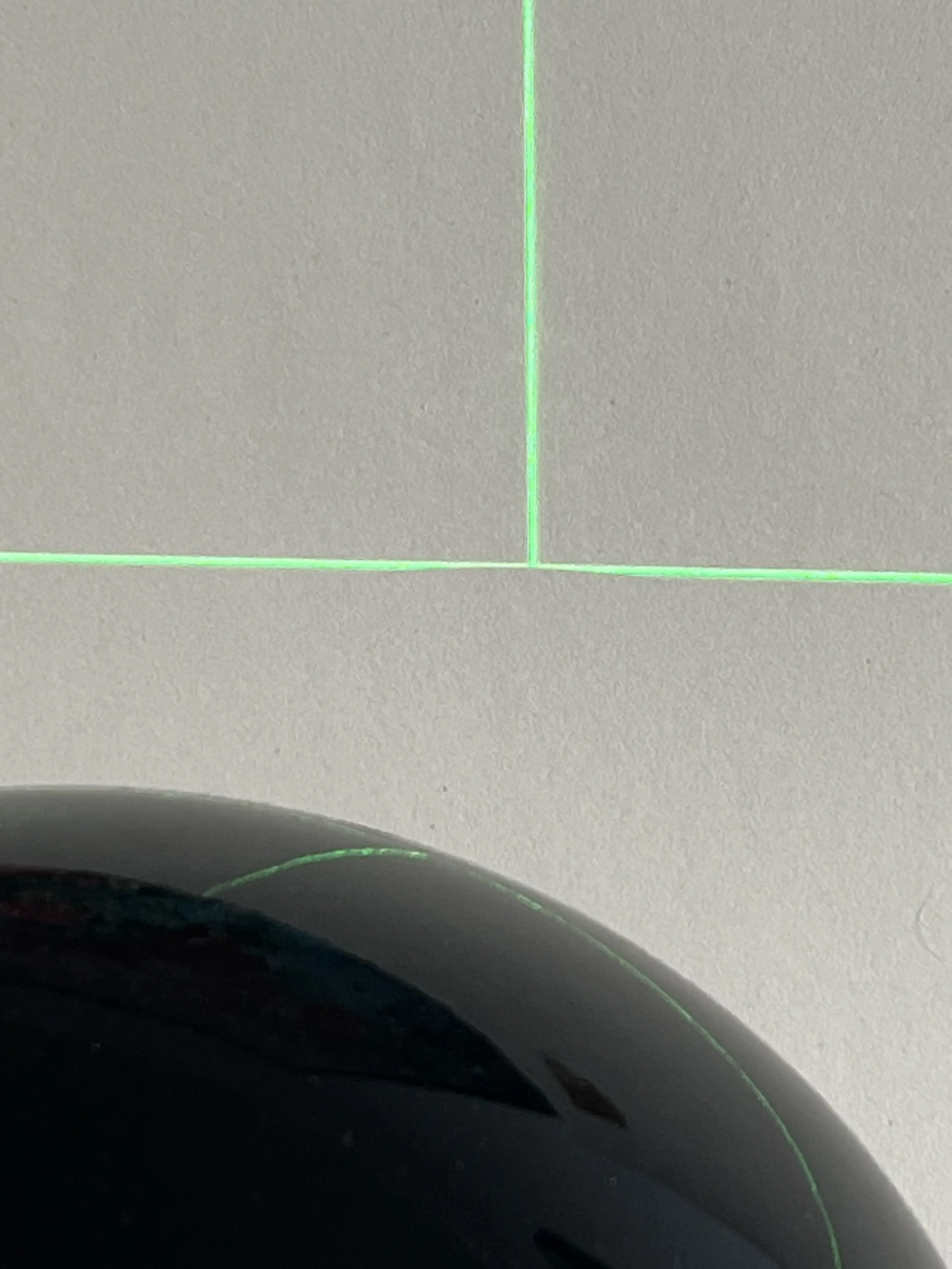
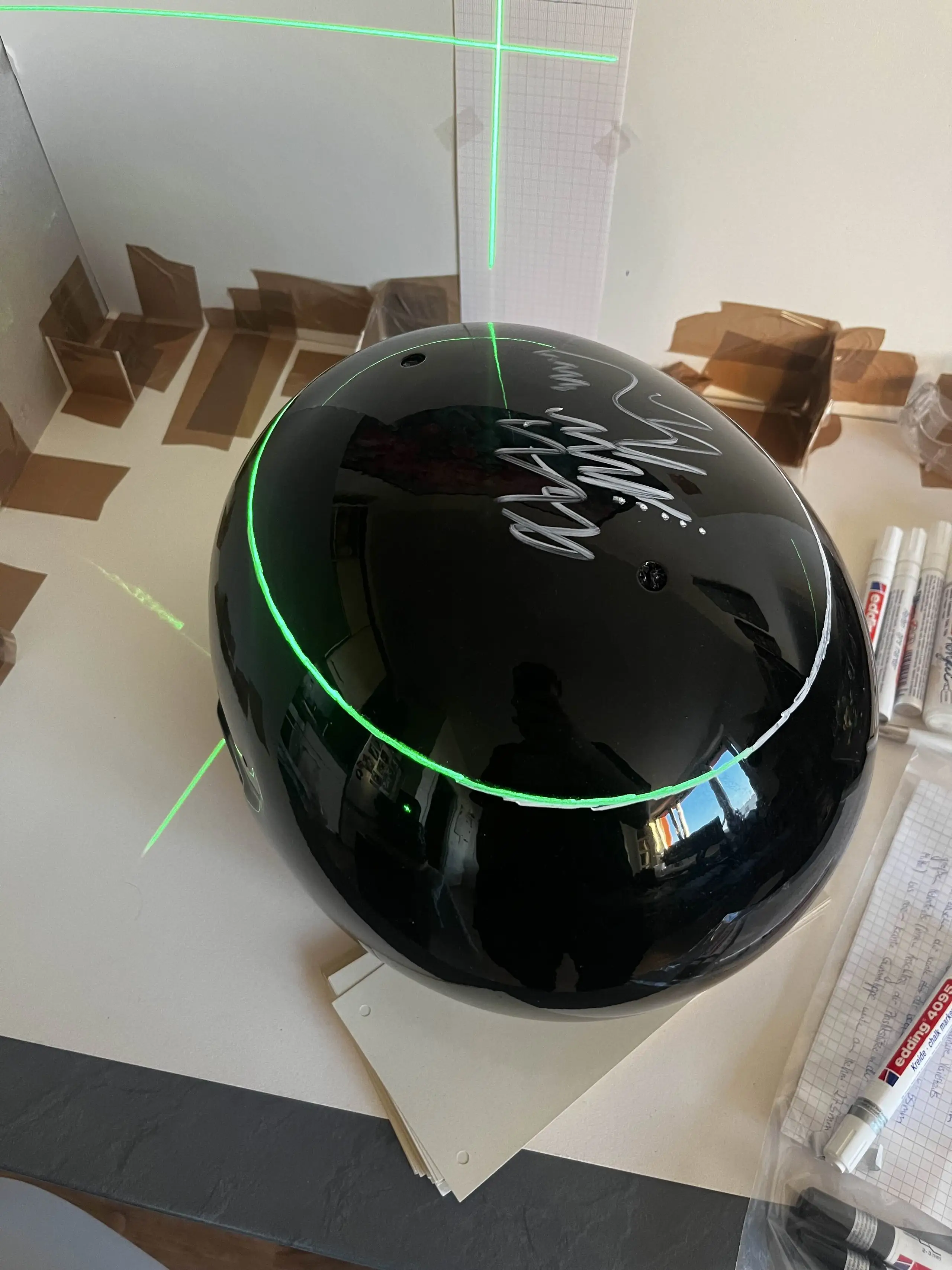
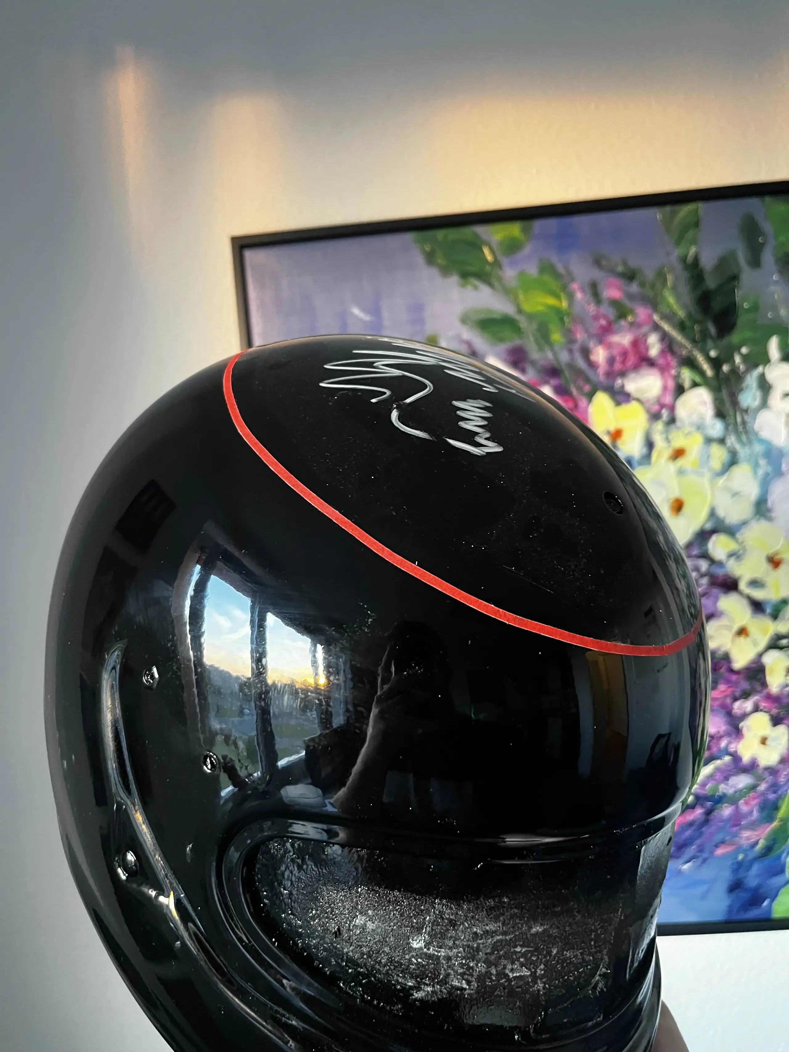
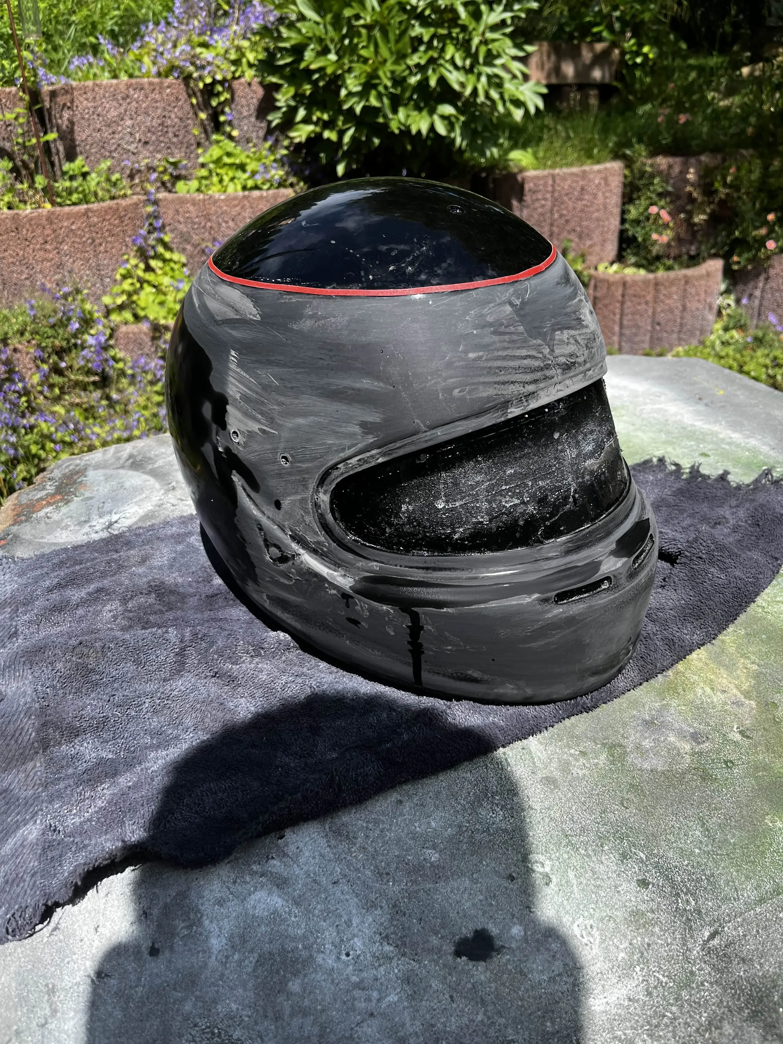
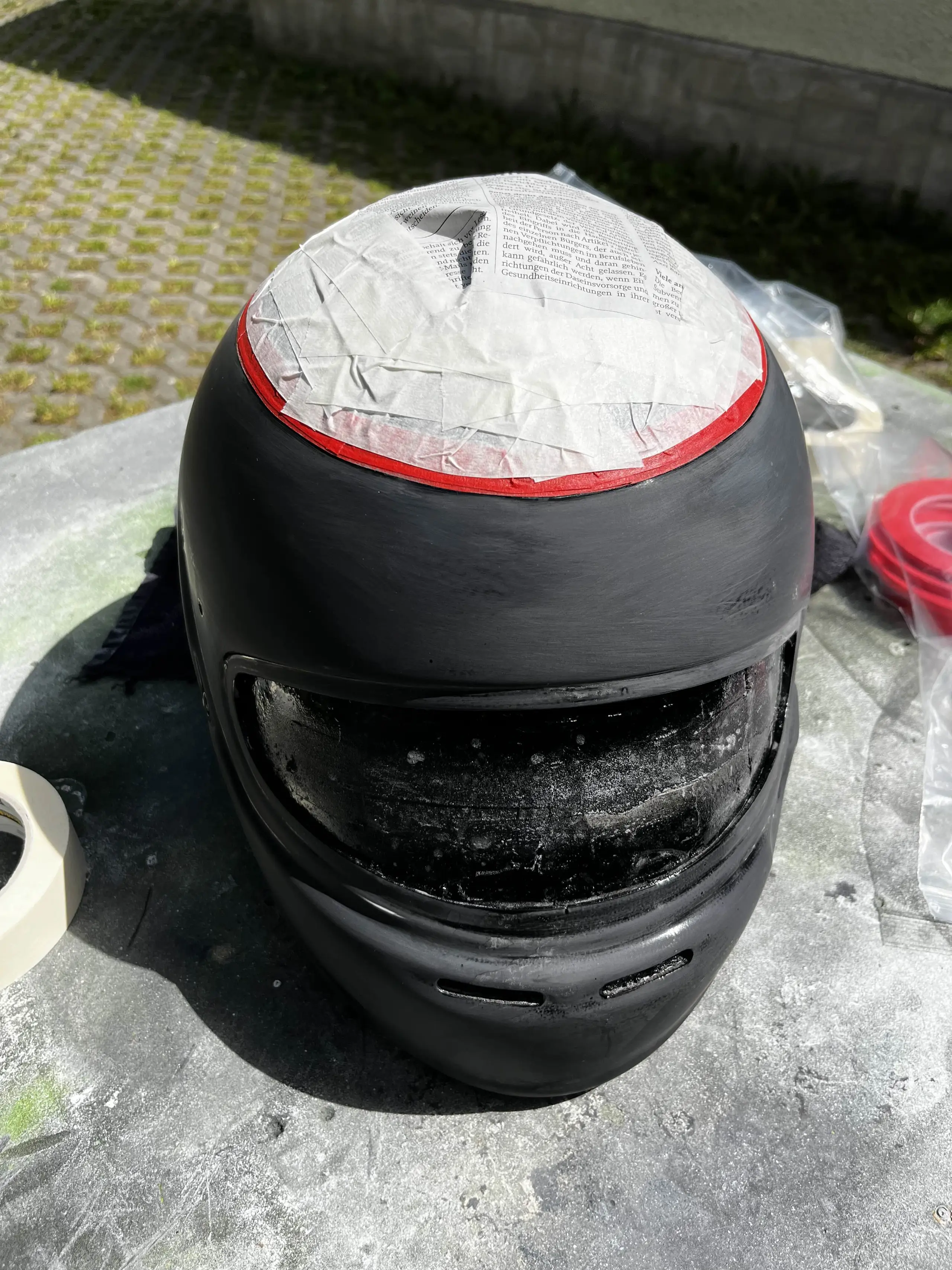
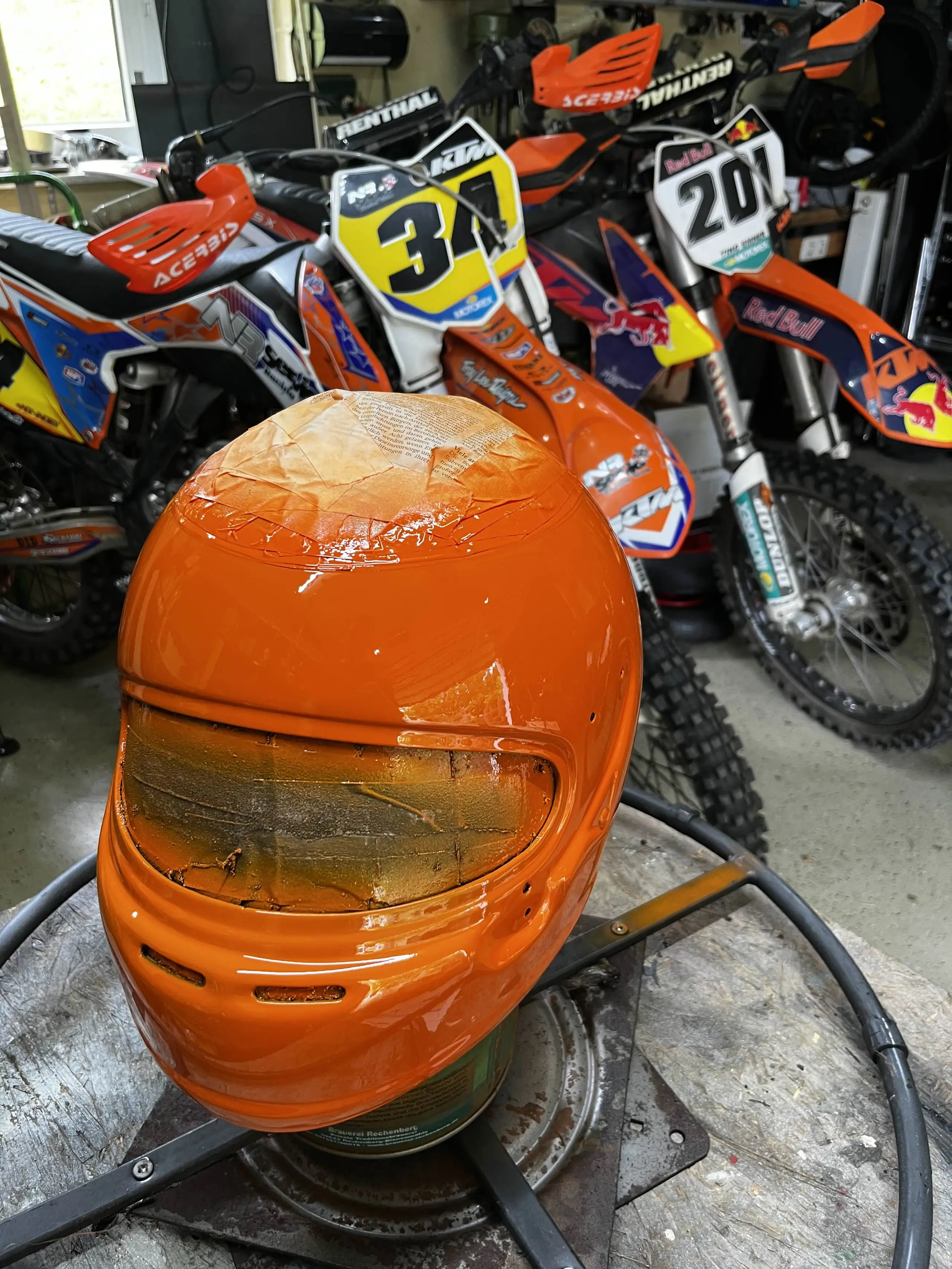
Bonus photo, I had no idea that RAL 2009 is the exact same shade of orange as the one used by KTM.
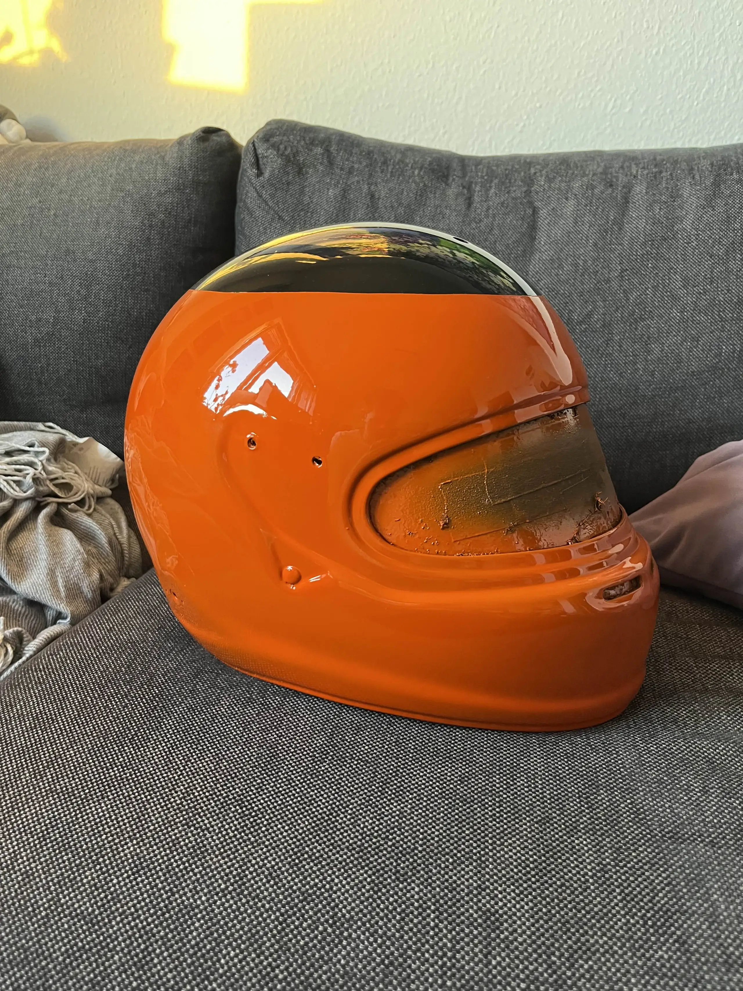
Repeat the process for white. Also, cardboard box has been replaced by a wooden one.
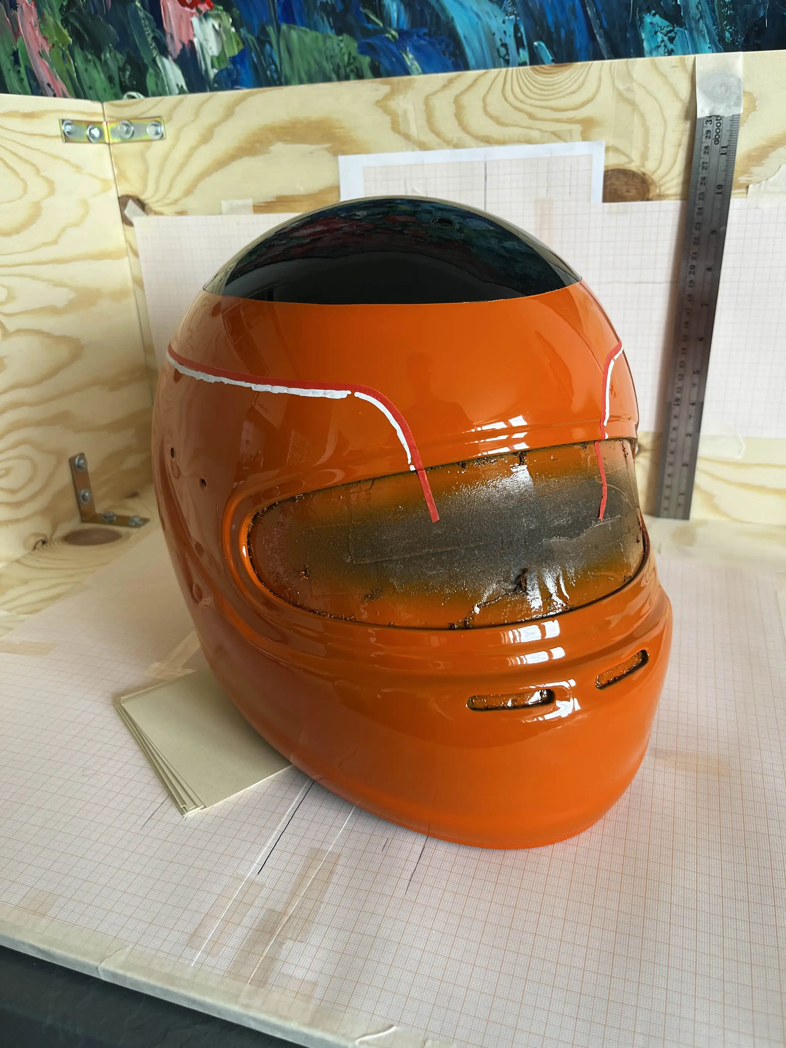
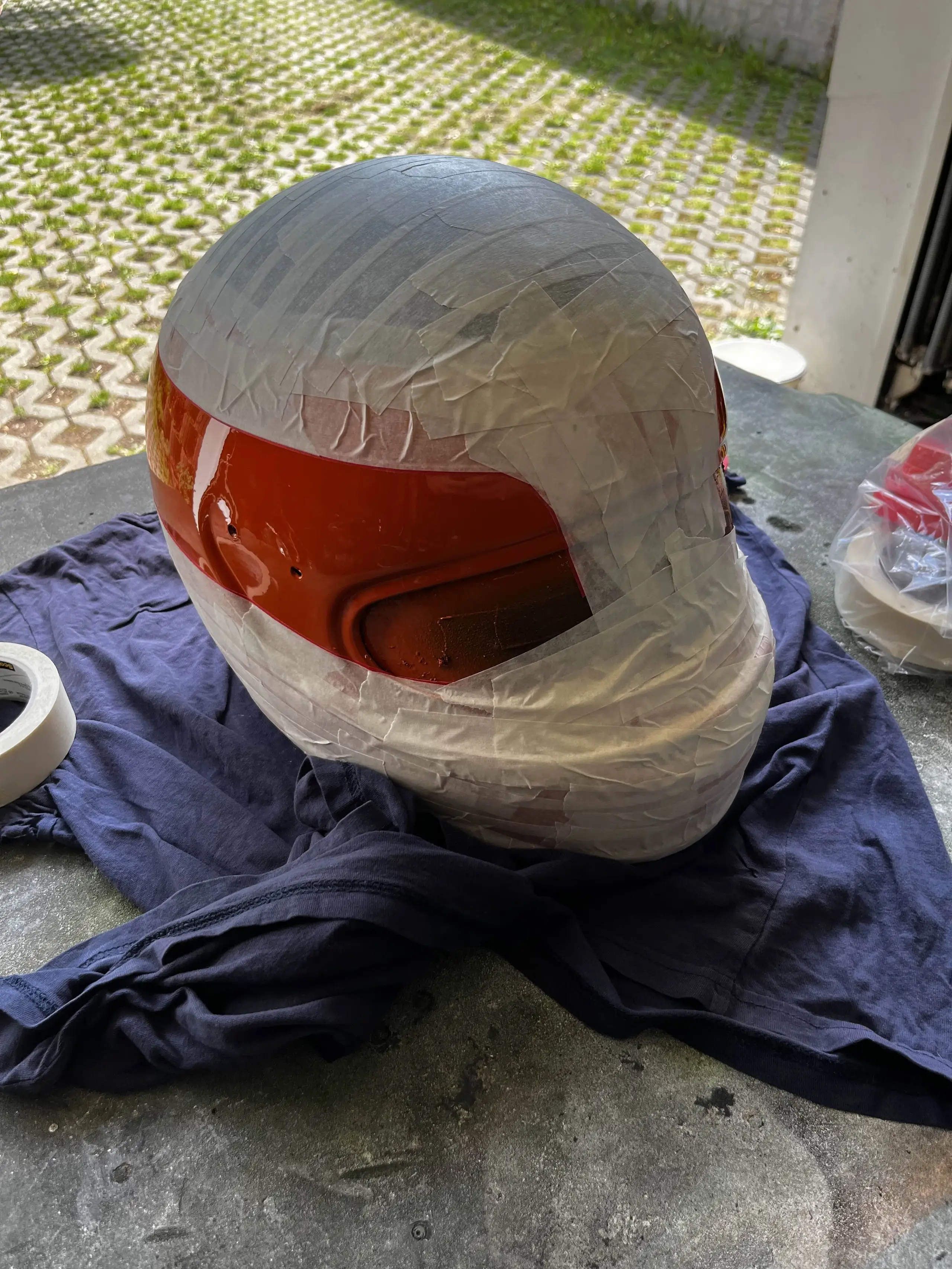
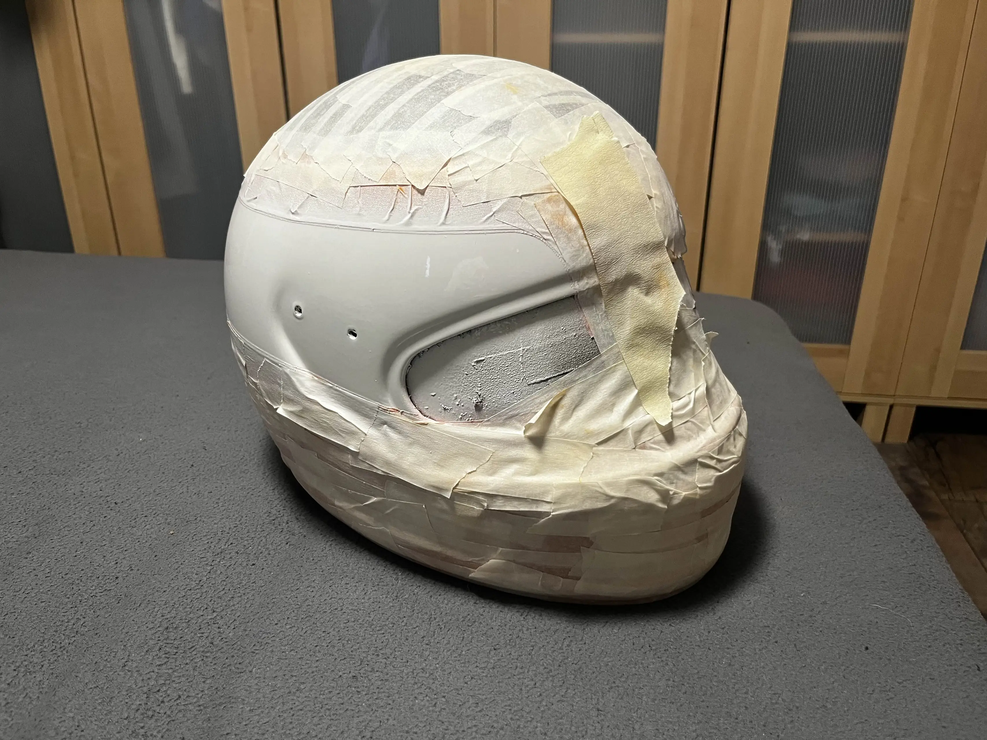
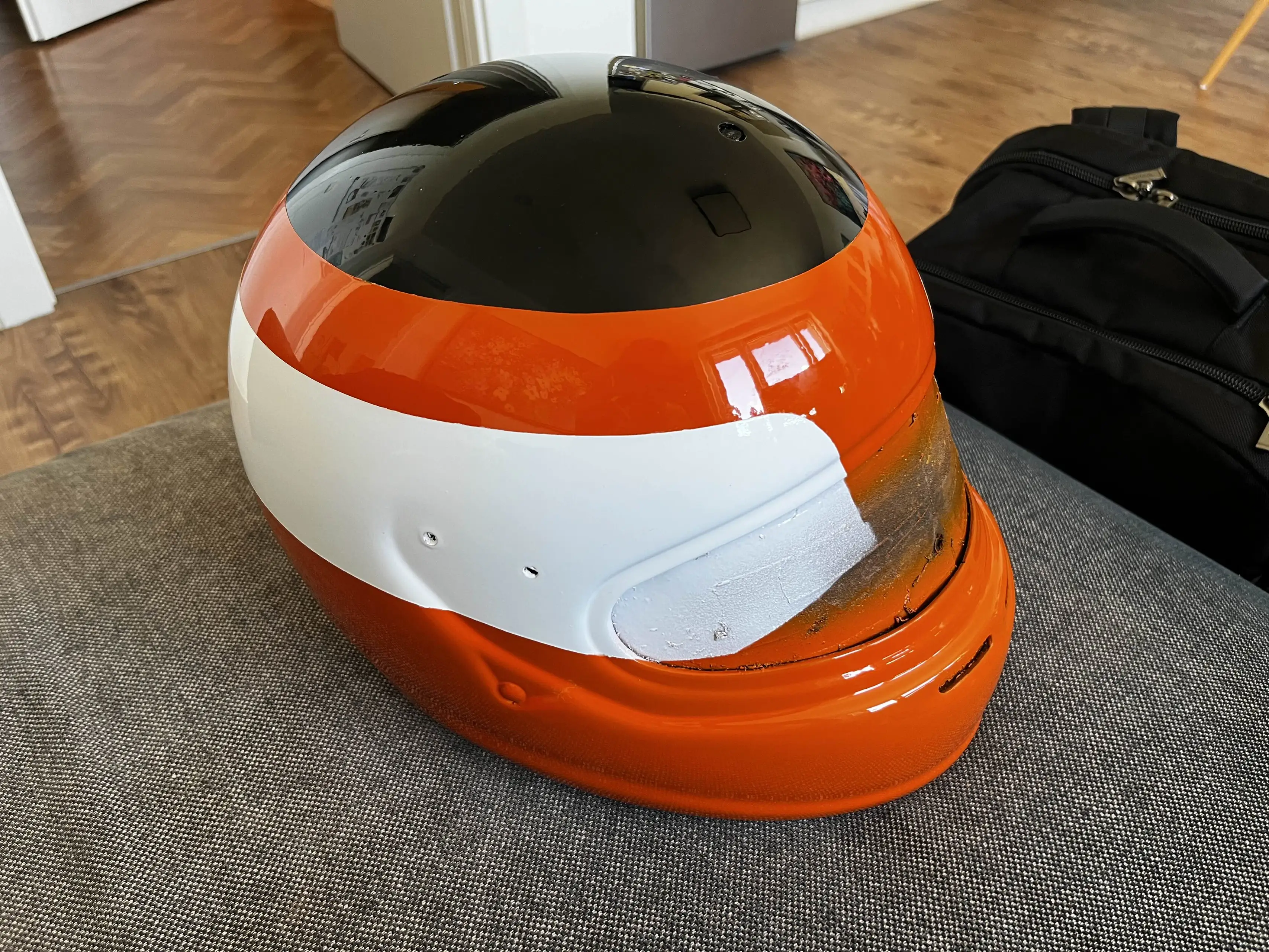
And then blue! Unfortunately, on the first attempt, the blue color still had tiny pigments in it that hadn’t been completely dissolved yet. So it took another try to lay down a solid coat.
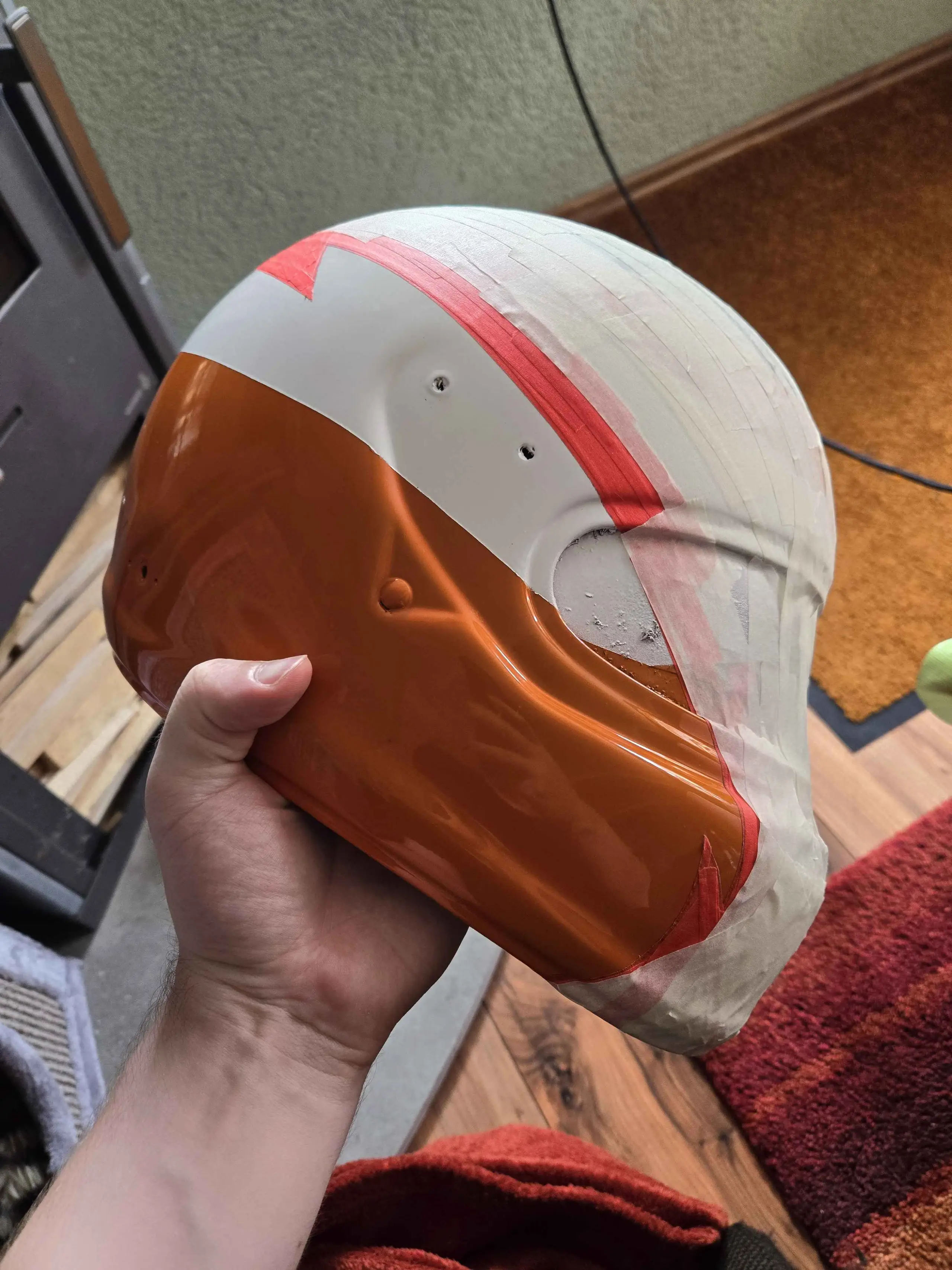
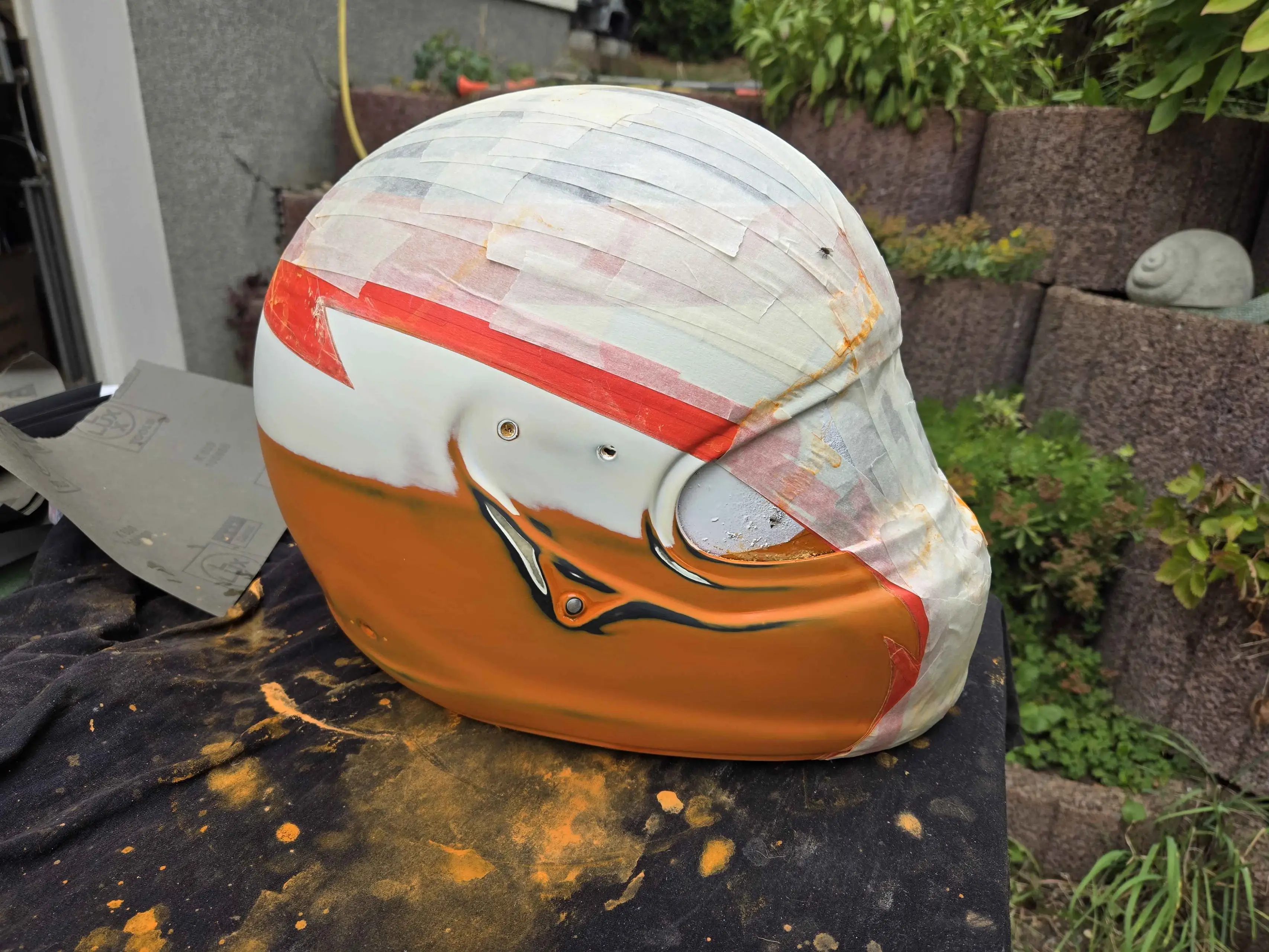
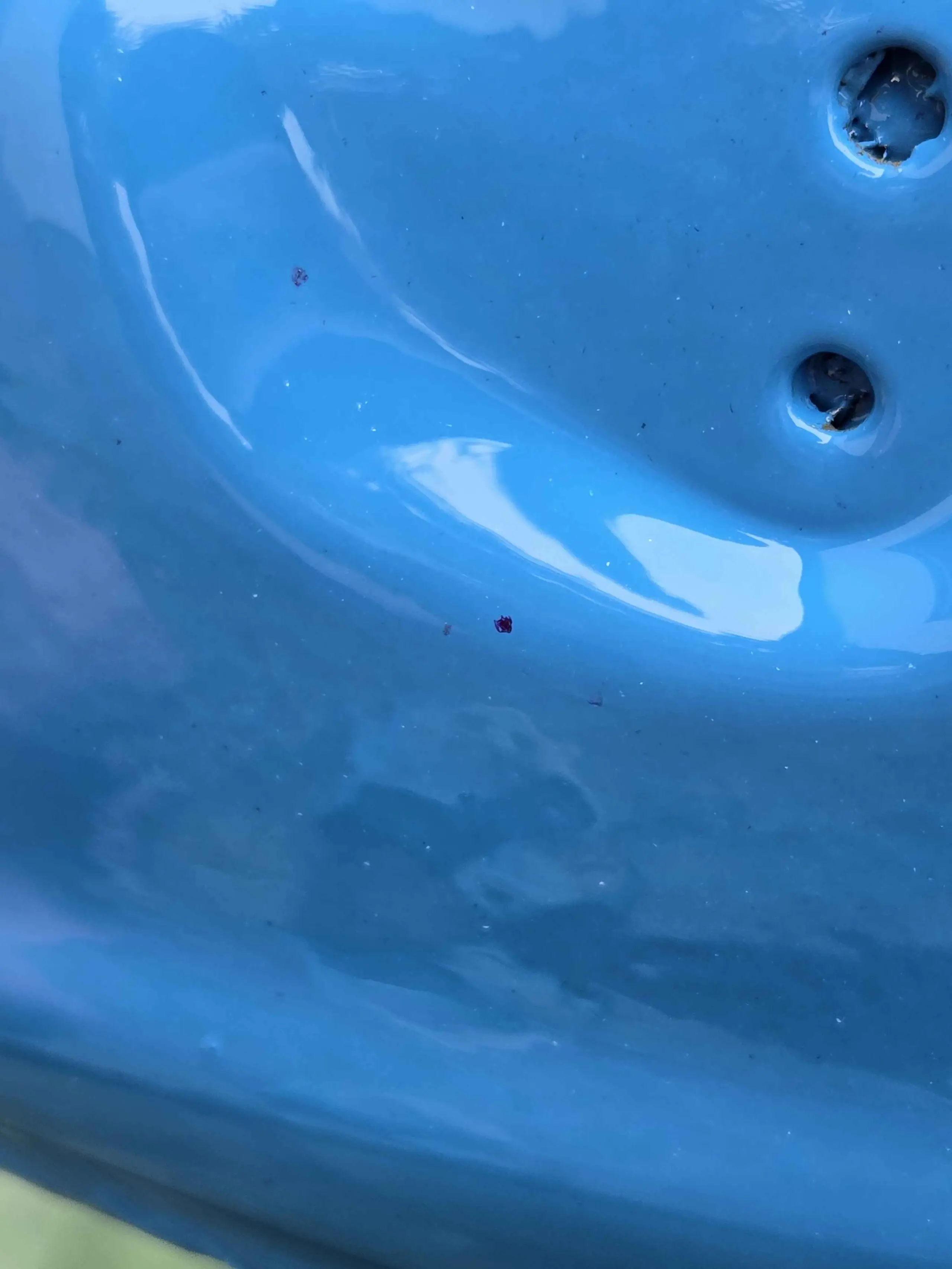
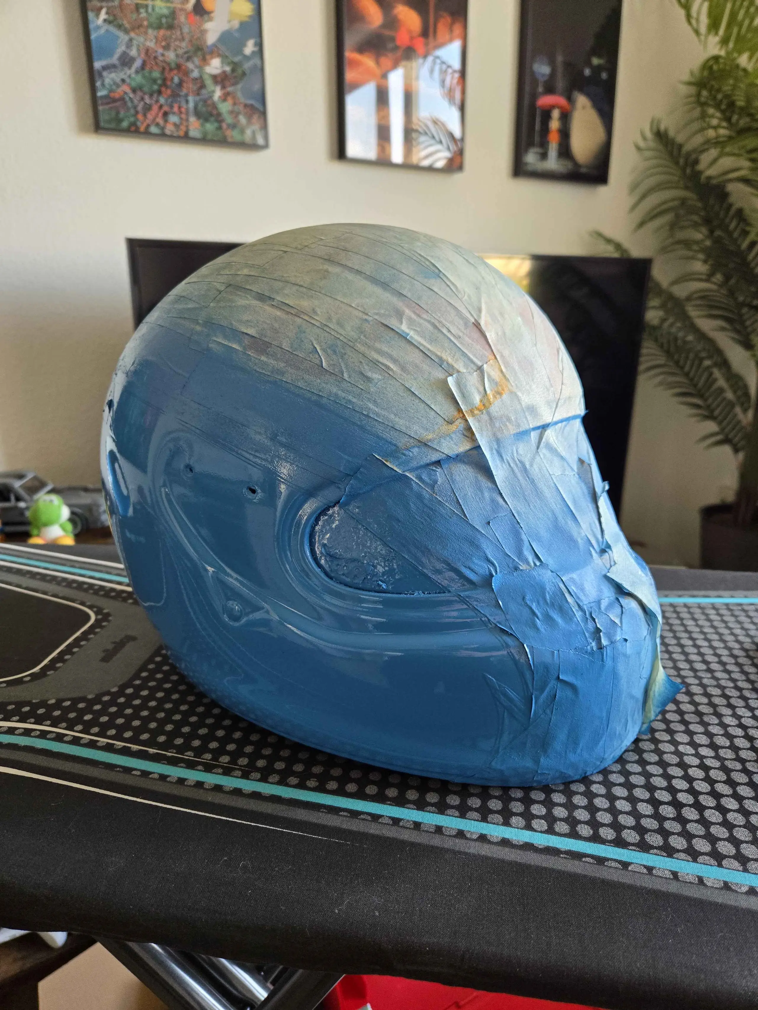
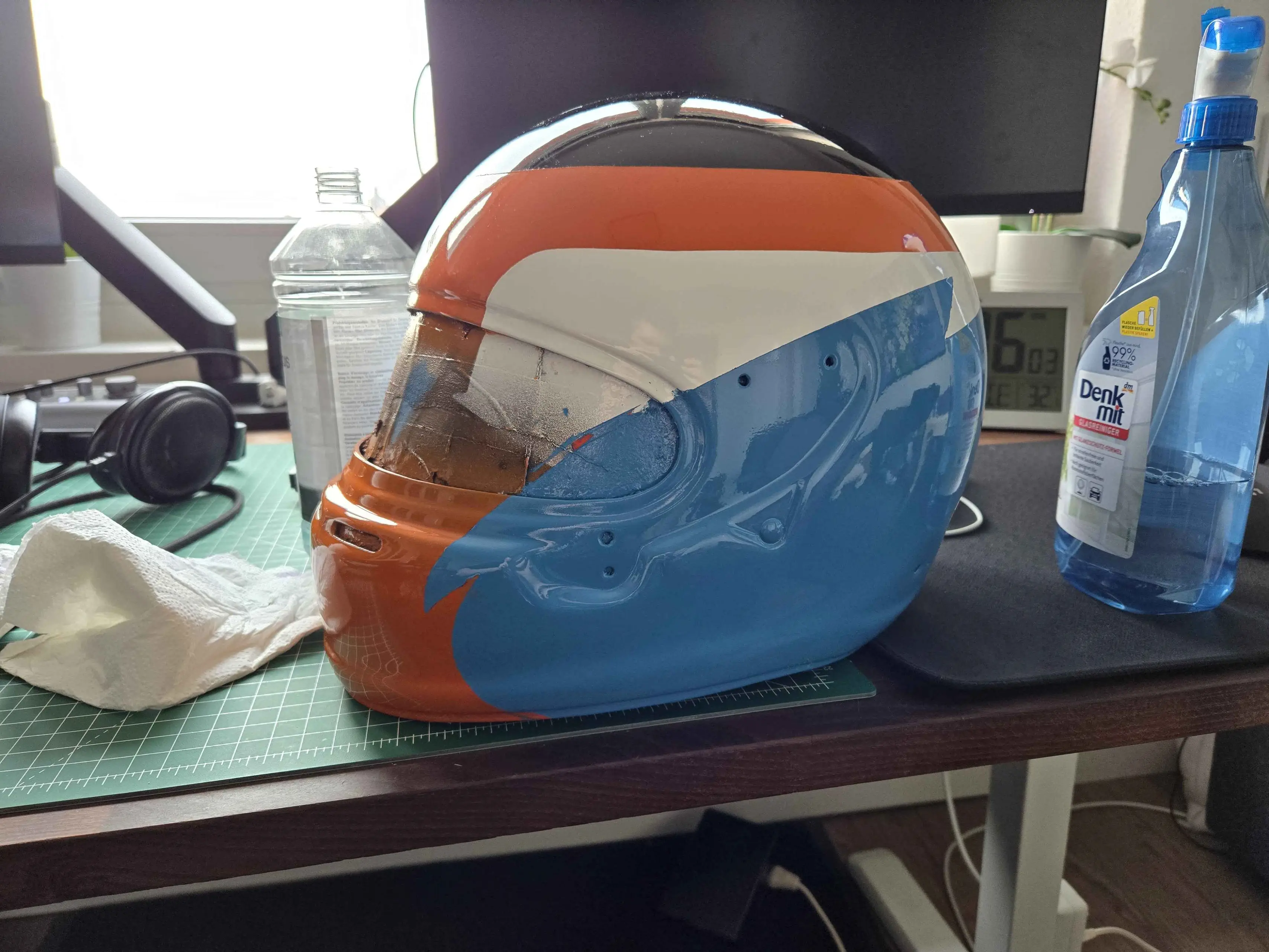
At this point, about a year and a half had passed since I last looked around for helmet photos online.
It was only the that I saw that the helmet was no longer with Frank Ocean or Ichiraku, but instead with a guy from the Netherlands as part of an exhibit called “Na Regen komt Neonlicht”. Would this be my chance to finally get my hands on detailed photos of the helmet?
The answer was no. I was genuinely considering just travelling to Arnheim, but it seems like I was just a tad bit too late. The exhibit was over. I emailed the guy, no response. Made an Instagram account just to DM him, no response after a month of waiting. I know I’m being somewhat petty here, but at only four thousand followers I was at least hoping he’d actually read his direct messages. Oh well.
Here are some videos showing the helmet up close that I ripped from TikTok lol
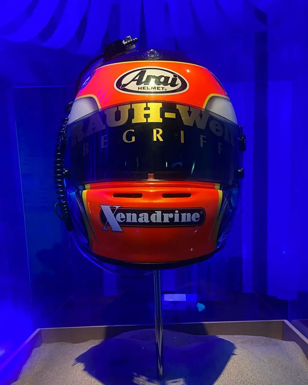
These videos confirm a few things that up until this point were big mysteries, at least to me.
The helmet had been sitting on a shelf for quite some time, and now, knowing that my paint choices were based on assumptions that turned out to be false, would have been a good time to cut my losses. But this isn’t the last paragraph of the blog post, so obviously I kept on going.
Since I do not have the necessary equipment to work on the helmet within my small apartment, I have had to travel to my parents’ place each time I wanted to apply a new coat of paint. With schedules colliding and me only getting to work on it during the summer months (because painting outdoors sucks ass in the winter and building an impromptu paint booth in the garage each time was not an option), things were moving incredibly slowly ever since I first started. The entire summer of ’25 was essentially off-limits, as family stuff got in the way. And with the 30th birthday of the recipient of the helmet swiftly approaching, I knew I wasn’t going to be the one to finish the job here. But I had tried by best. I’m putting this post up to show that I did indeed try. And at the end of the day, that’s what it’s all about, isn’t it?
I ended up contacting two painters in my area, one of which agreed to do the job. Remember how I said that airbrushing would be too expensive? Well, look at me eating my own words here. But I would rather pay the money than to have this project, after all this time, sit in a corner abandoned and collecting dust.
After a fair bit of back and forth, I dropped off the helmet along with all of my design files and reference materials sometime in November of 2025. I received a quote for the work that had to be done and we agreed on a deadline.
Time for me to get started on the remainder of things that I had put off for the longest time.
The painter told me that he would deal with the stickers on the helmet, but I was left with the visor sticker. I eventually landed on a company called Typographus, who were willing to do free-form gold foil cutouts. I’m fairly sure I messed up their margin template somewhat, but even if it’s 2mm smaller, it’s not like anyone would be able to tell. All in all it took about two weeks from start to finish, with me going over my Illustrator files a few times and a bit of back and forth via e-mail. The rainbow and black stickers were the ones I bought from that now defunct online shop, just as a size reference.
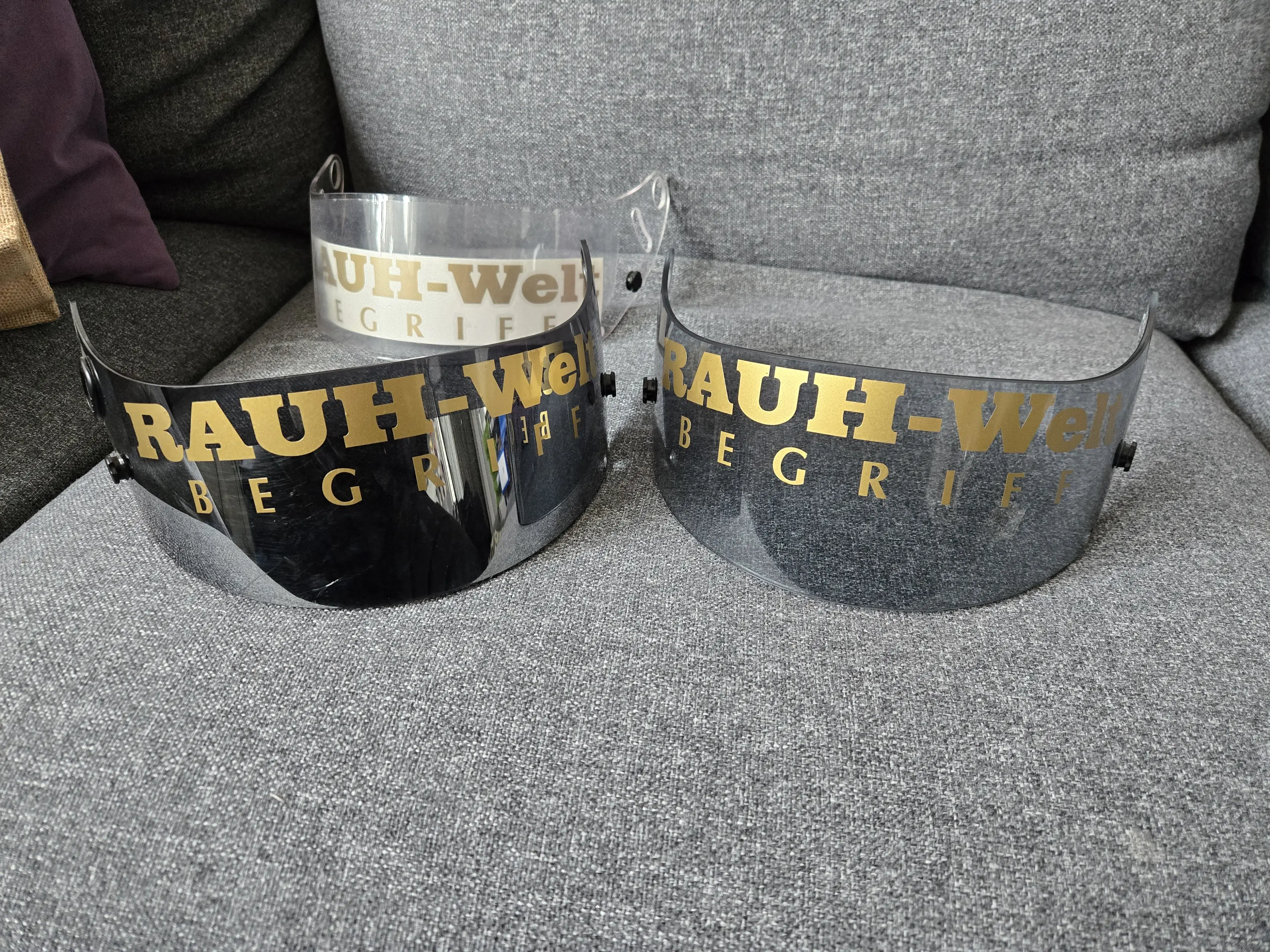
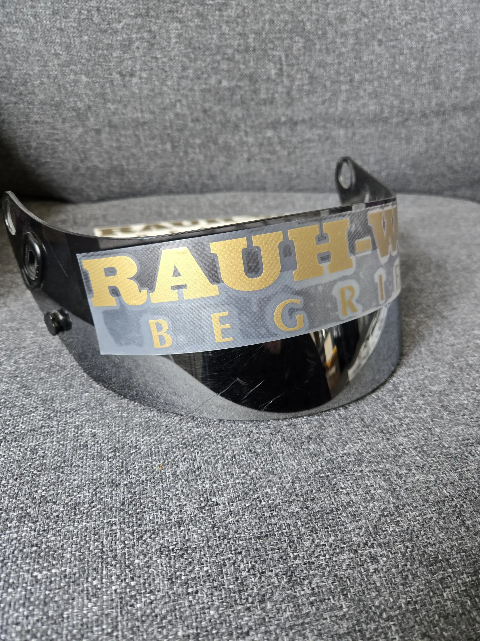
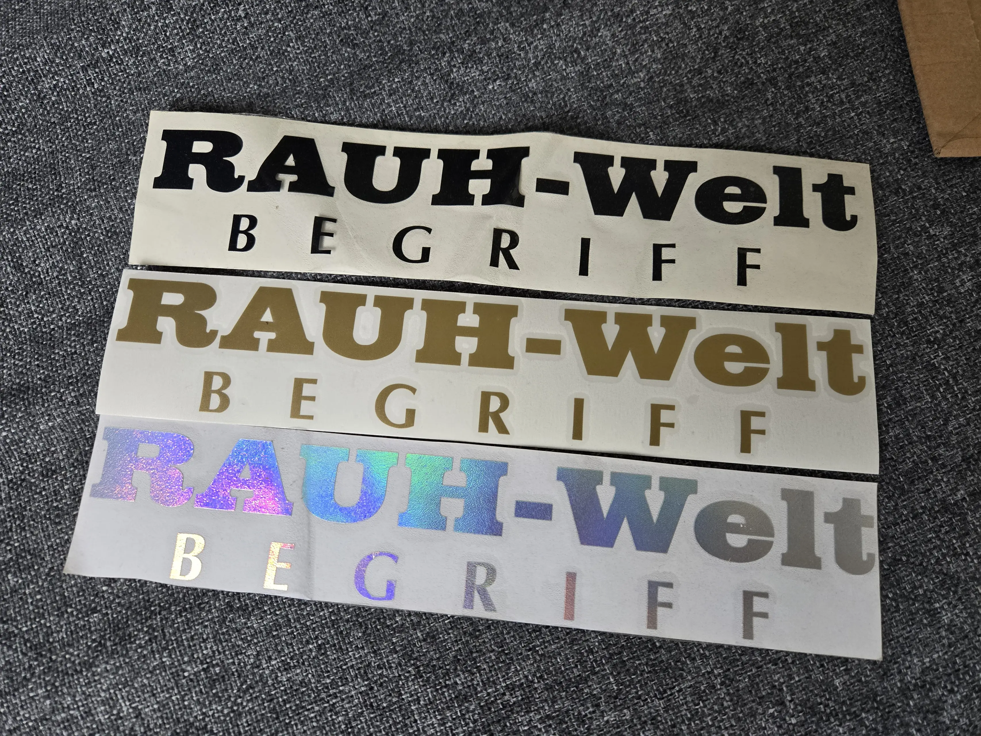
I also had to fix a problem that past me created during the disassembly process. One of the rubber trim bits had torn, so it was up to me to source a replacement. Arai does have an extensive replacement parts list for their helmets, but neither the 2017 nor the 2024 catalogue listed either of the trim pieces for the GP-6S. I ended up reaching out to Point Racing, an authorized dealer for Arai car helmets (with the GP-6S officially being up for sale there too, just to be sure), but was swiftly told that they would be unable to source the parts for me. I ordered generic replacements and crossed my fingers.
One thing should be noted: with Frank and/or his team seemingly going after online resources covering him and/or his work, see the blonded.blog takedowns etc., I will not be mentioning the painter or his company by name. I don’t want to cause them any trouble.
Now for the big one. When I originally dropped off the helmet, the painter and I discussed what colors to go with, since my original choices had essentially been disqualified by the recent discoveries. He told me right off the bat that the orange here was without a doubt a neon orange, much more vibrant than what I had picked out. Same with the yellow. Not neon, but more vibrant than what I would have gone with. We both agreed that the previously black parts would have to be a very dark metallic blue with a slight hint of purple, which would really only reveal its true color under sunlight. The trickiest color to figure out was the light blue. It was the one that shifted the most from one reference photo to another.
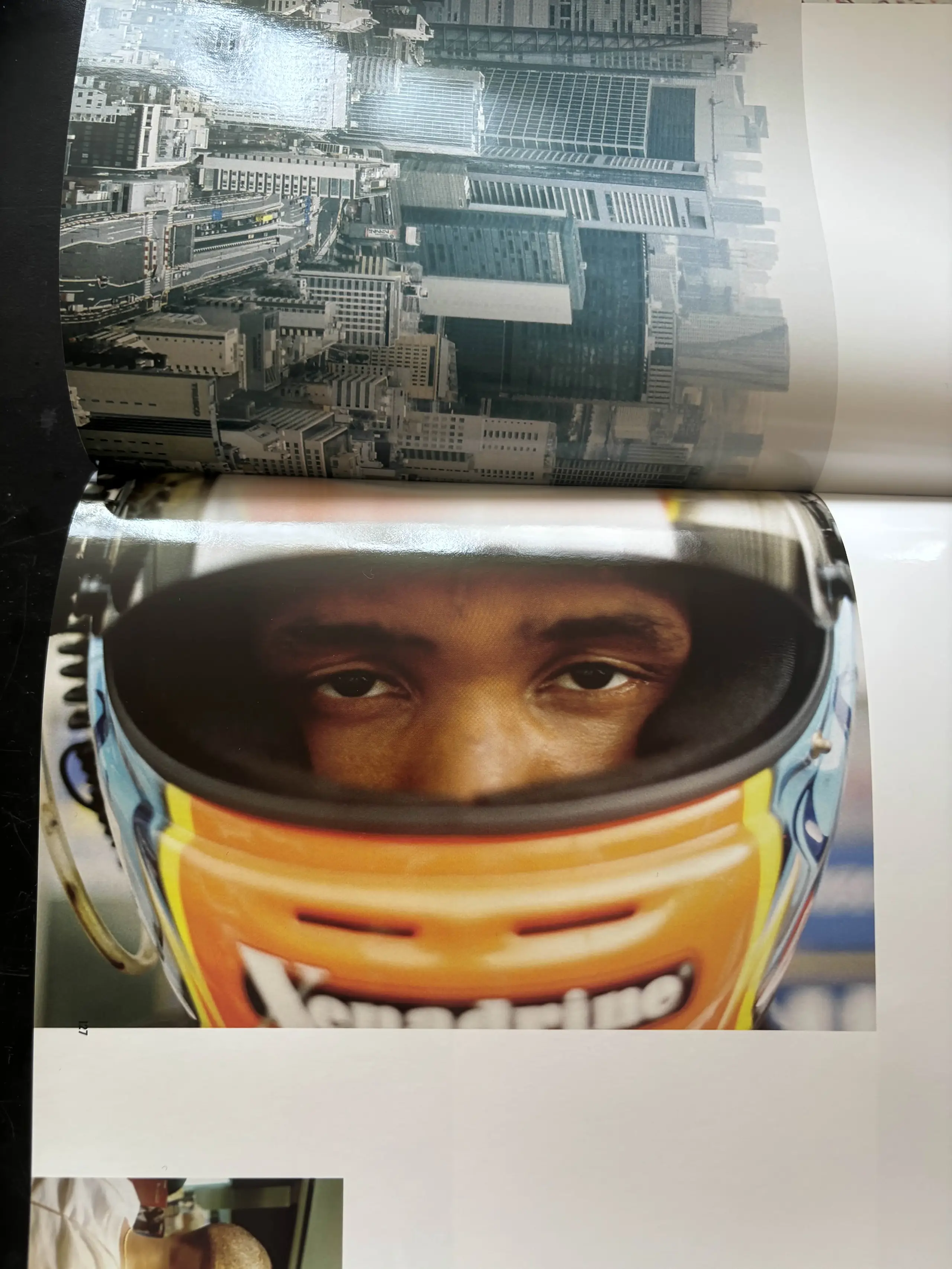
If you’re only used to seeing the cover image with the red hue, then the final color might seem awfully bright. There are barely any photos of it under proper sunlight, besides that one of Ichiraku sitting in his car. But there is one more photo hidden away in the giant Boys Don’t Cry artbook that helps us try and approximate the shade of blue:
With all of that out of the way, let’s look at the helmet step by step.
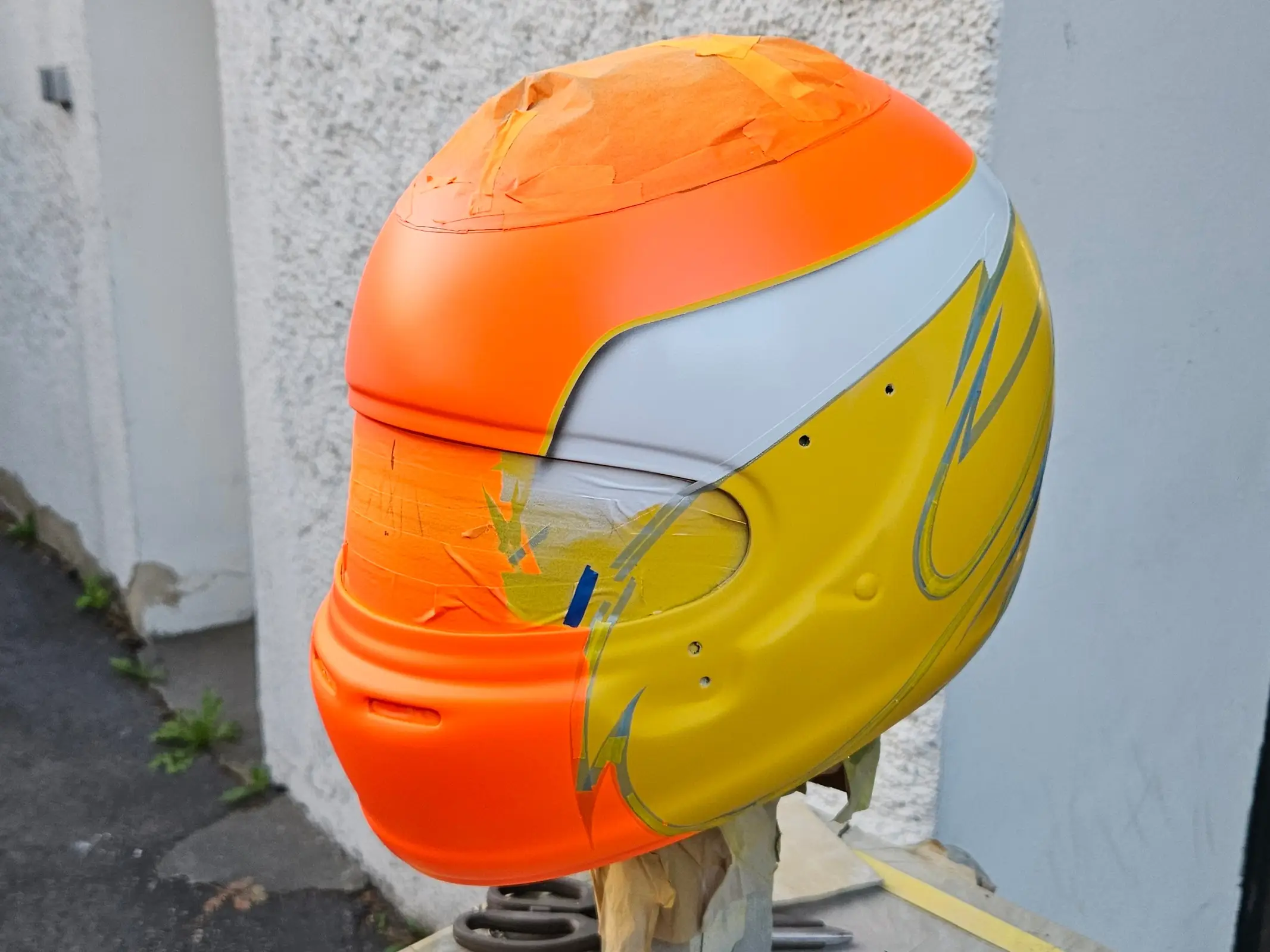
Unlike me, who could start with a black base coat, here the coverage of the white paint meant that yellow had to be the first coat to be laid down.
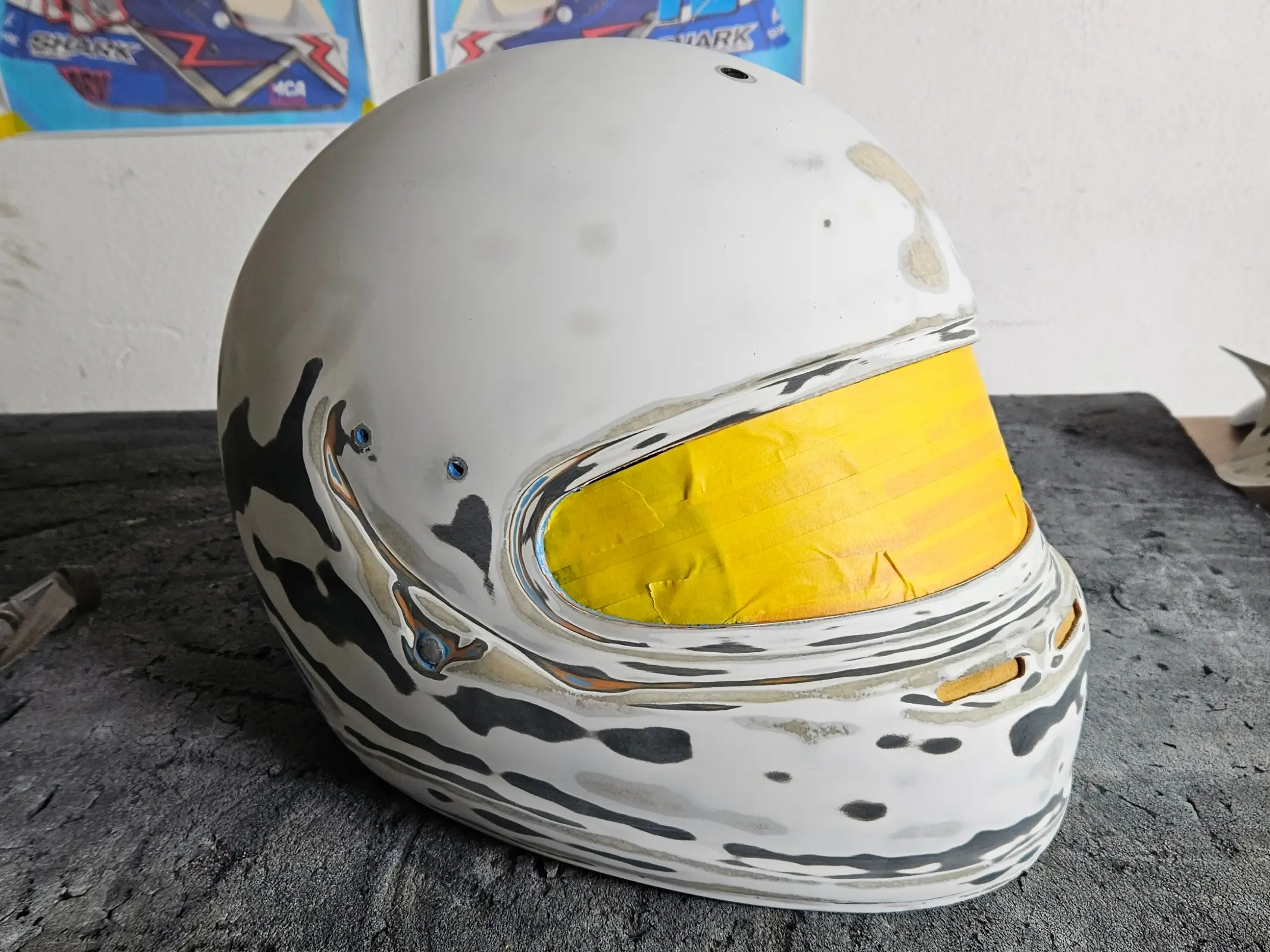
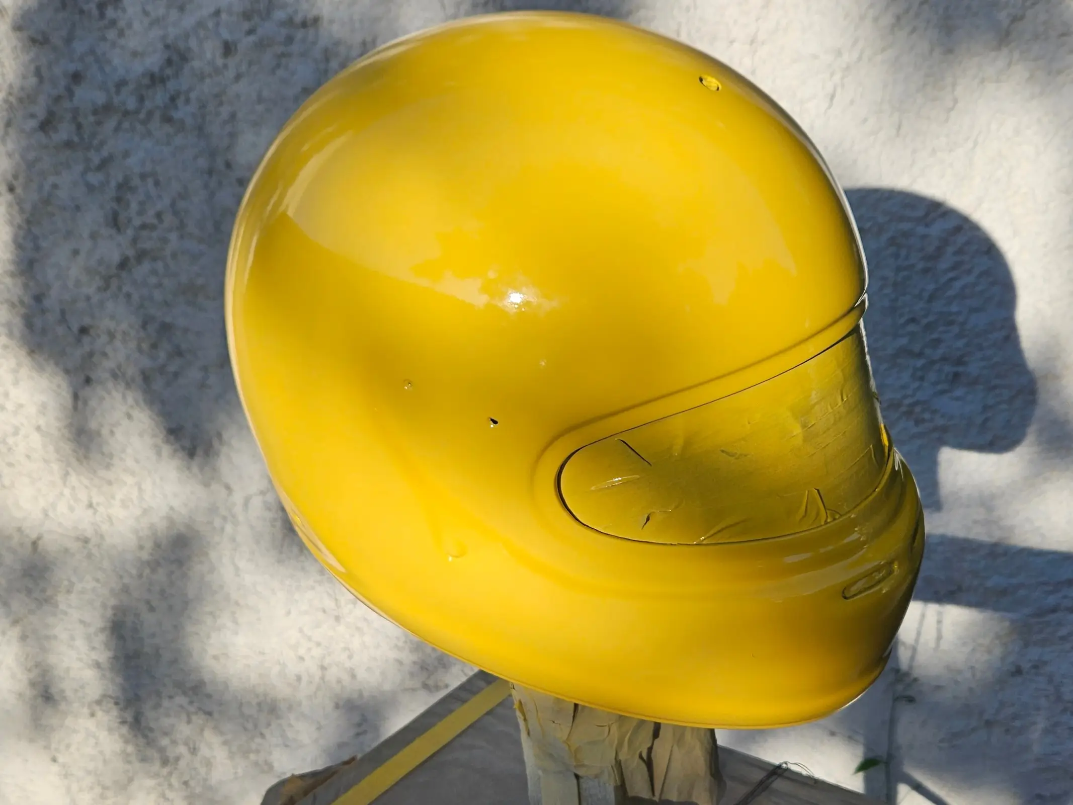
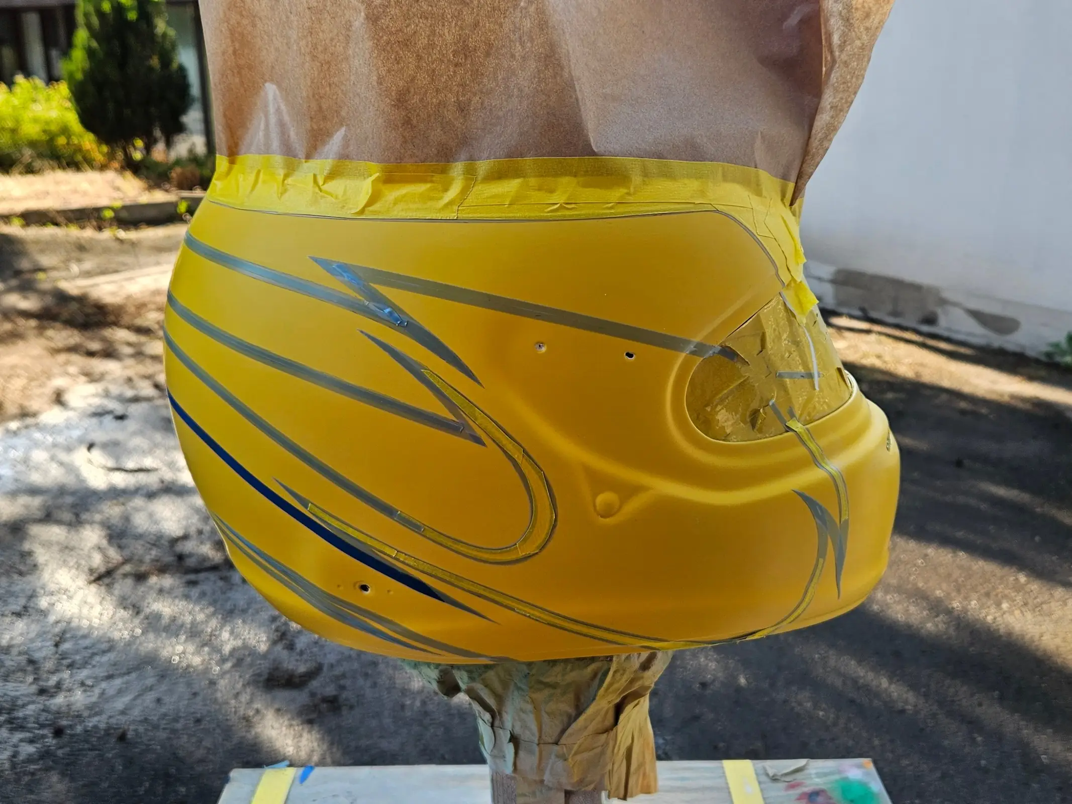
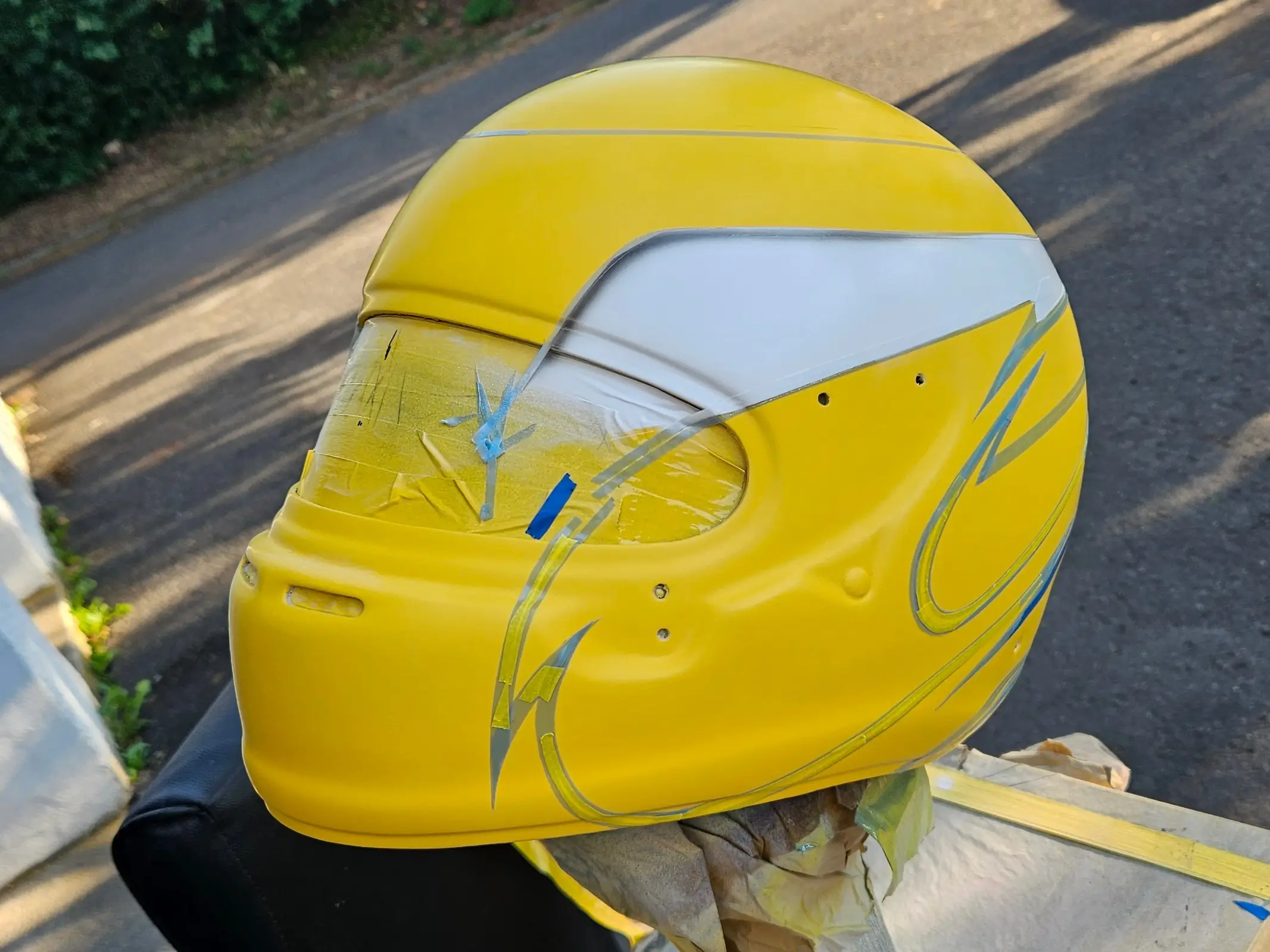
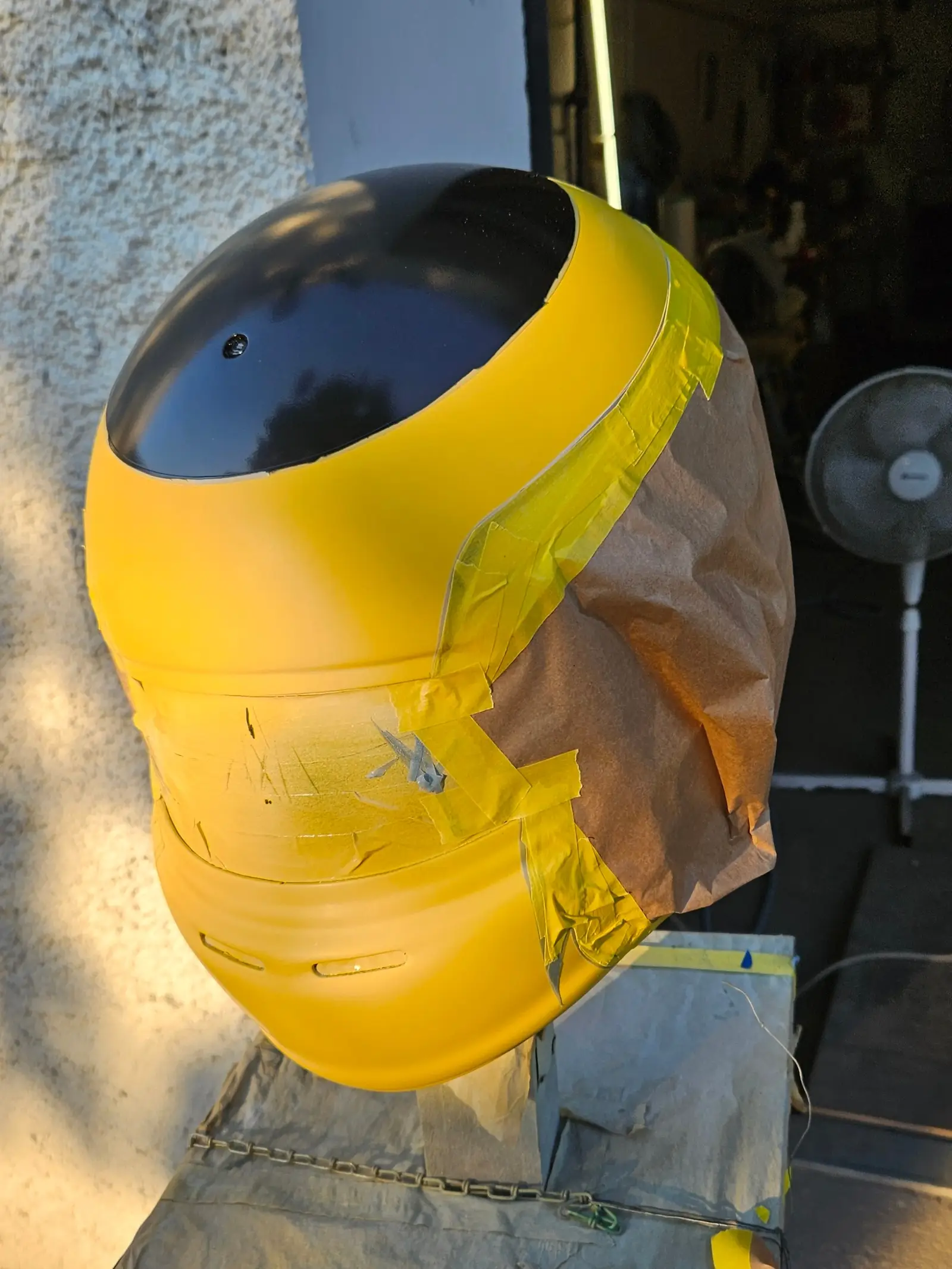
The neon orange was the most delicate and therefore frustrating coat to do. I was told that it took multiple attempts to get right. It does look incredible though.
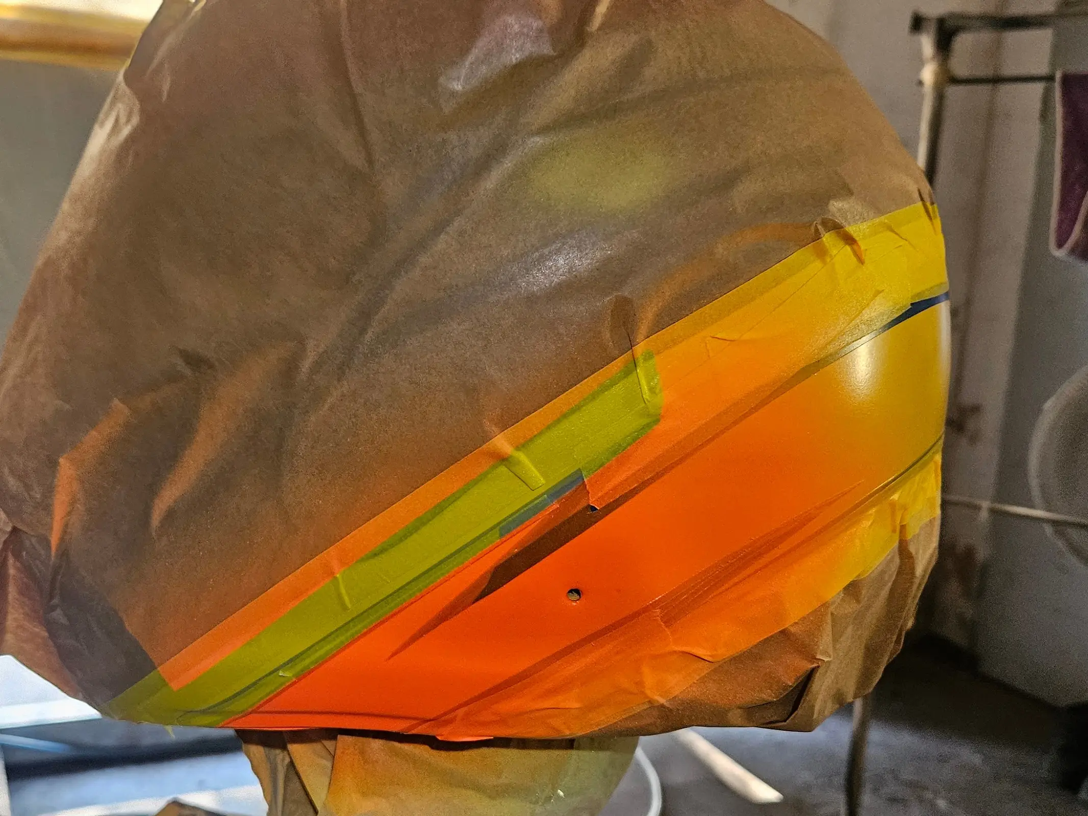
Even without any sanding or clear coat you can already see what the metallic effect will look like by the end.
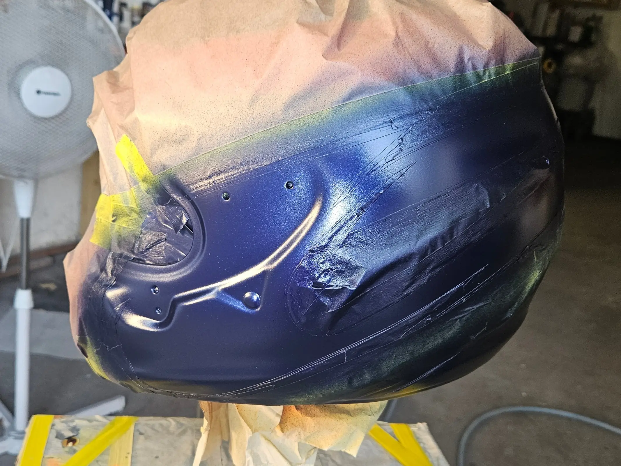
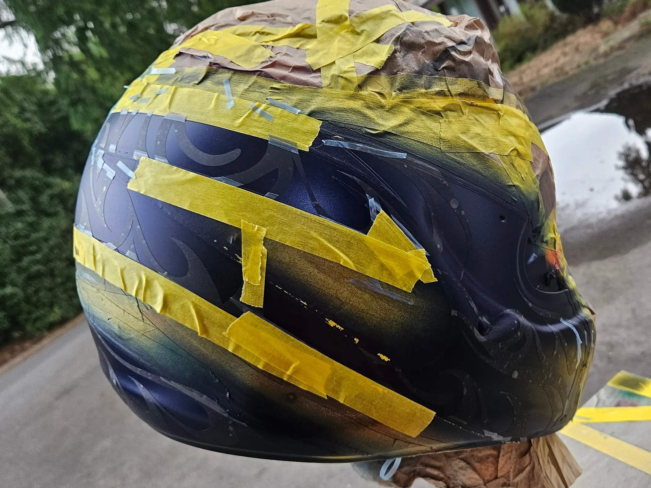
Here you can see the flames on the back, reconstructed by those two frames visible in that one video.
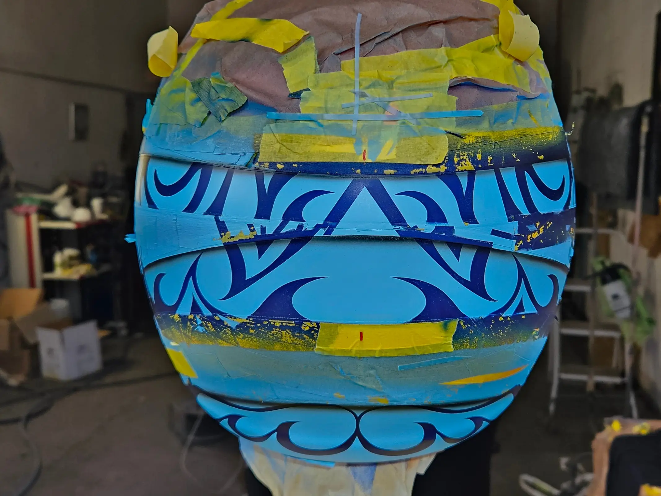
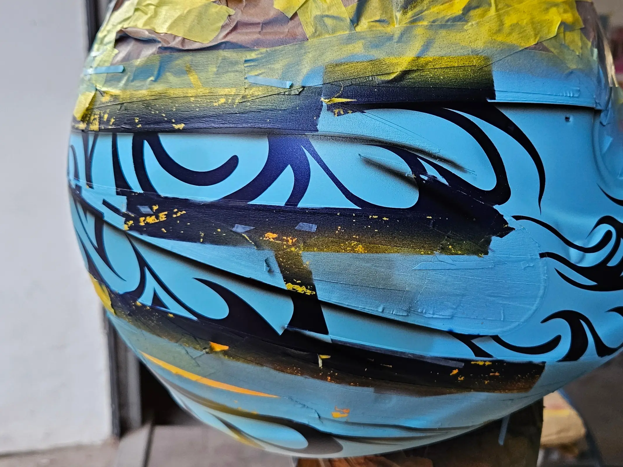
With the masking tape off, you can see where this is going.
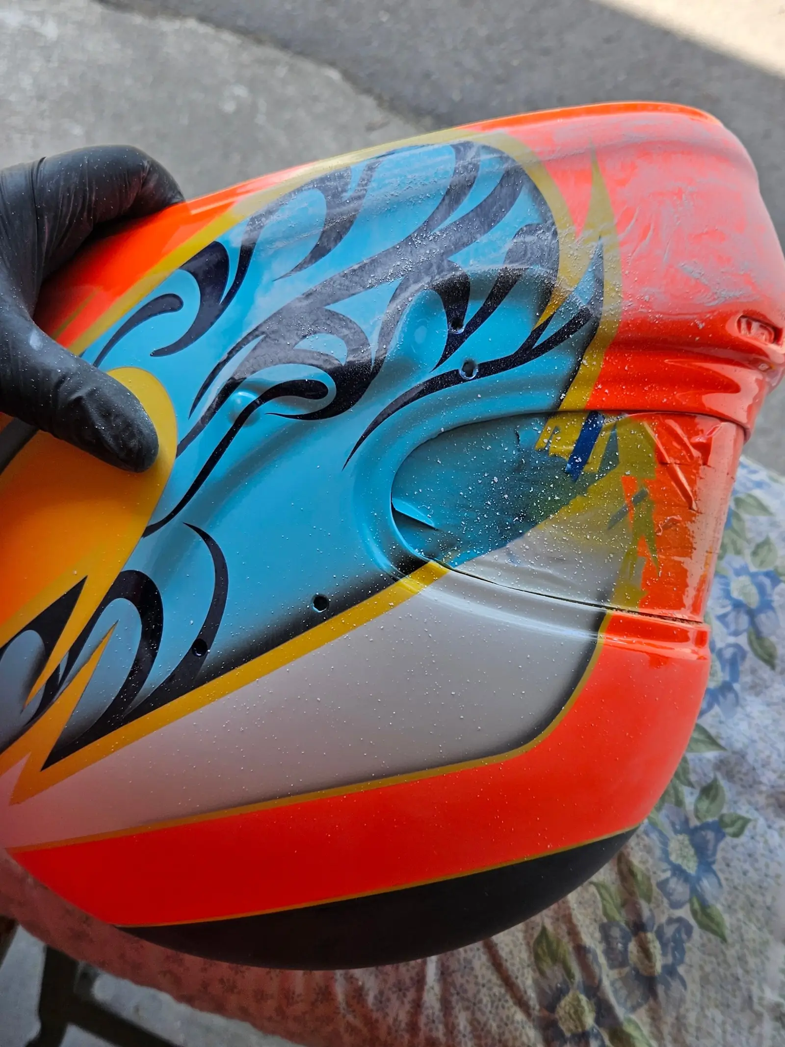
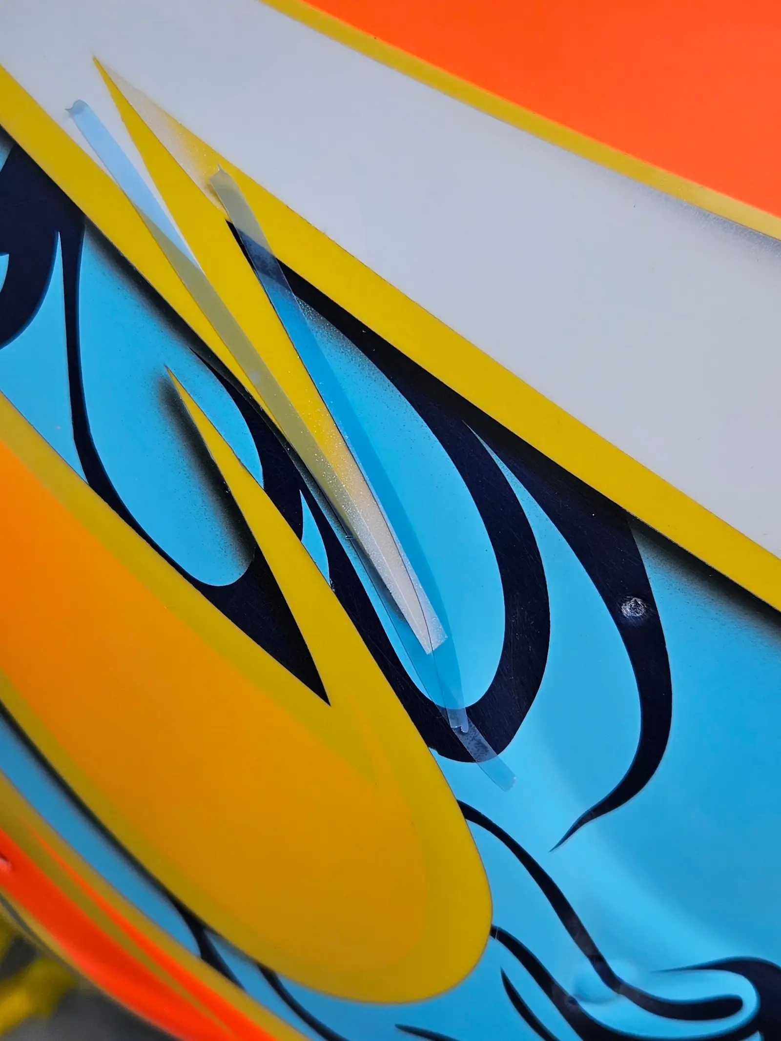
Now come the two-tone gradients in the corners of the flame outlines.
And the logos! Oh my god, the logos. When we first discussed how they would be done, both him and I agreed that stickers would be the most appropriate option, but he later told me that several attempts to mimic the look of the logos present on the real helmet by warping them in various ways digitially and printing them, had gone nowhere. Especially the Xenadrine one. So masking them by hand was determined to be the better option, which is just insane to me. Even the little registered trademark logos, that’s just nuts!
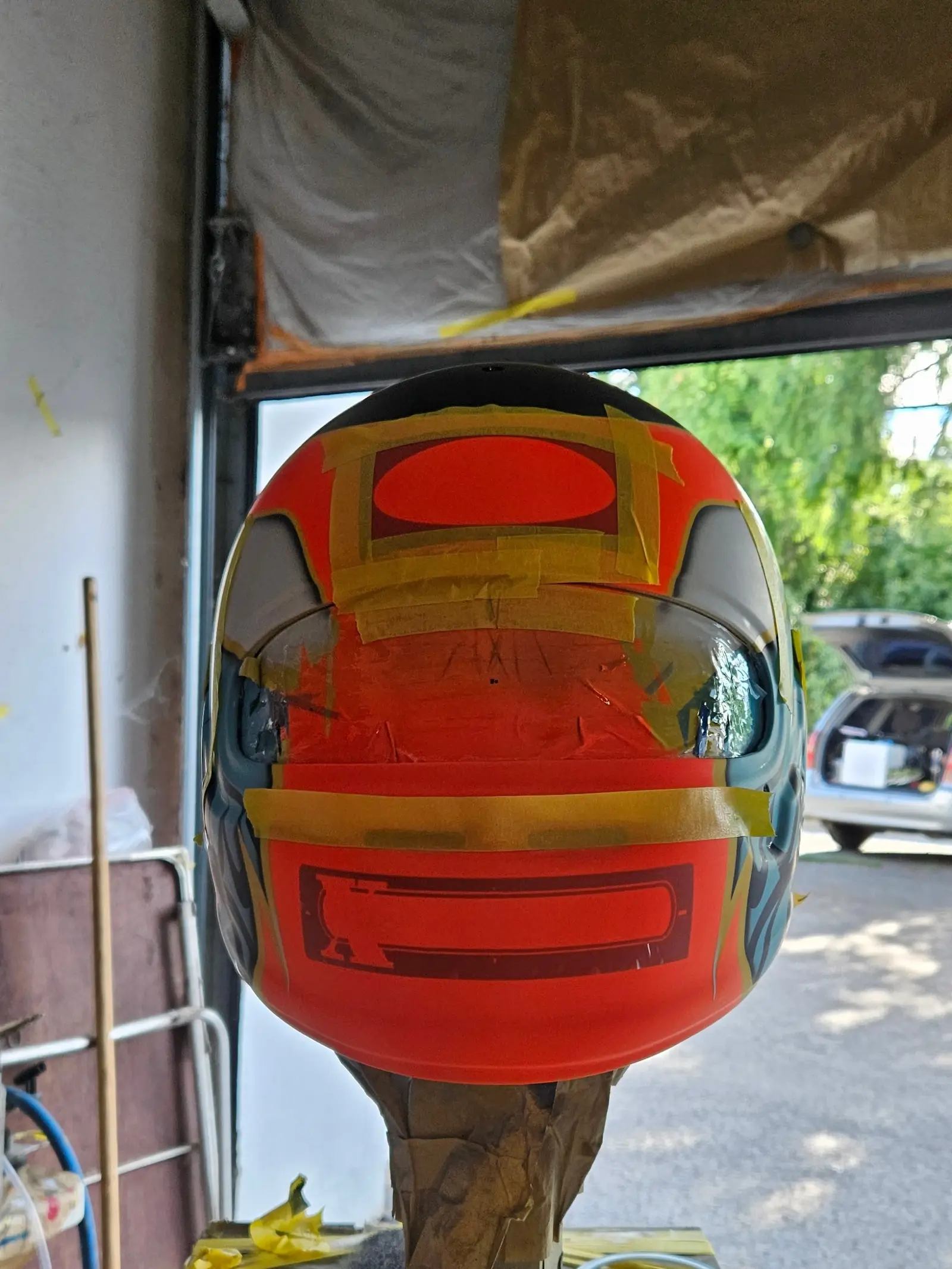
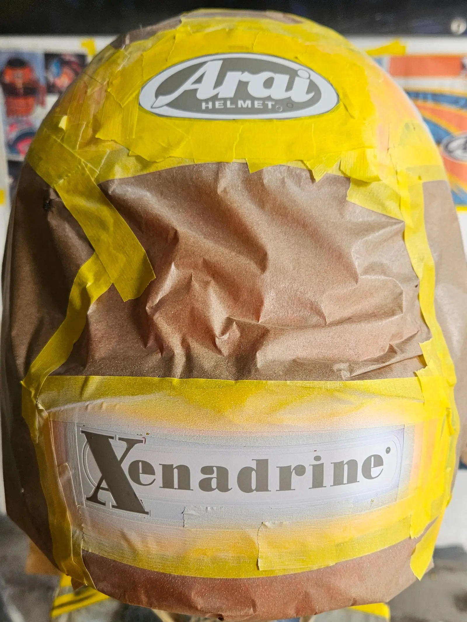
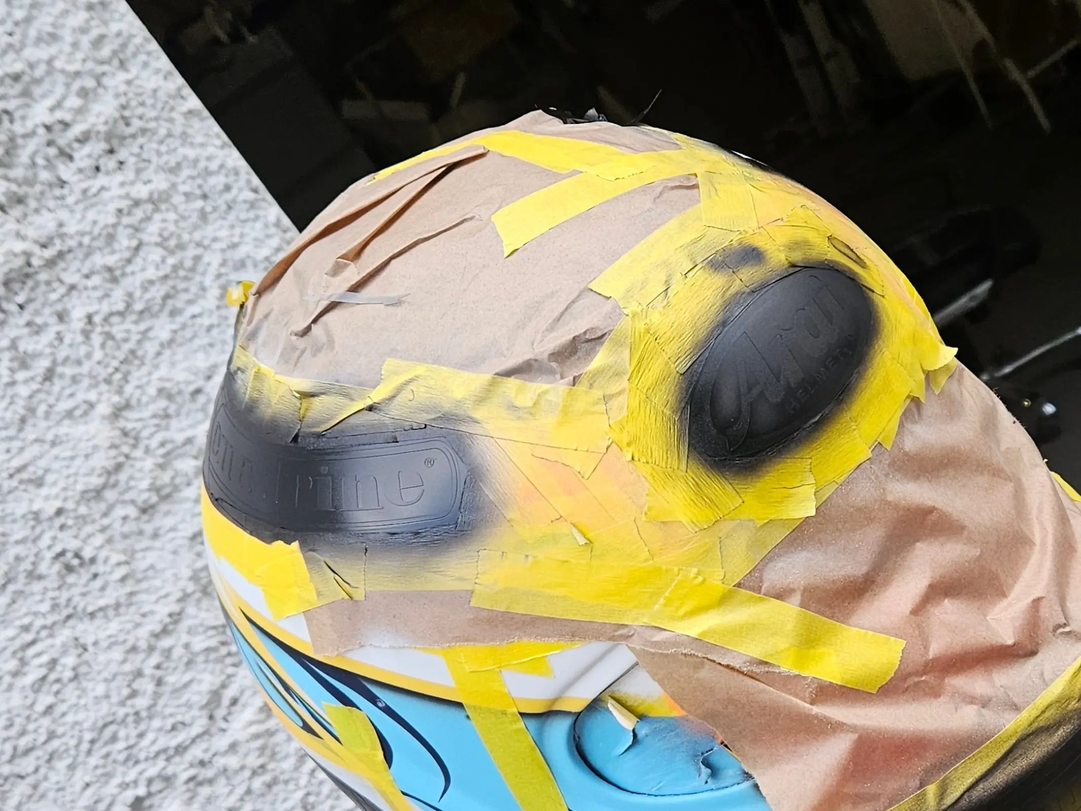
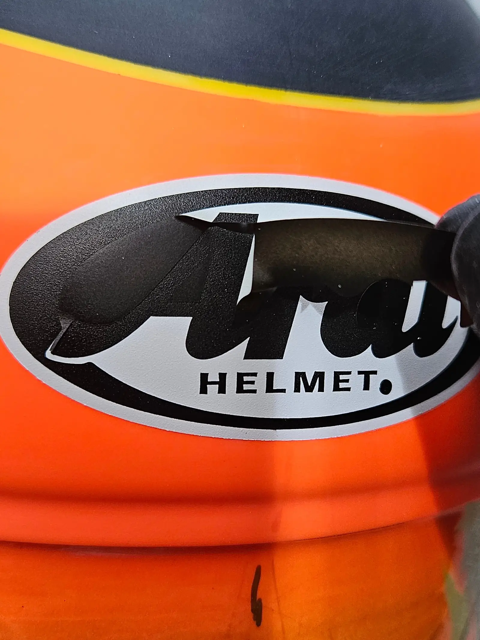
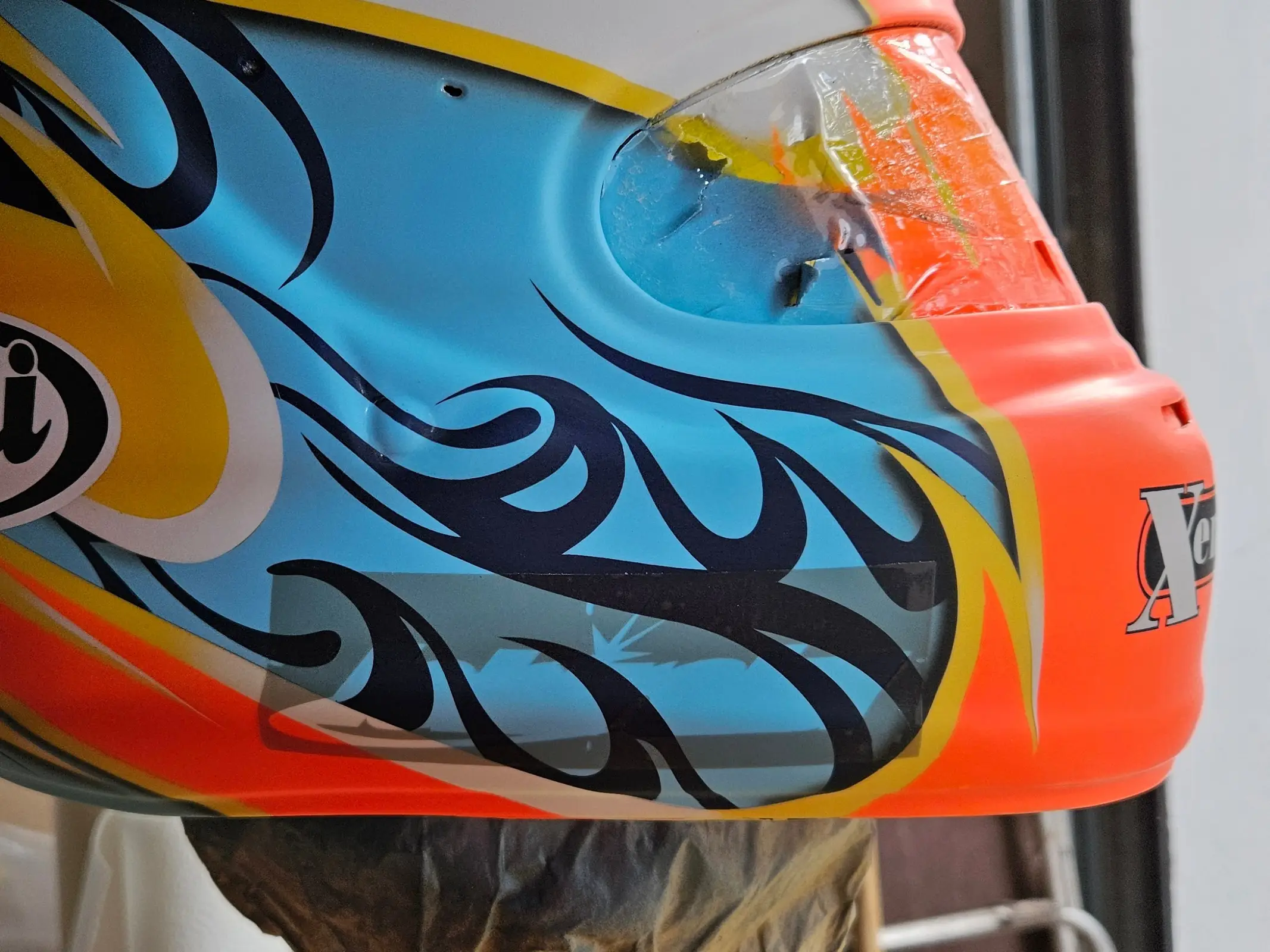
And with that, we’re now on the home stretch. I can already see the finish line.
First, the rubber bits. The ones around the visor were done with thinly applied all purpose adhesive and clamped into place. This ended up leaving small bumps in the rubber but they will be hidden underneath the visor so that really did not concern me. Doing it bit by bit did take forever though…
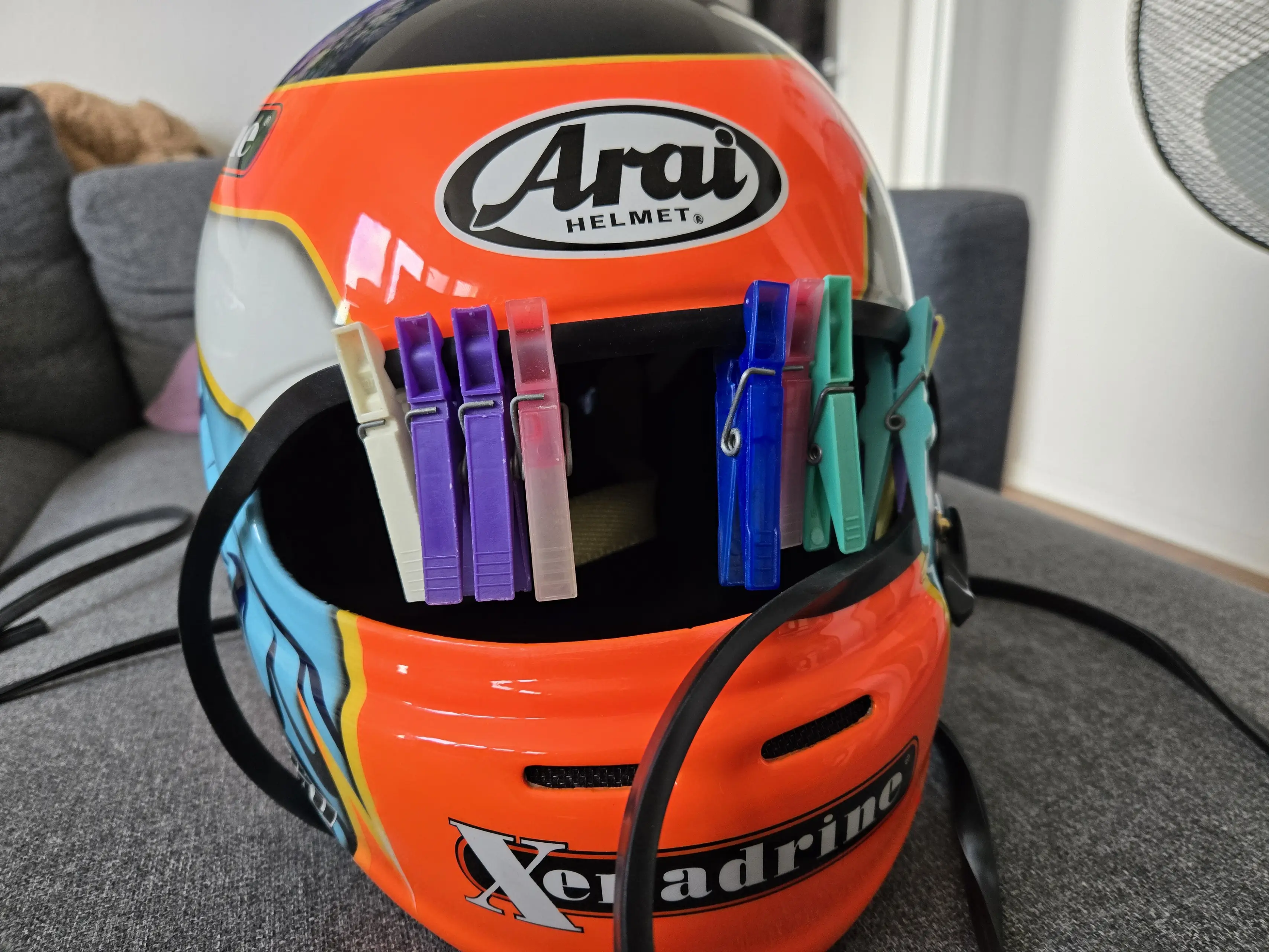
For the strip around the bottom edge I first tried superglue. I went around the rim and spot-glued it all into place, only to realize that the height of the rubber was not up to the task.
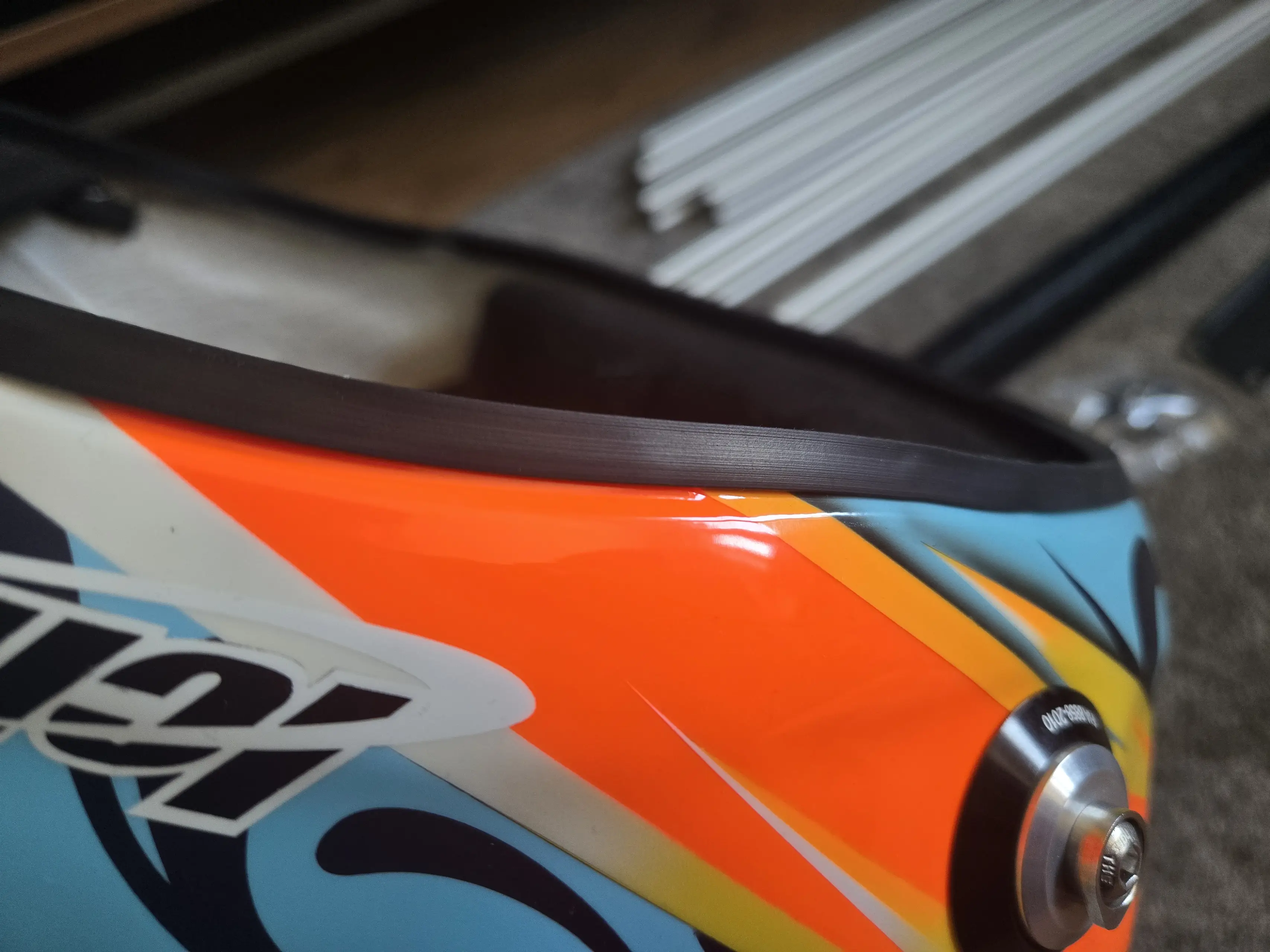
Thankfully there are adhesive removers for Cyanacrylate. It says on the instructions to have it soak and dissolve the glue overnight. Well, sucks to be me, because in some places the paint underneath the glue had started dissolving. Luckily it wasn’t in an area that would end up being visible, but still, I did almost panic when I first saw that.
I ended up ordering a much taller rubber trim piece with adhesive strips on the inside, meaning I would not have to deal with glue again… Worked like a charm. You’ll see it in the final set of photos.
The visor was also a breeze, after scraping all the excess paint from the threaded holes.
While the painting was still ongoing, I ordered an Arai GP-6 shield lock kit from AFB Motorsport, because I stripped the screw during disassembly. I also bought a few different ducts straight from Japan: a Delta Duct 5 in Smoke/Frost Black (101903) and in Glass Blue (104908) as well as a GP-6S Rear Duct in Clear (104889).
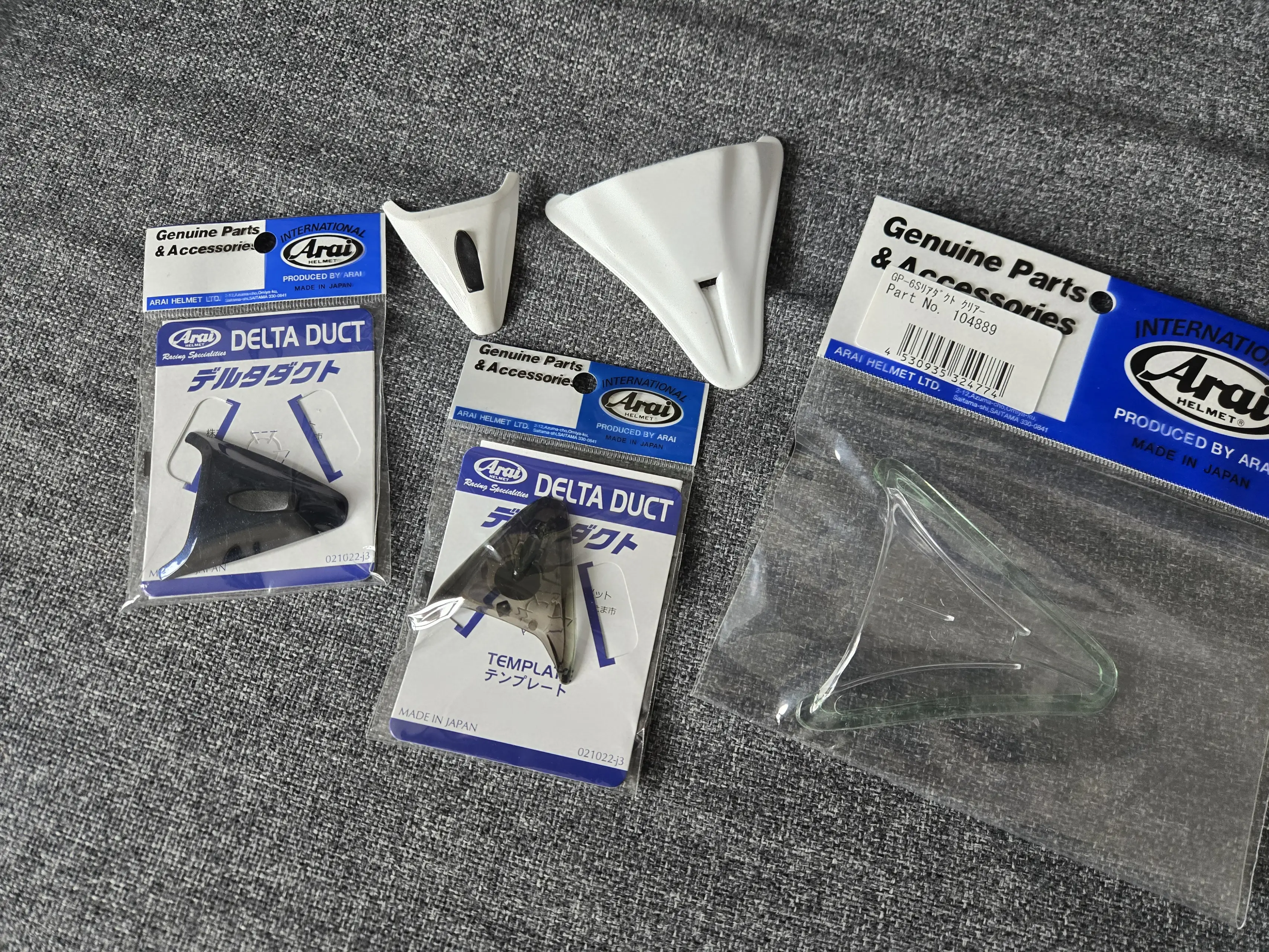
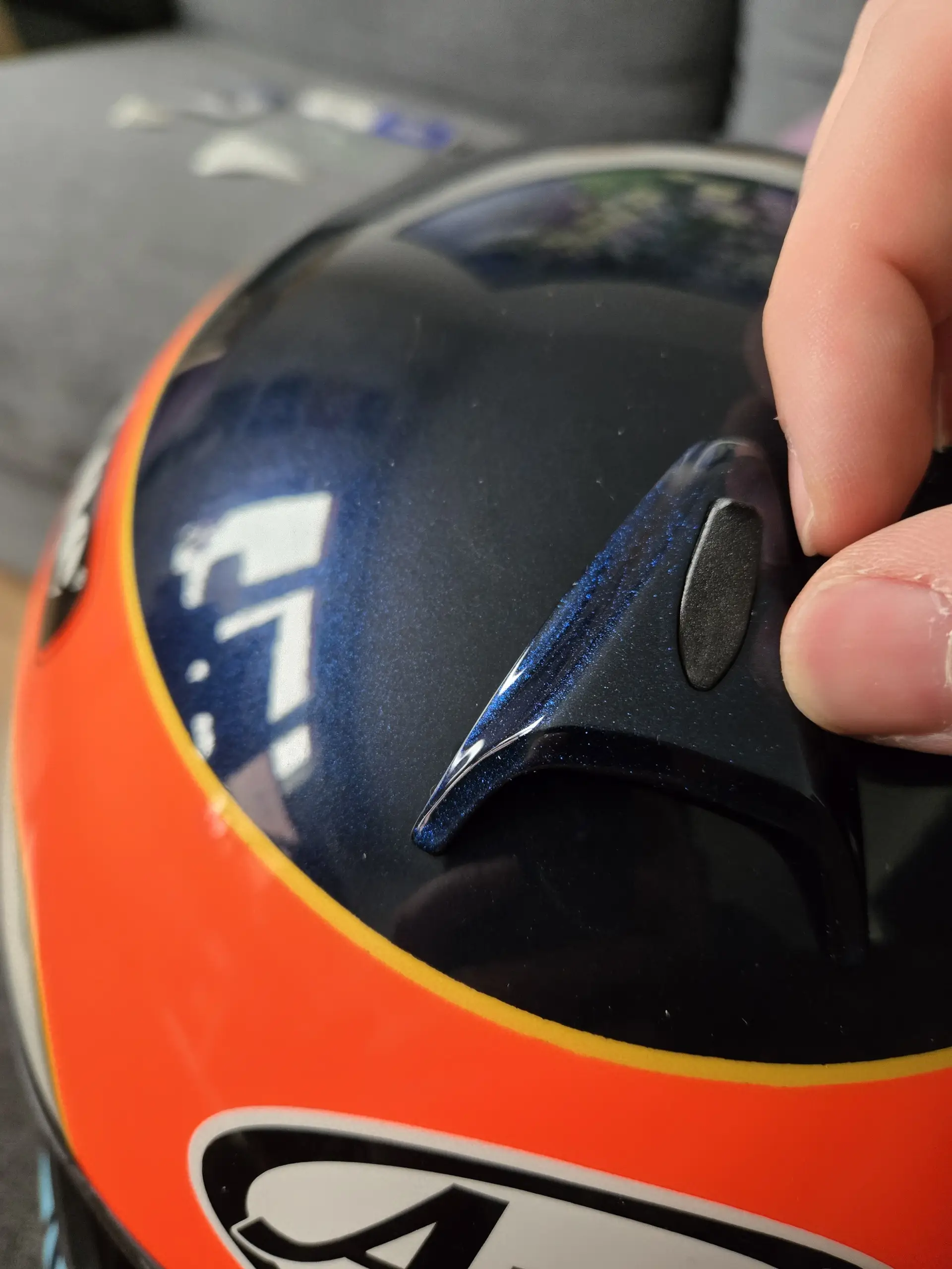
Turns out, through sheer luck, the glass blue front duct was an exact match for the metallic blue on the helmet!
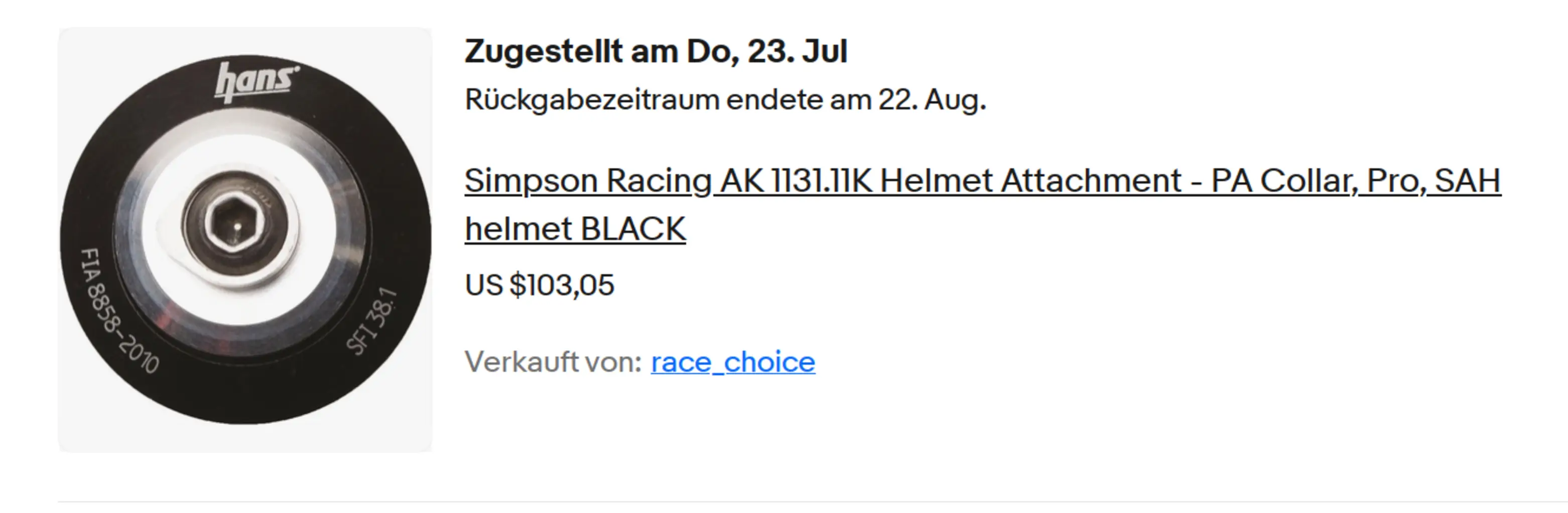
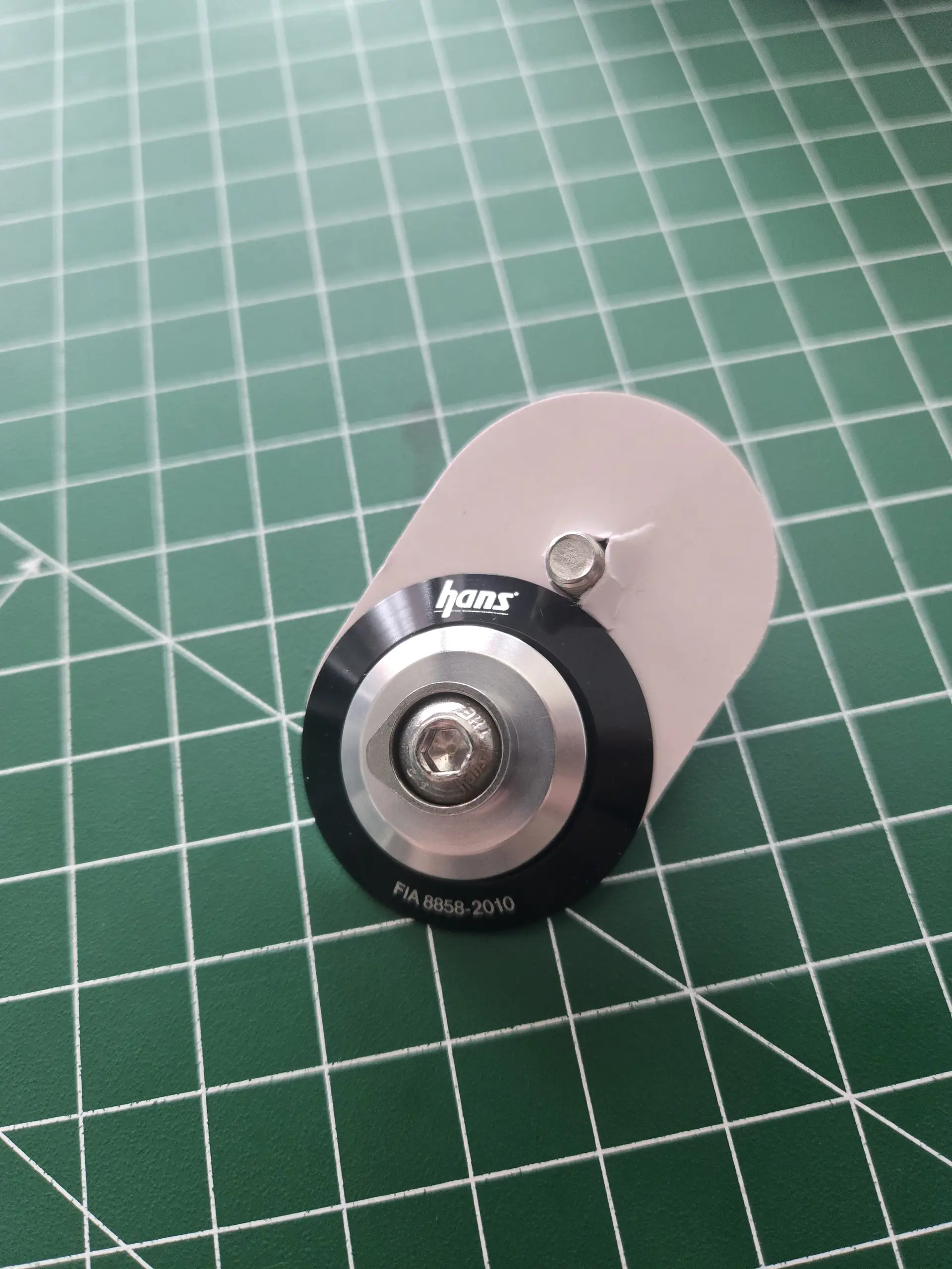
That only leaves one last thing: the HANS posts. They changed the design over the years, moving the text around, but I was determined to find ones with the old design to match! I tracked down a pair and even paid a whole bunch extra to have them imported from the US. Go on, flip over to the second image. BETRAYAL.
But with that, it was all done. Finished.
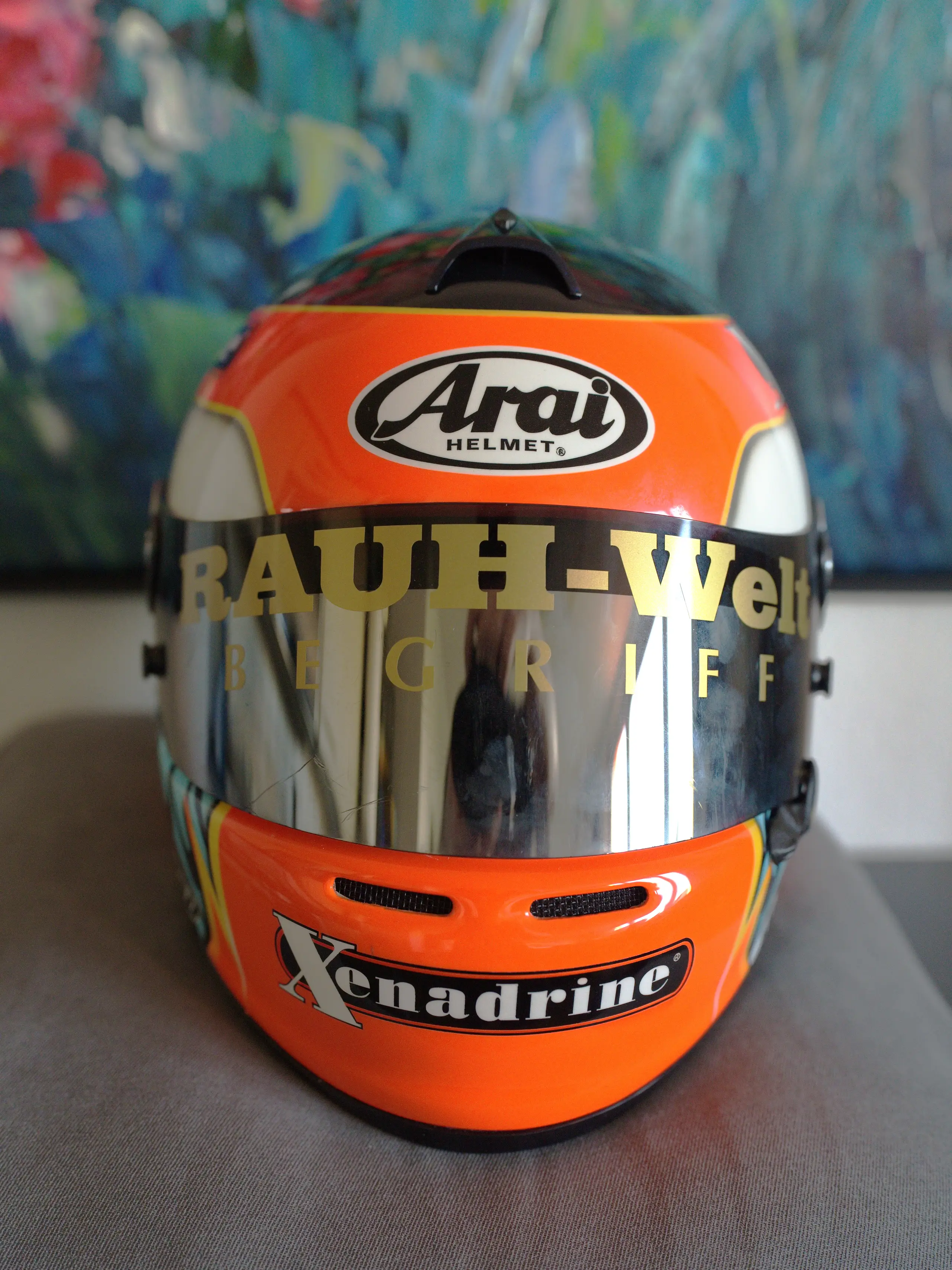
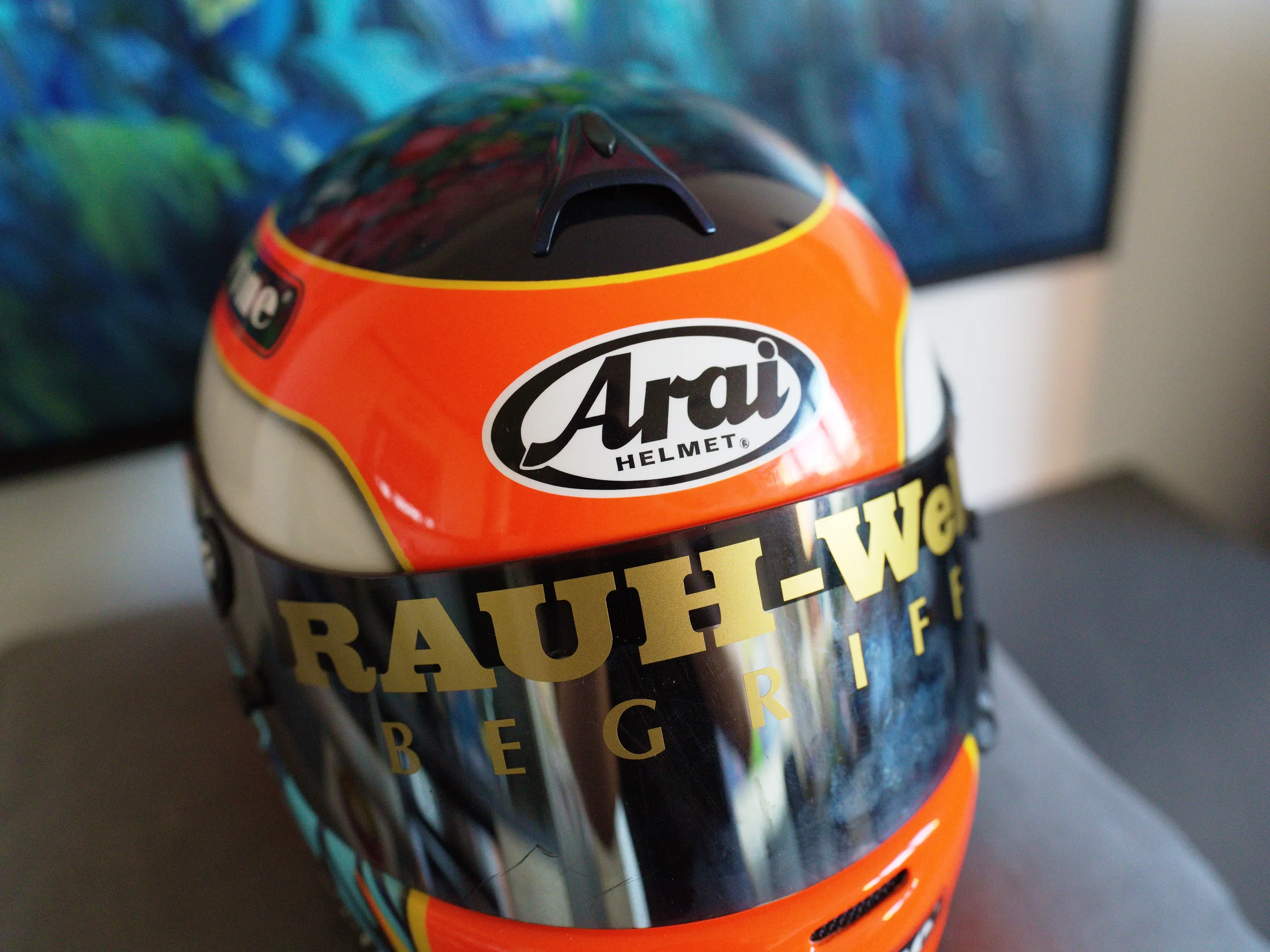
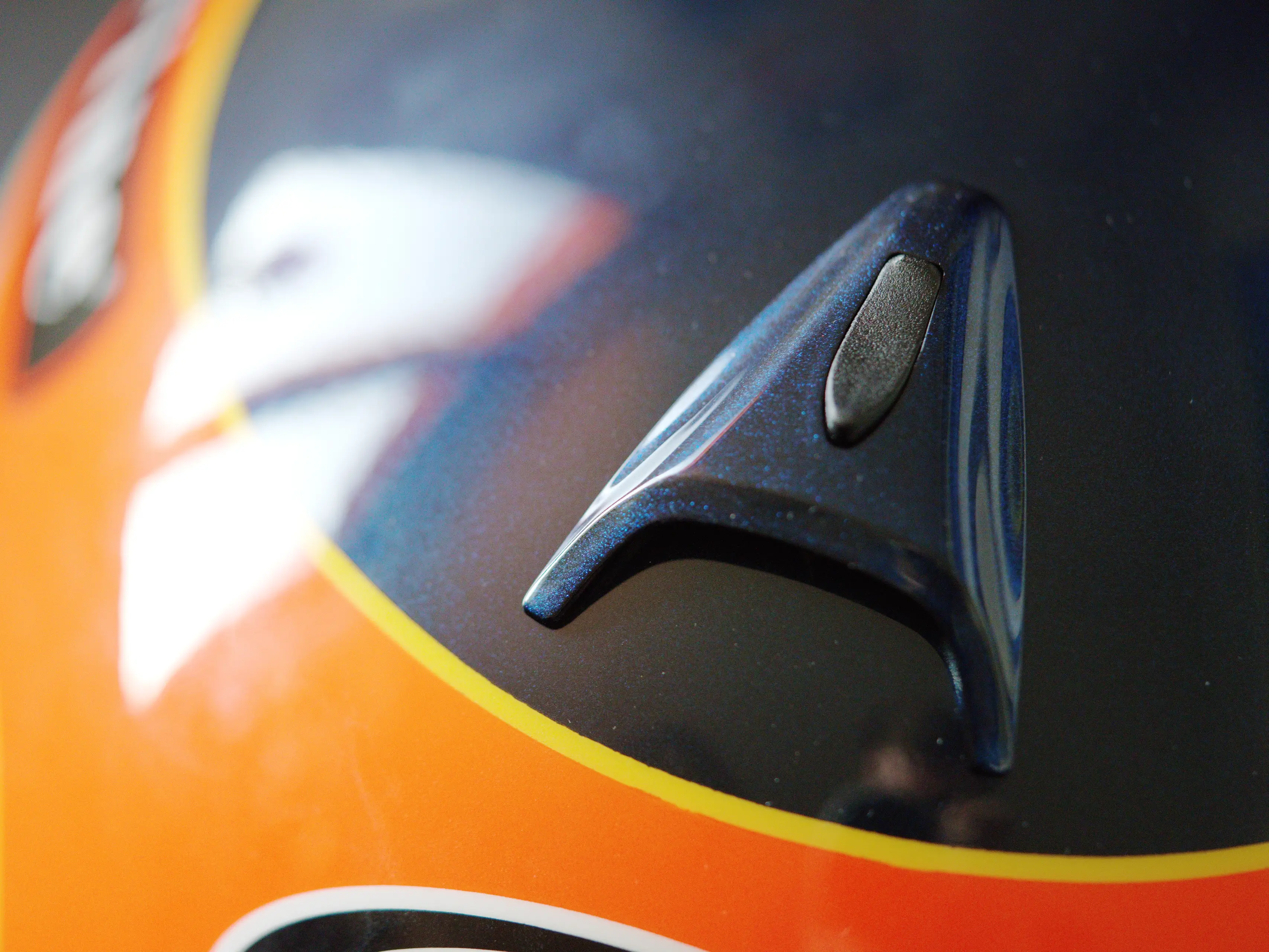
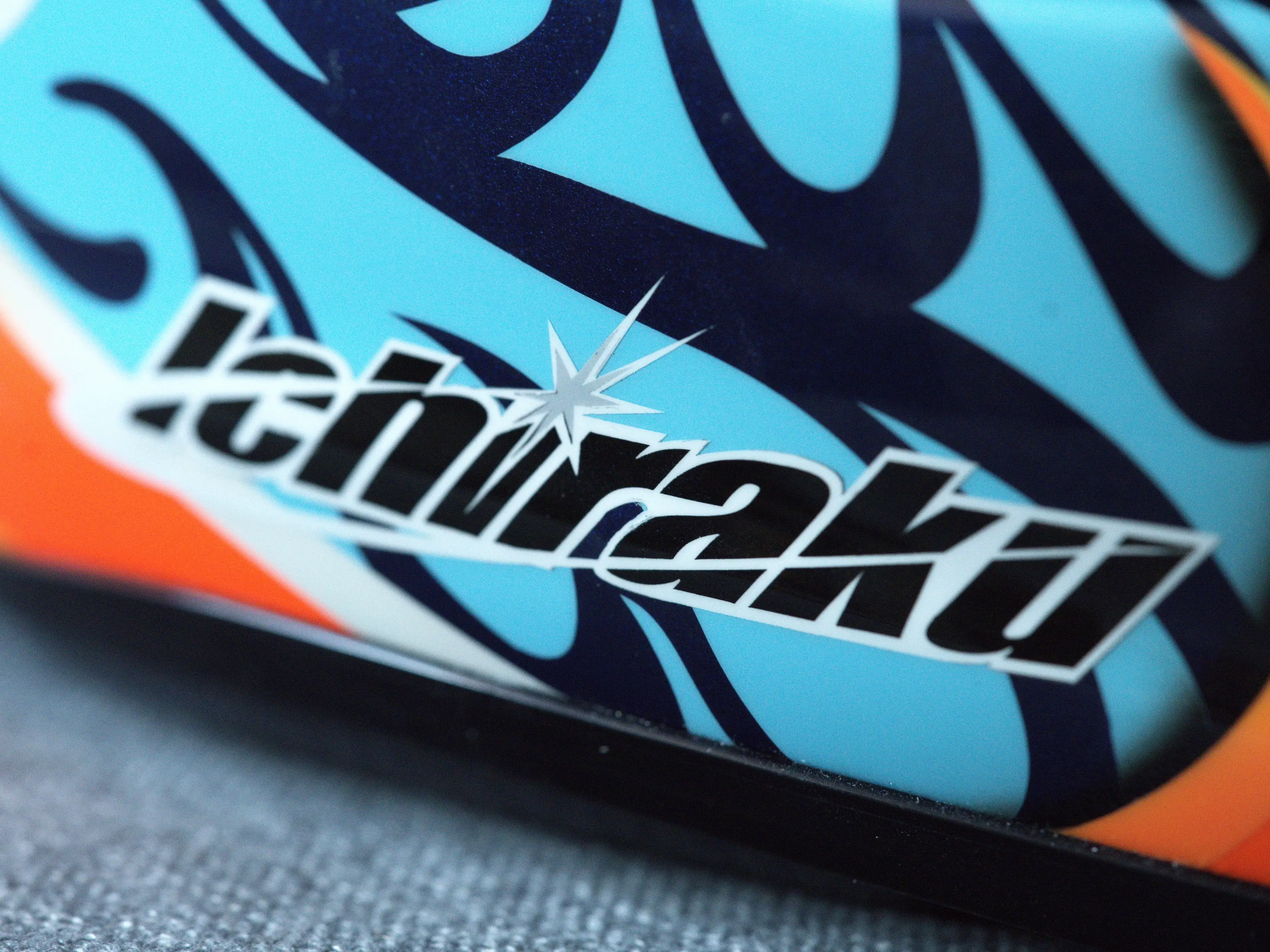
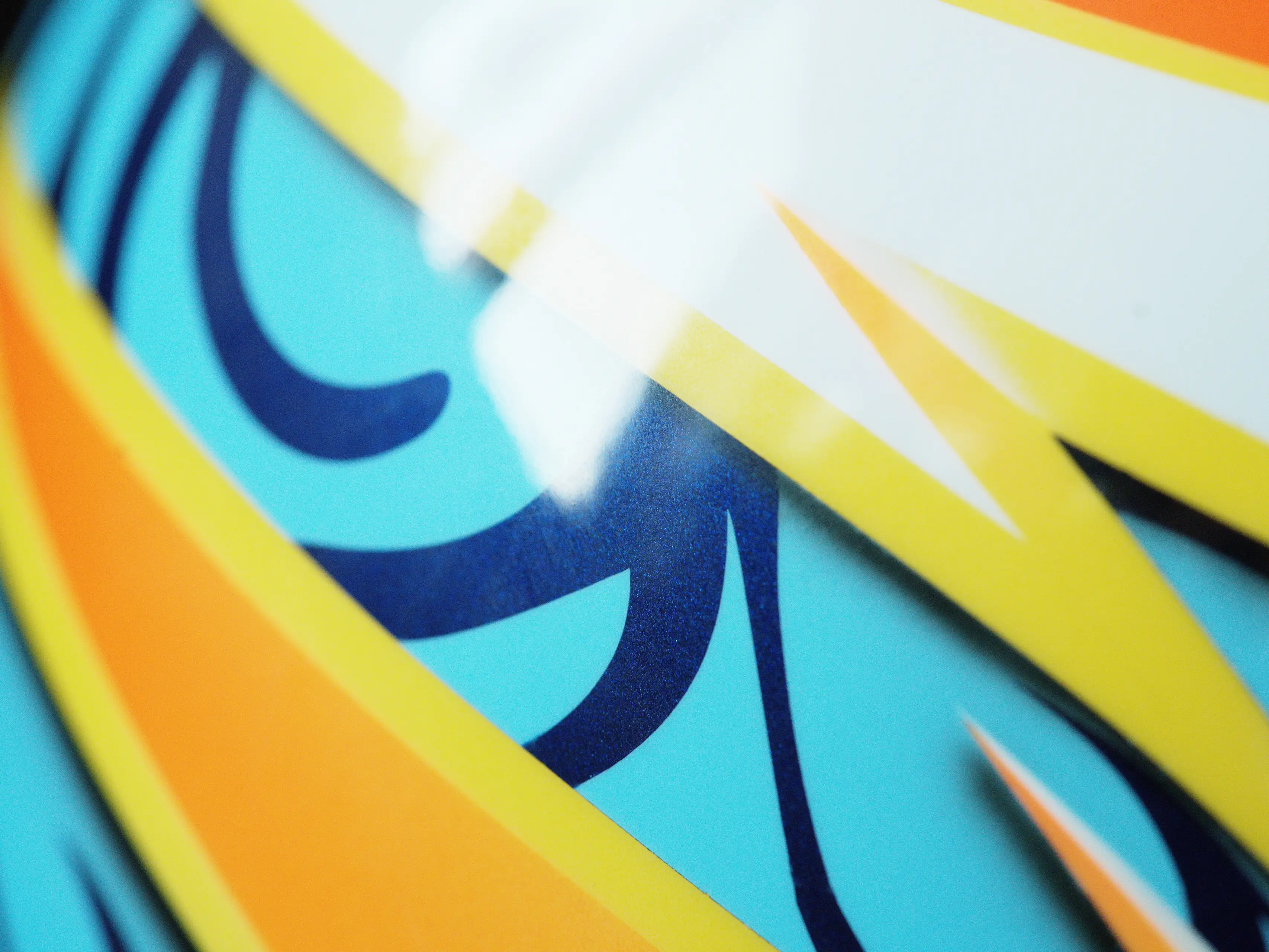
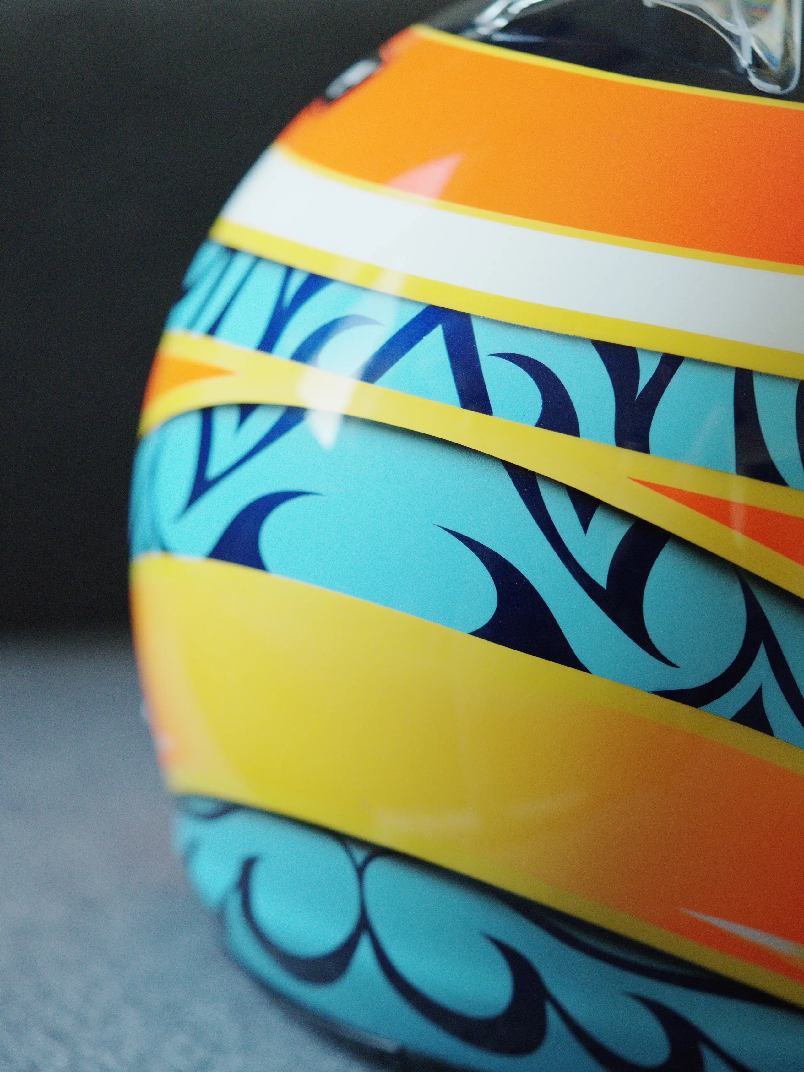
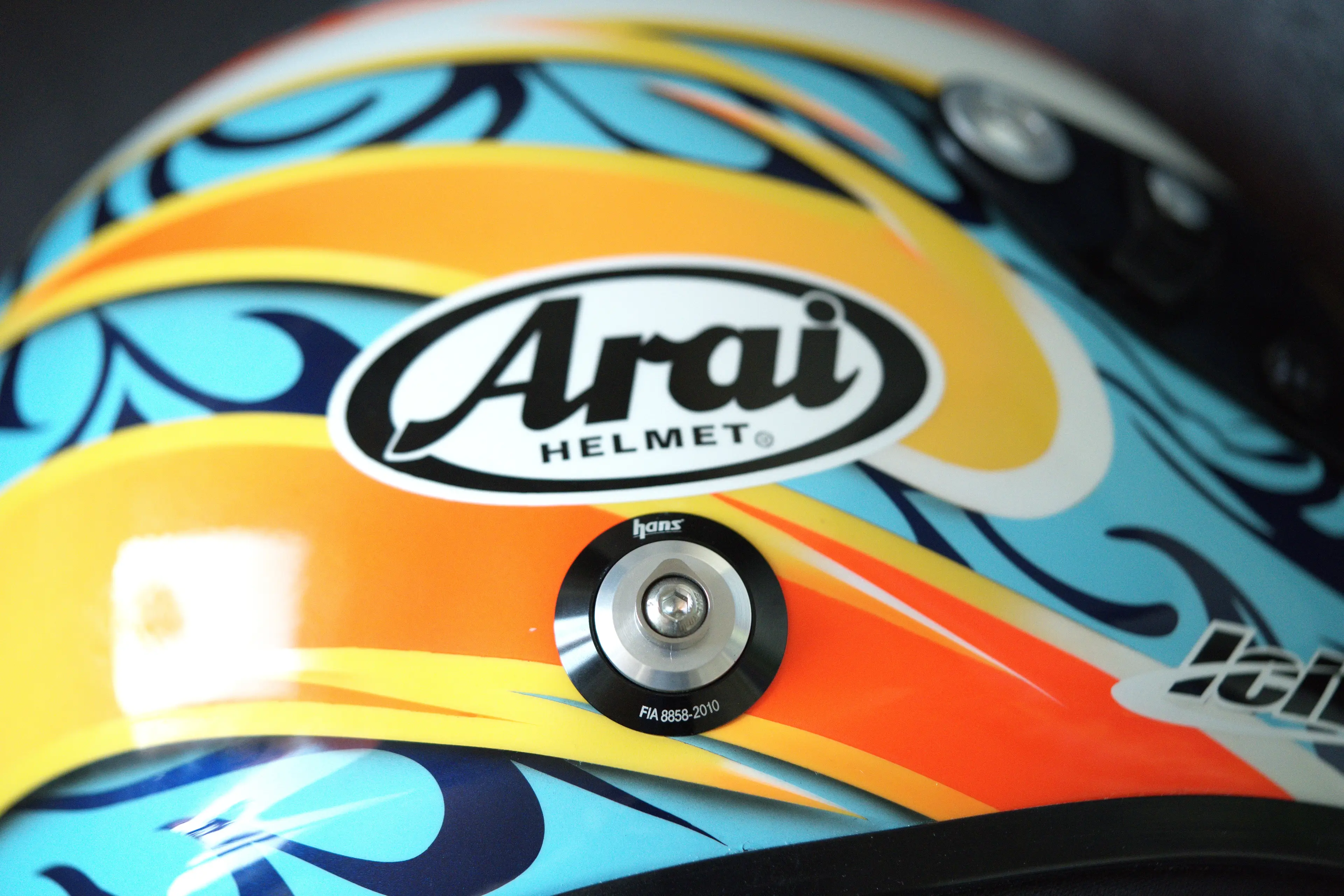
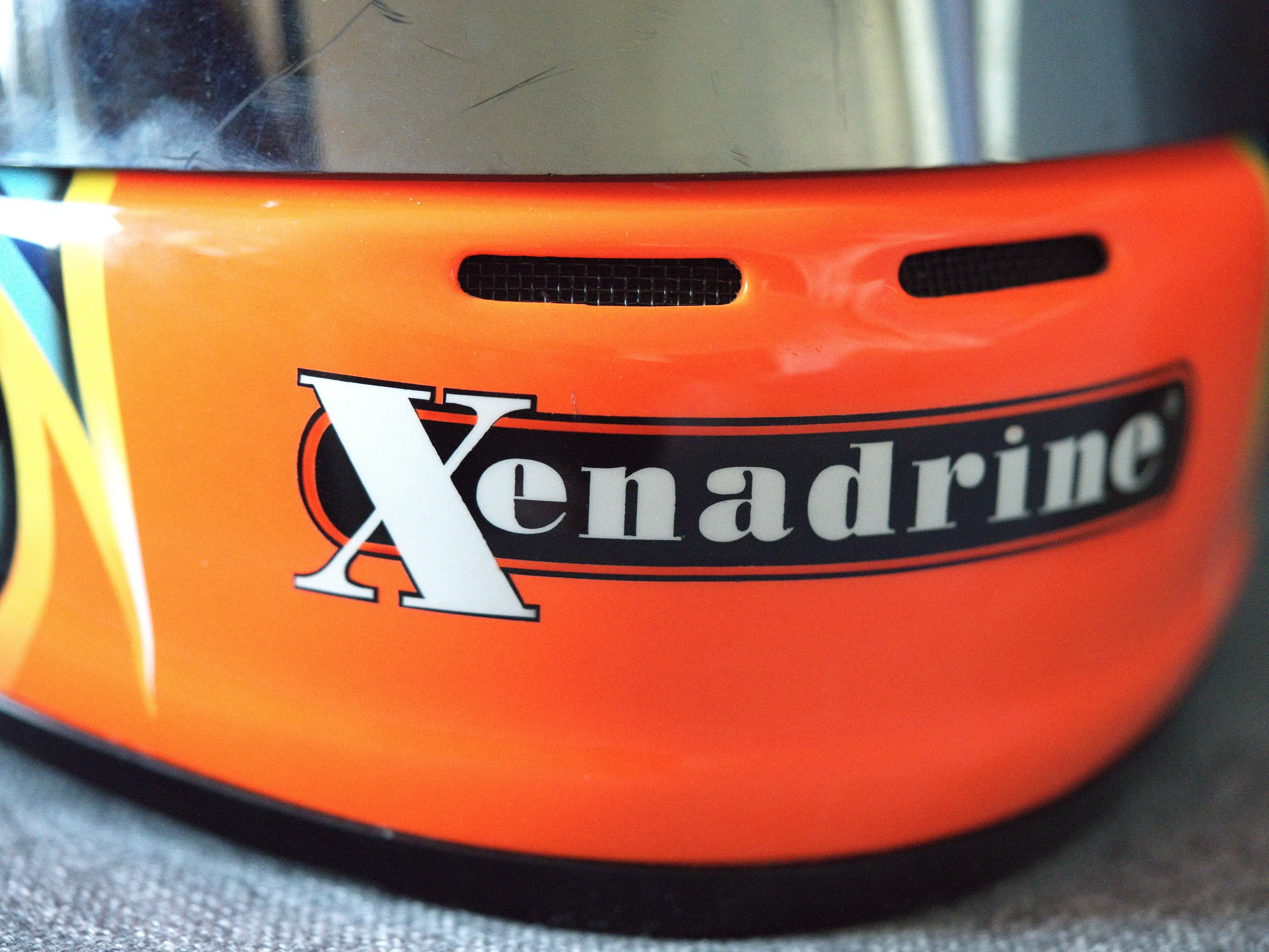
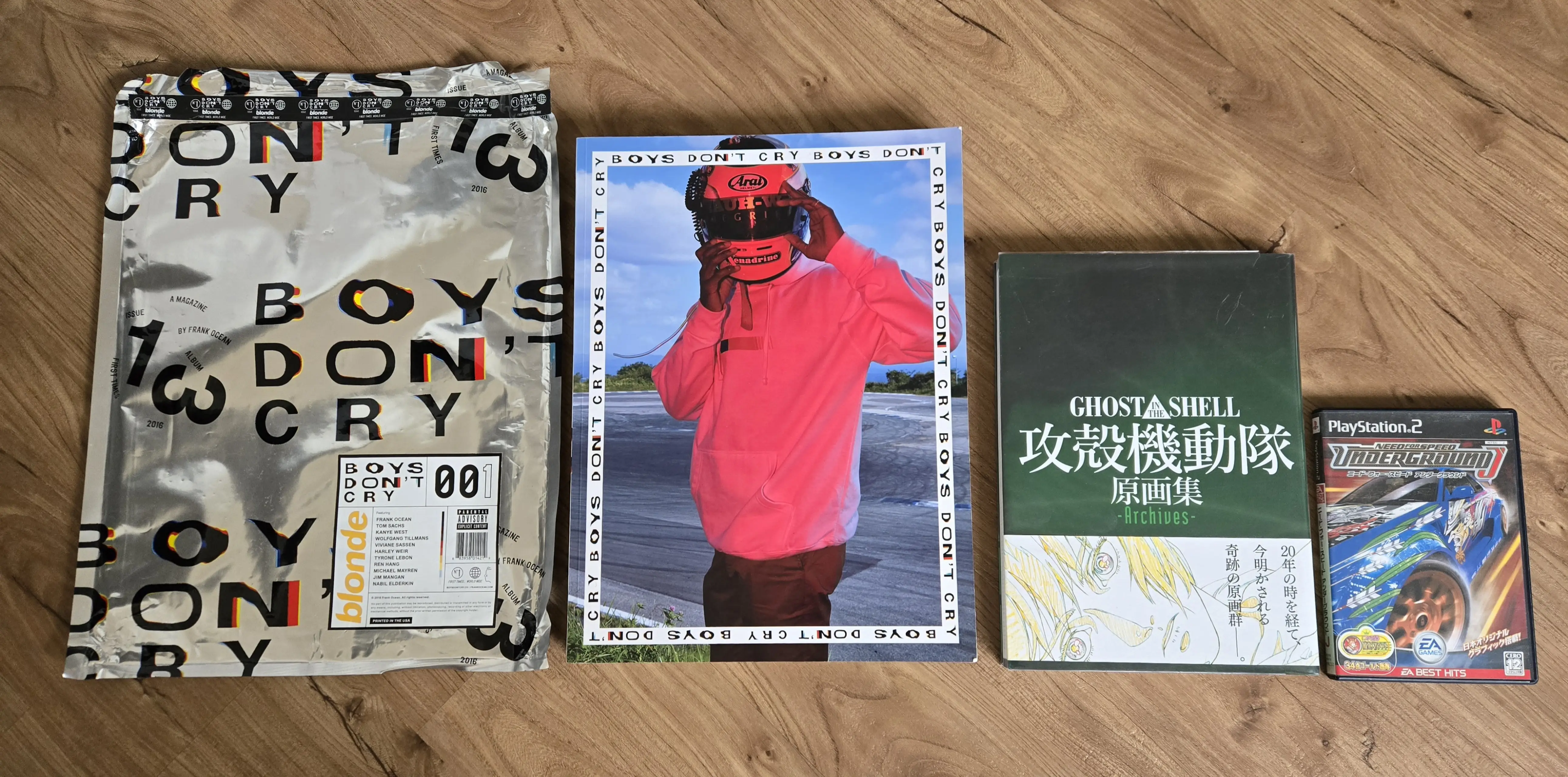
It only felt right to include the magazine along with the helmet. I was expecting this to be A4-sized, turns out it’s very big and heavy as fuck. Here it is sitting next to an actual A4-sized book and a PS2 case.
I originally had a full breakdown here, but after seeing it all written out I decided it would be better to just keep the exact number to myself and say “all in all it was a little under three grand.”
Thanks for reading :)
